Happy Doudous
Educational stationery eCommerce & brand identity
- UX/UI
- Brand Identity
- eCommerce
Overview
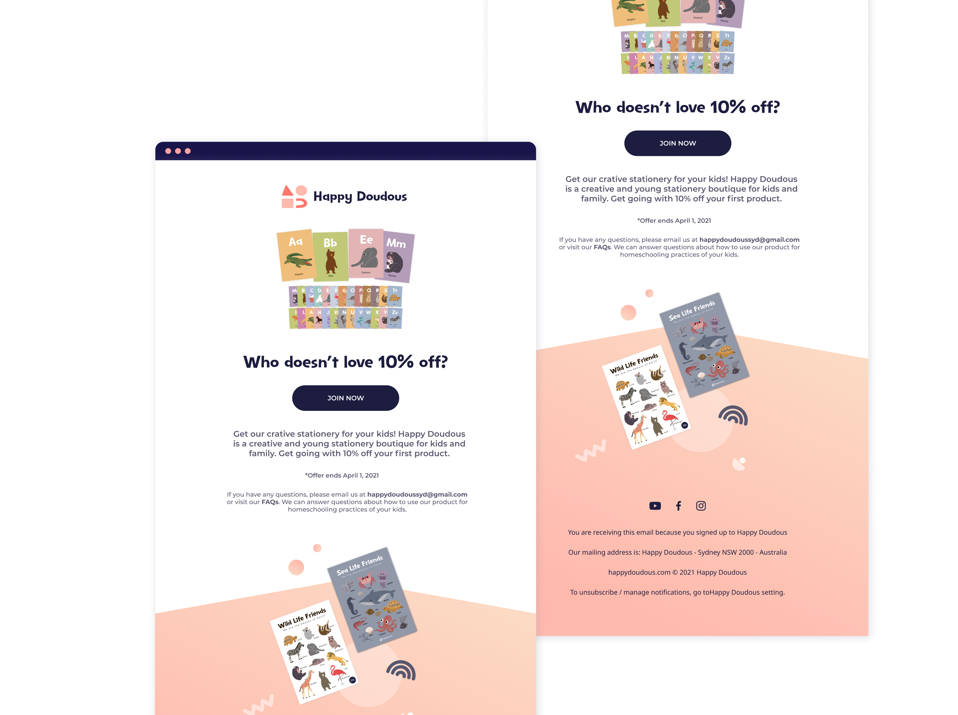
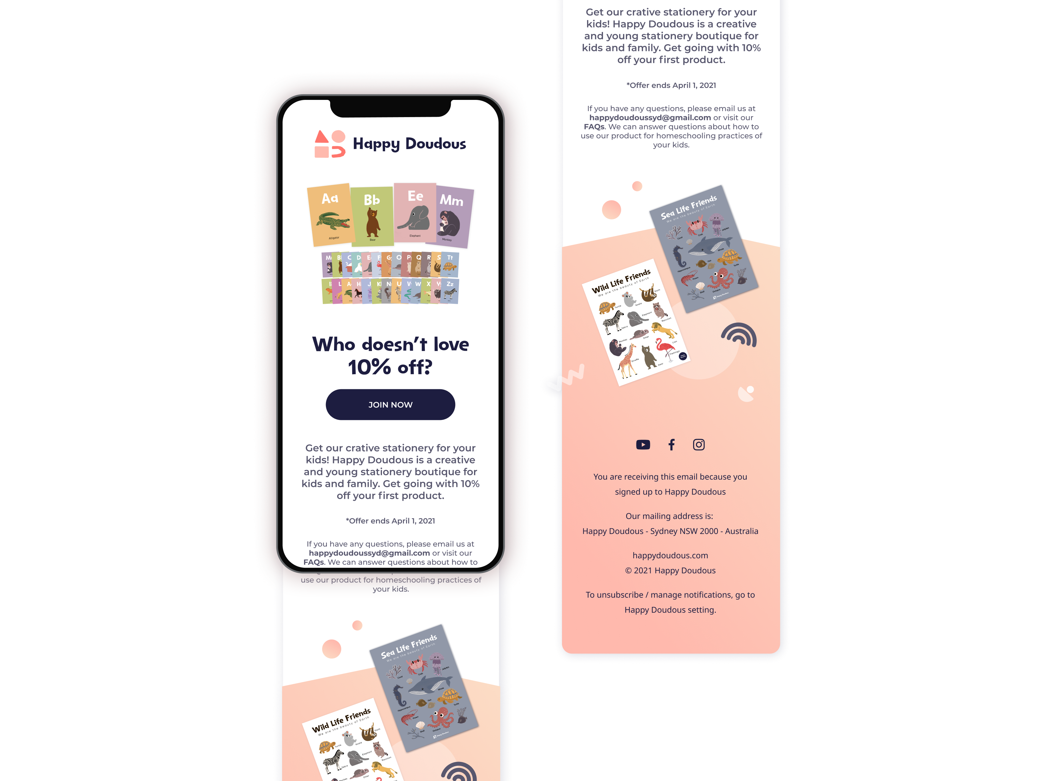
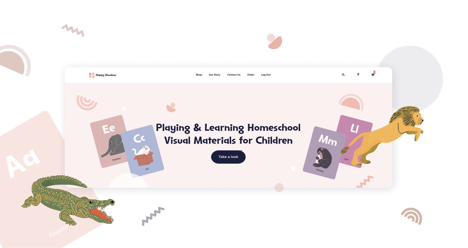
Happy Doudous is a stationery boutique that teaches preschool methods and life skills to children. I led brand and web design for its eCommerce launch, turning hand-drawn product art into a cohesive shop with clear collections, trustworthy product listings, and launch creative for email and social. I worked directly with the founder from concept through implementation.
Role
Delivery
Timeline
CONTEXT
From hand-drawn products to a shoppable brand
Happy Doudous sells playful educational stationery for preschoolers. I partnered with the founder, who already had hand-drawn product art and a clear teaching philosophy, to shape a shop that felt as warm as the illustrations—easy for busy parents to browse, trustworthy in how products are shown, and flexible enough for new collections.
GOAL
A cohesive eCommerce experience from sitemap to checkout
Map the full customer journey, define a flexible layout system, and apply a consistent visual language across homepage, product detail, and post-purchase flows. I worked directly with the founder from wireframes through final UI, so each review had one clear decision: structure, then look, then live shop.
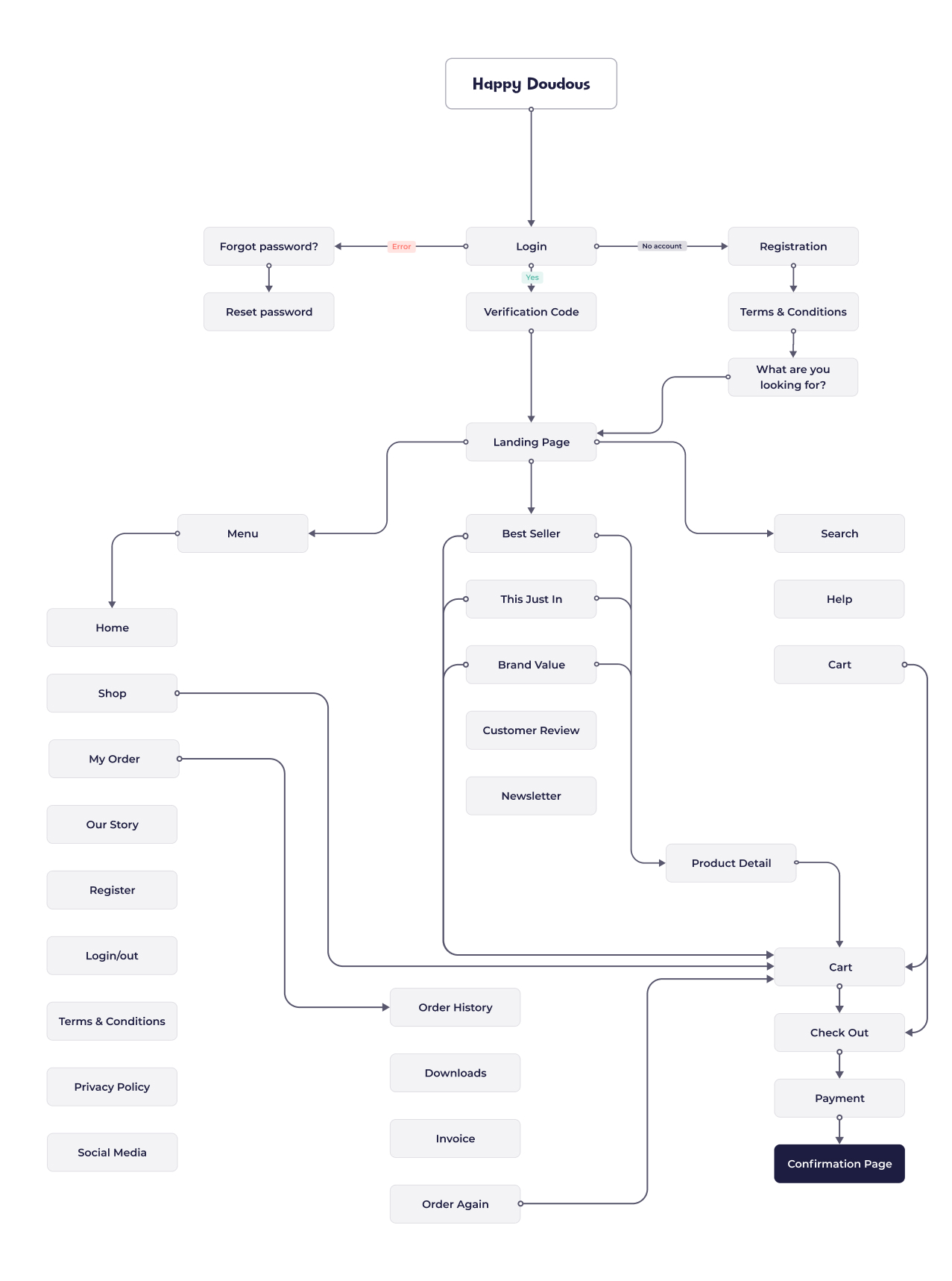
Sitemap
The sitemap groups products by theme and age, separates marketing from shop pages, and keeps account and order paths easy to find. I walked the founder through this structure first so we agreed on the shop before investing in visual design.
Visual System
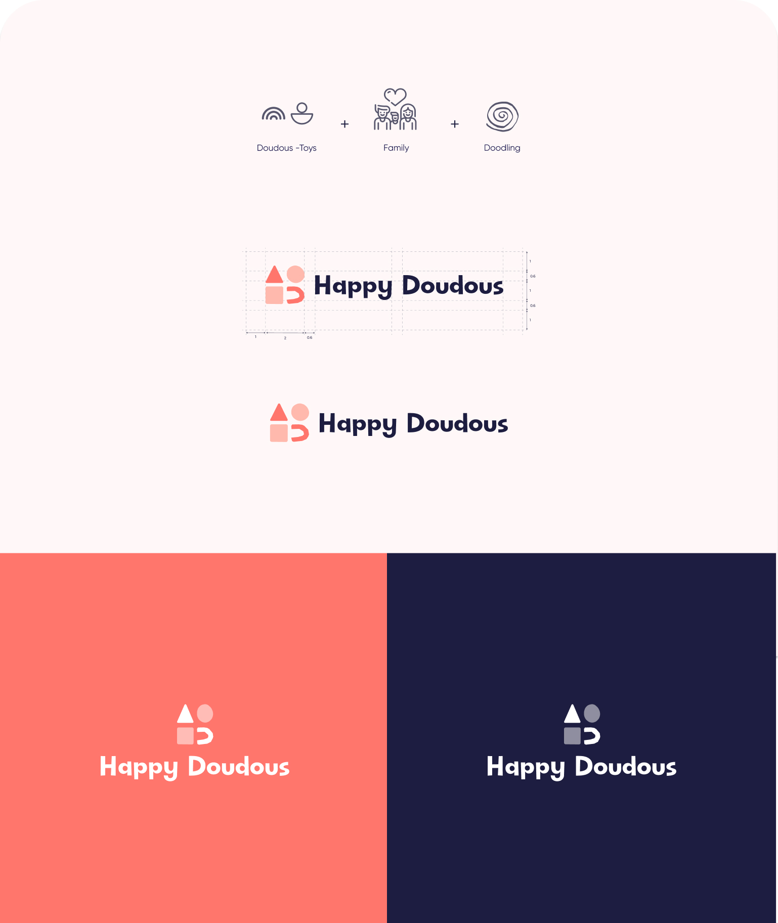
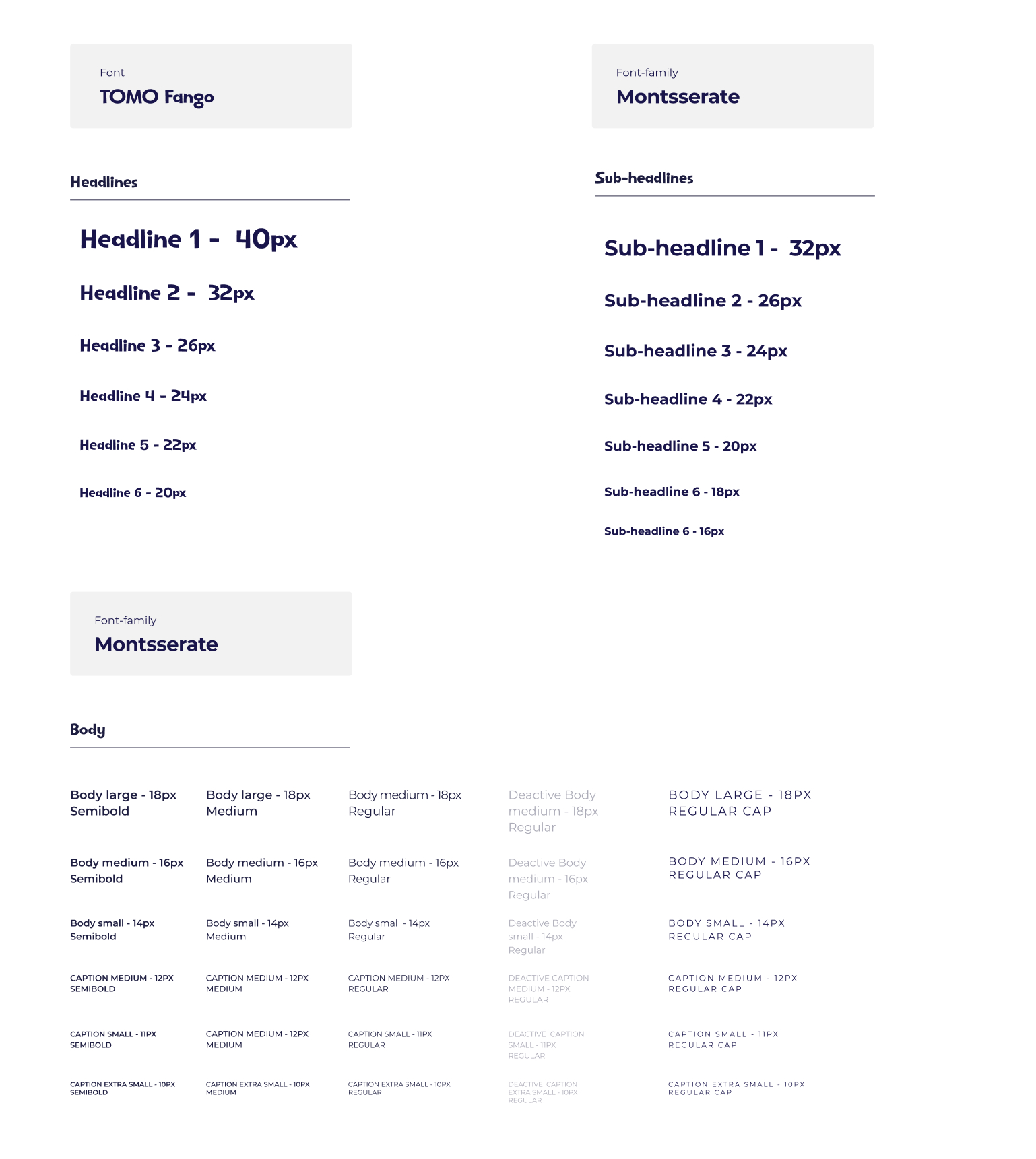
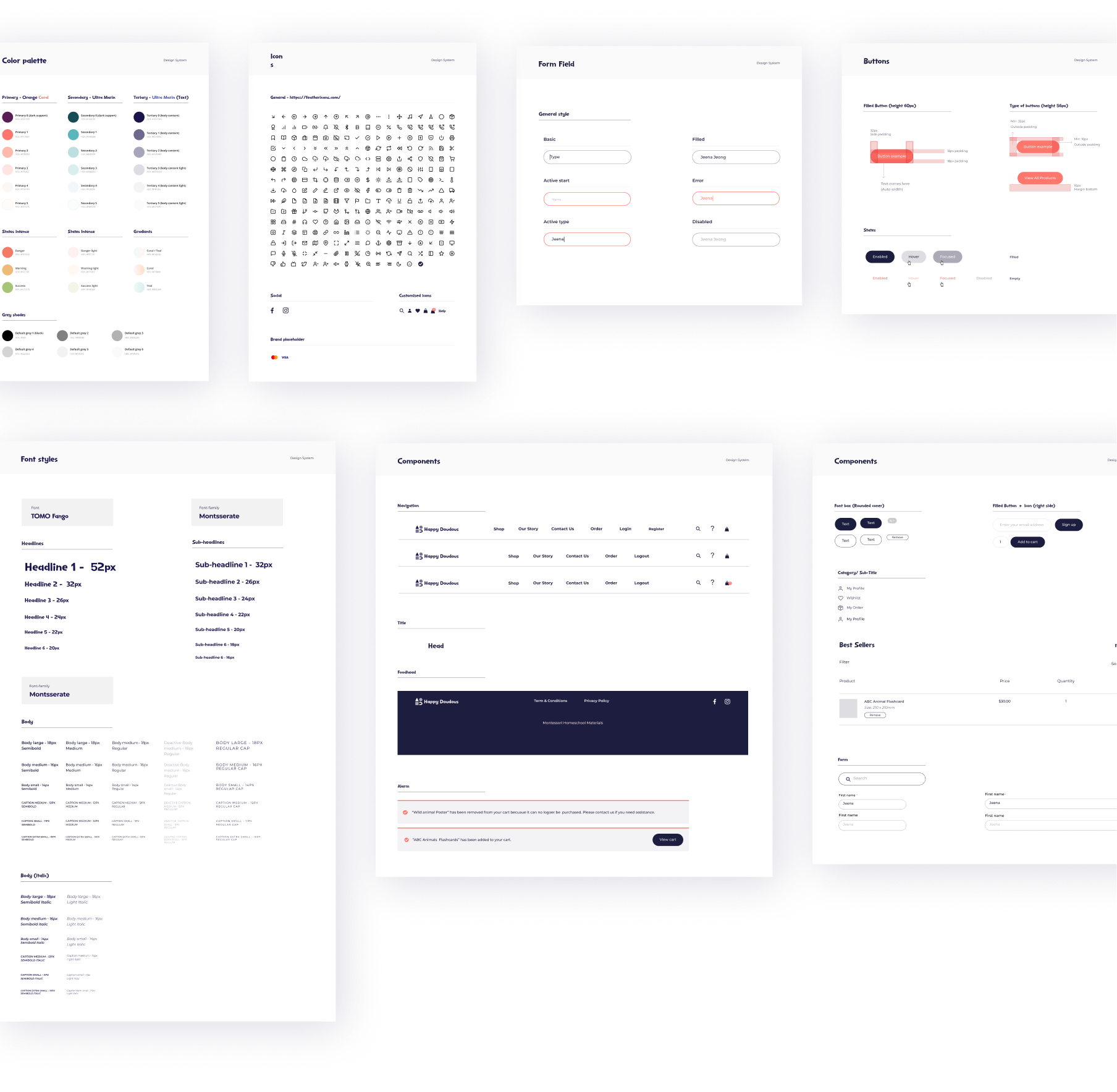
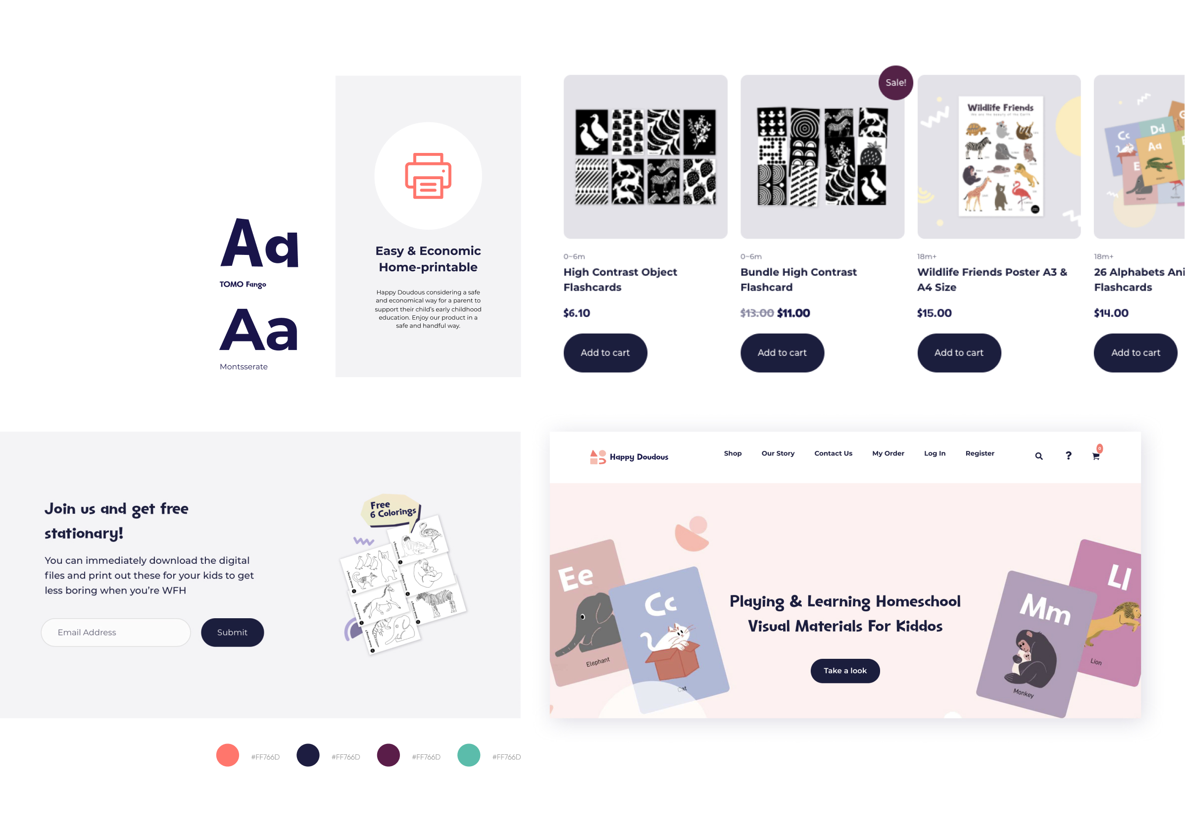
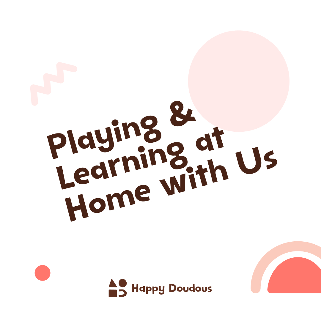
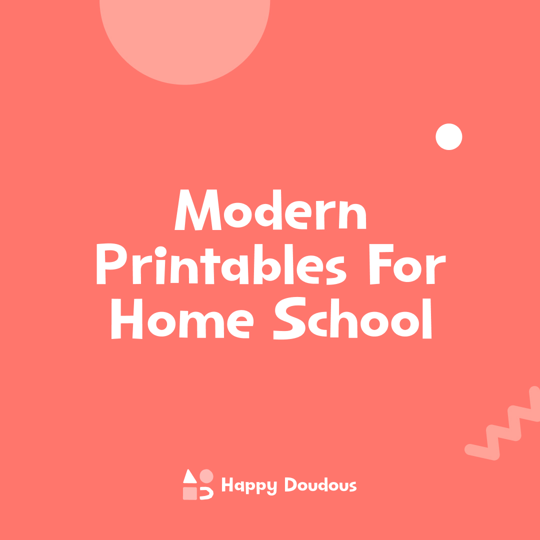
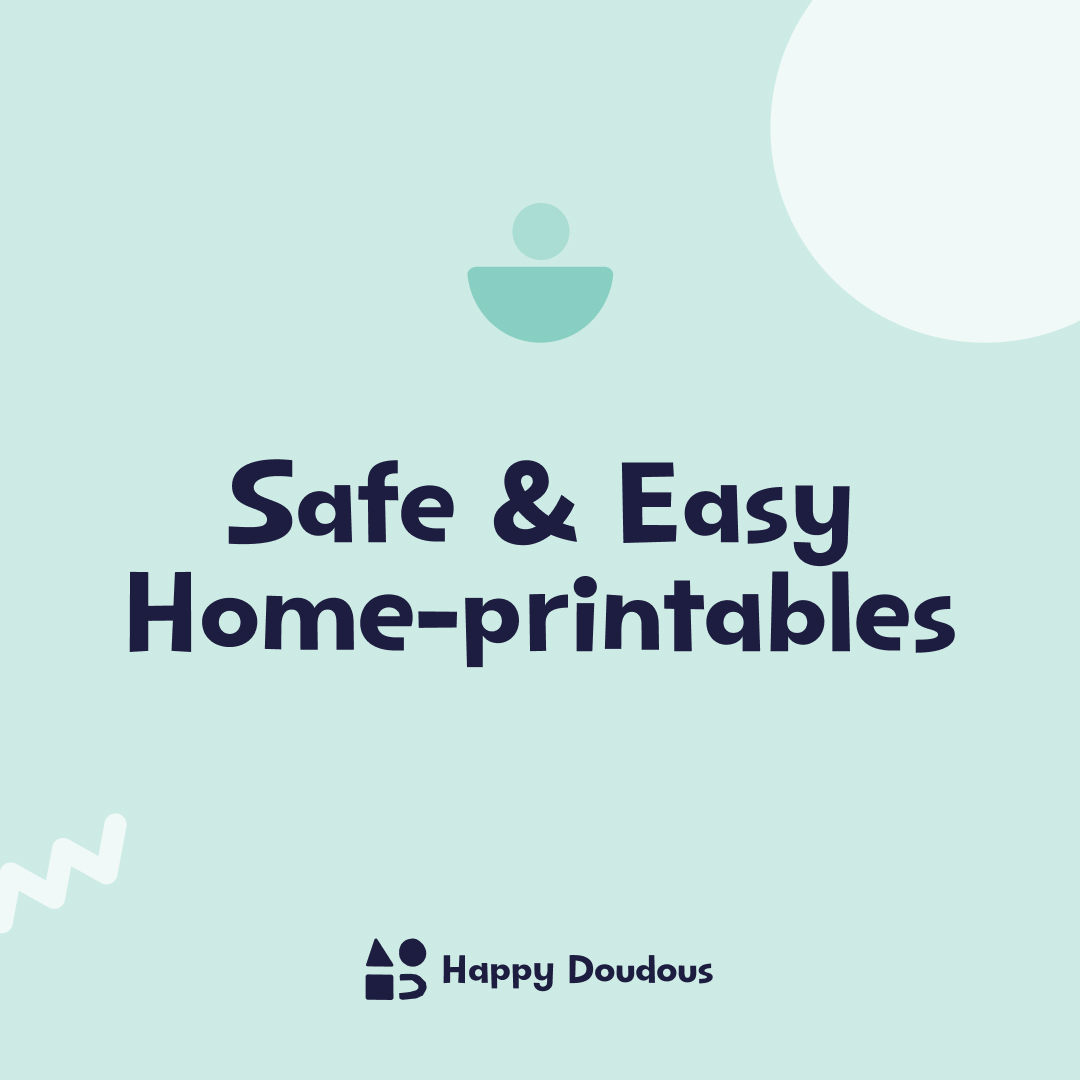
Brand building blocks extend the hand-drawn product world into UI—rounded logotype, warm palette, readable type pairings, and a repeat pattern for backgrounds and marketing. We built from their existing doodles so the brand stayed theirs, not a redesign from scratch.
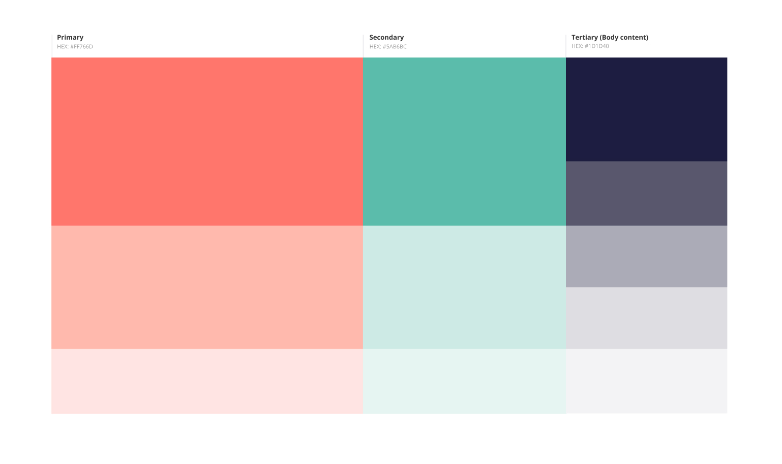

Design system

Wireframe
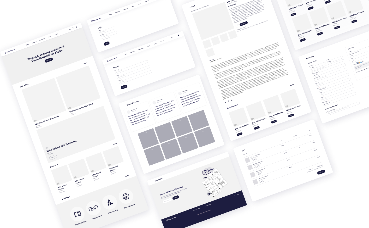
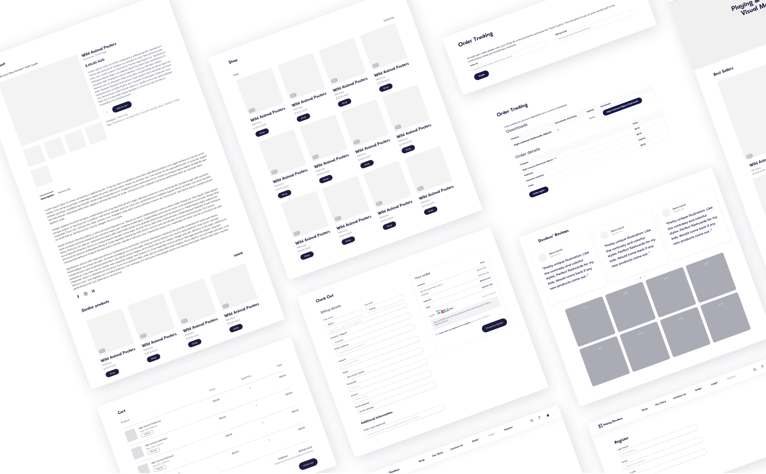
Low-fidelity layouts tested navigation, homepage modules, and product grid density before visual design. Reviews with the founder focused on what parents need to see first, not polish.
Grid & layout
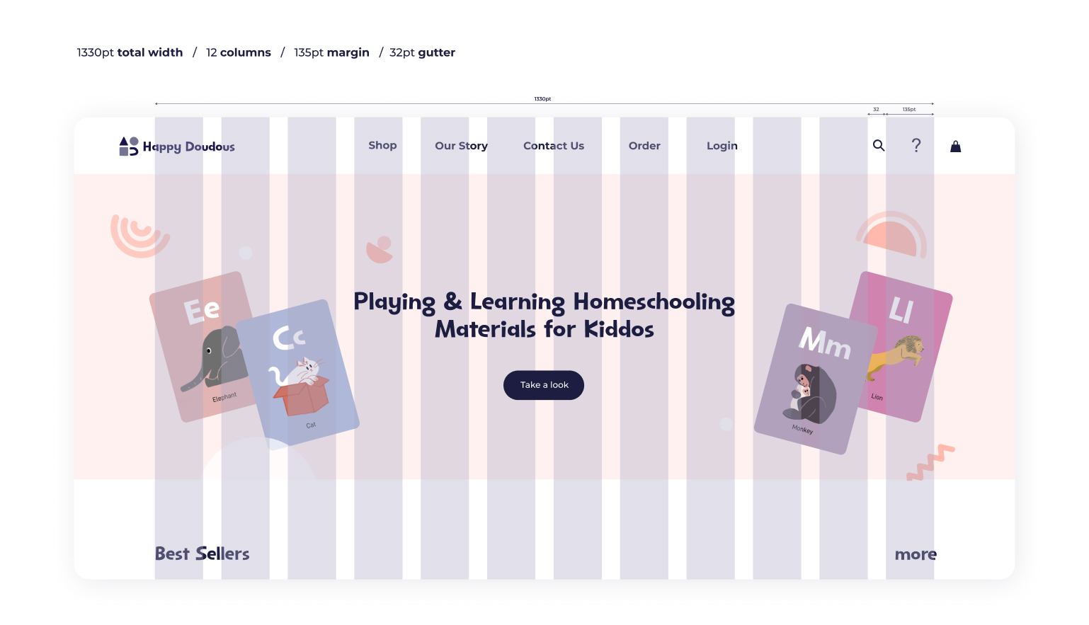
A responsive grid defines spacing, card sizes, and breakpoints so new pages stay aligned with the rest of the shop.
WEBSITE
High-fidelity storefront
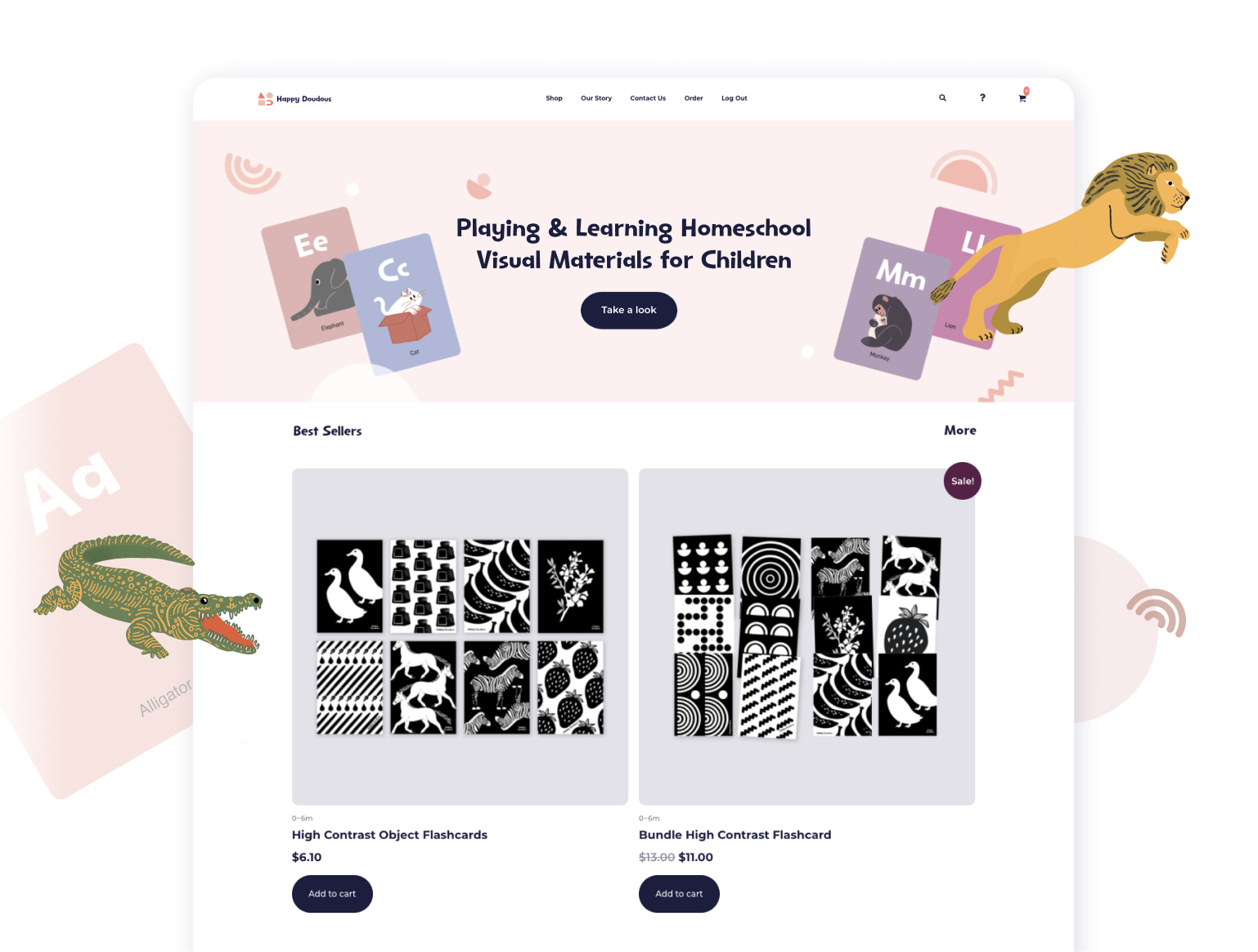
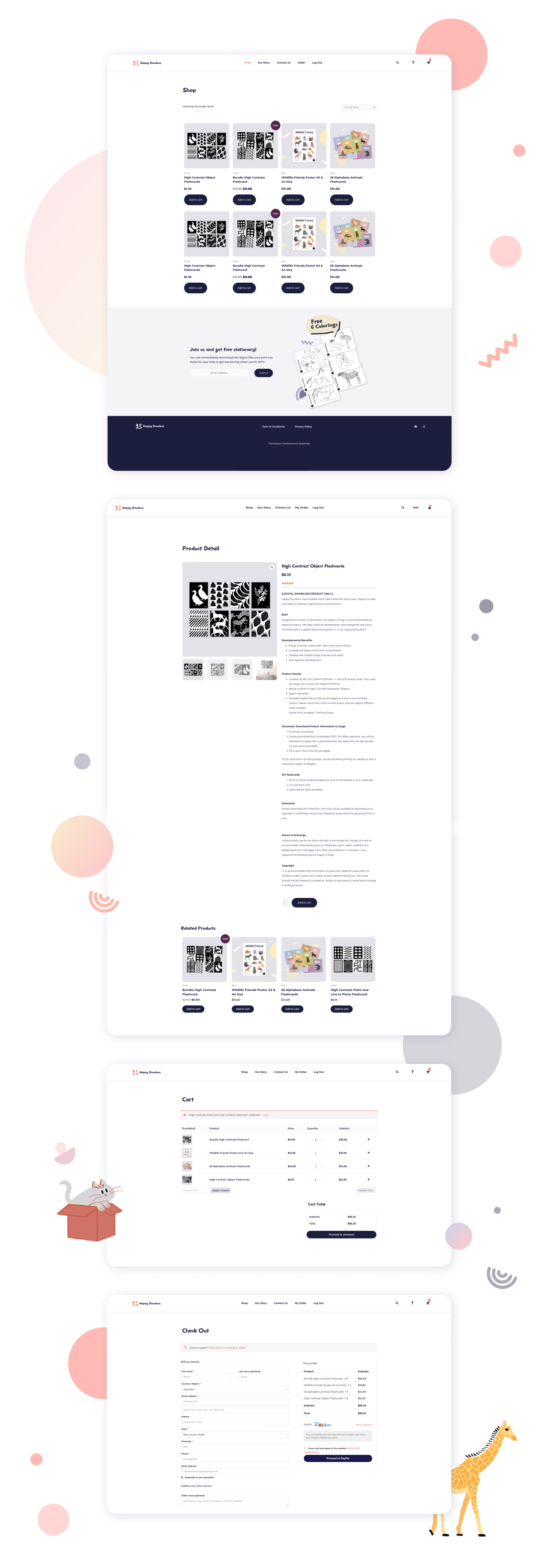
High-fidelity screens show how collections, product storytelling, and soft brand colour carry through the primary shopping paths.
From Figma to WordPress
I designed the sitemap, wireframes, and high-fidelity pages in Figma, then brought the storefront to life in WordPress. To match Happy Doudous' new visual scheme—colour, typography, layout, spacing, and rounded buttons—I customised the CSS directly, so the founder could keep publishing products and posts without waiting on a designer.
Campaign & social posts
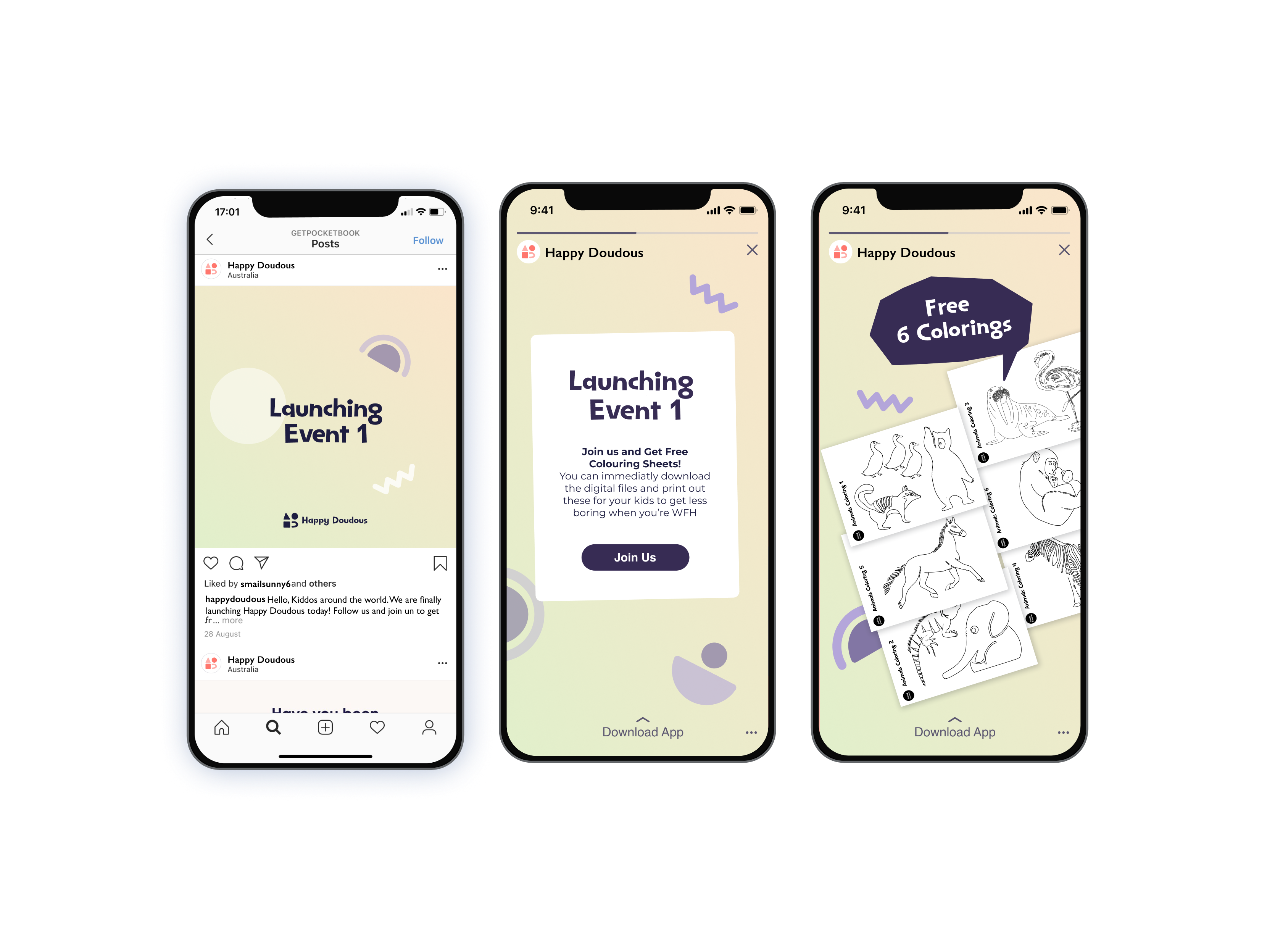
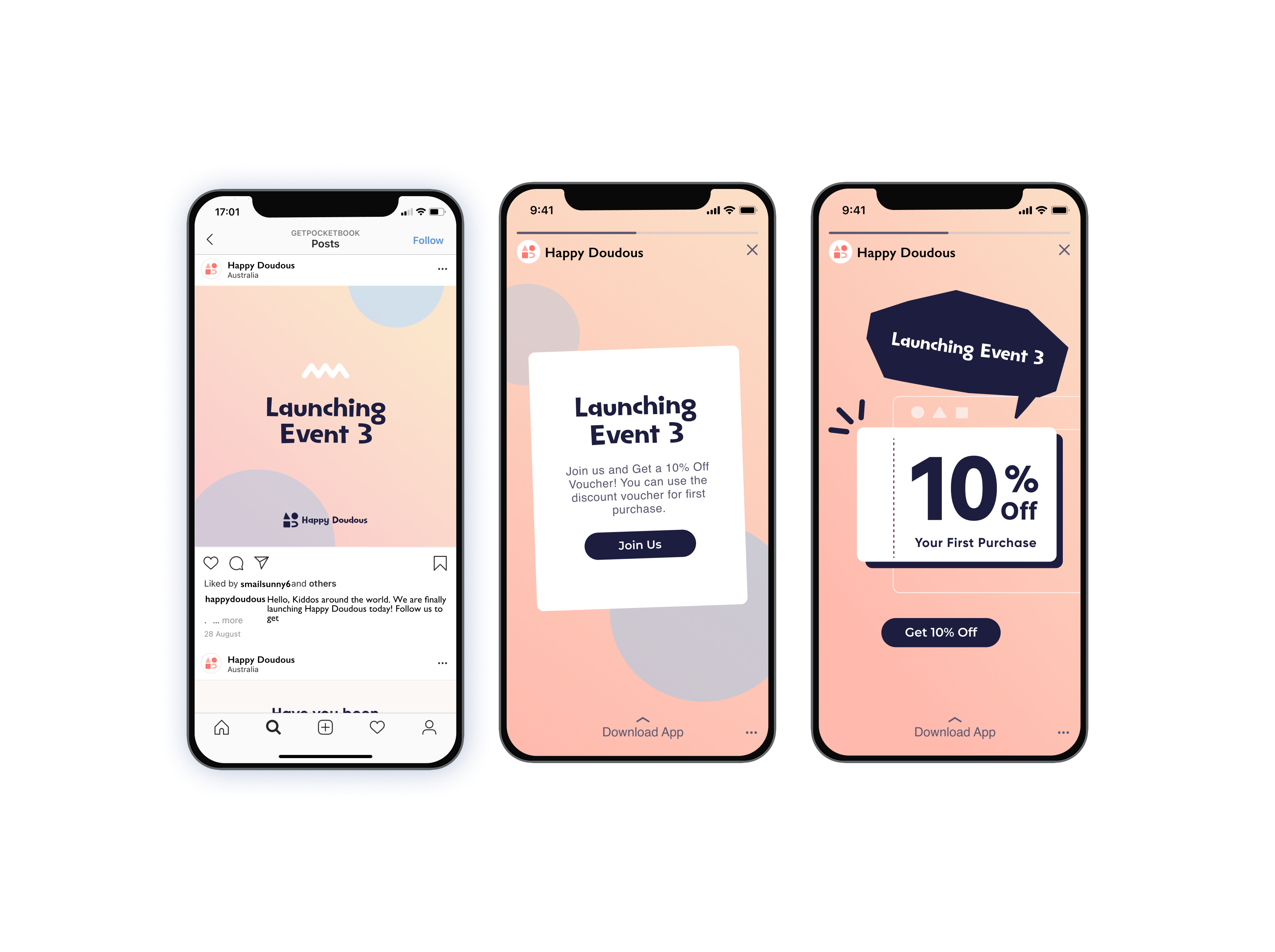
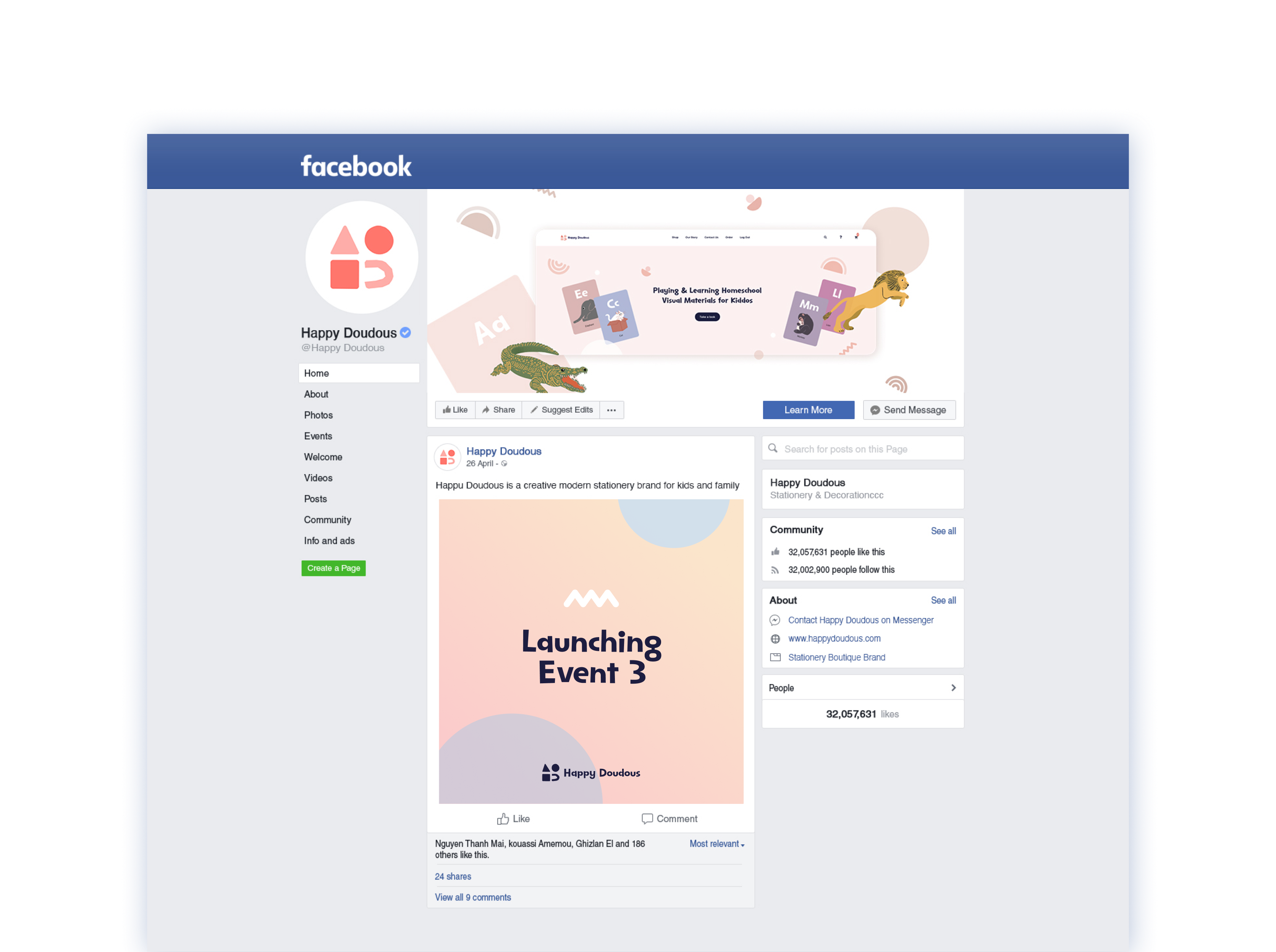
Launch creative for Instagram that carries the same colour, type, and illustration language from the storefront into weekly posts. I designed the first campaign set with the founder so they had a reusable template for later launches.