Deferit
Motion Animation and Website Redesign for Deferit
- Website
- Illustration
- Motion Design

Overview
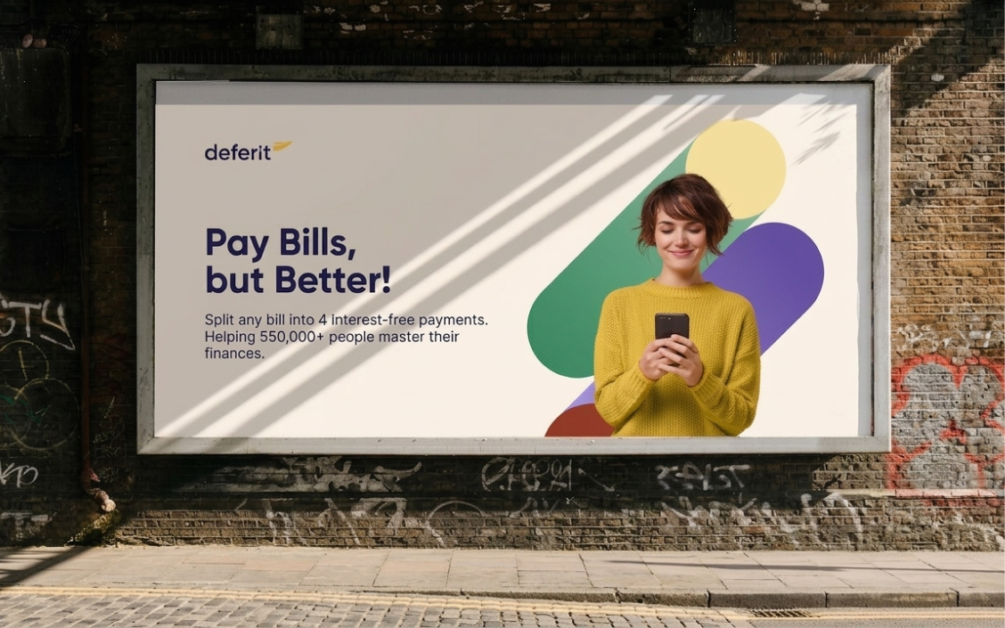
Deferit lets you pay bills on your terms, splitting costs into four interest-free instalments. As the brand prepared to scale across the UK market, it needed a visual language strong enough to carry trust while feeling distinctly modern and approachable.
Key Results
- 300k+Sign ups
- 190kNew users
- 74%Retention rate
- $200M+Bills managed
Role
Team
Timeline


PROBLEM
Limitations of a Localised Identity
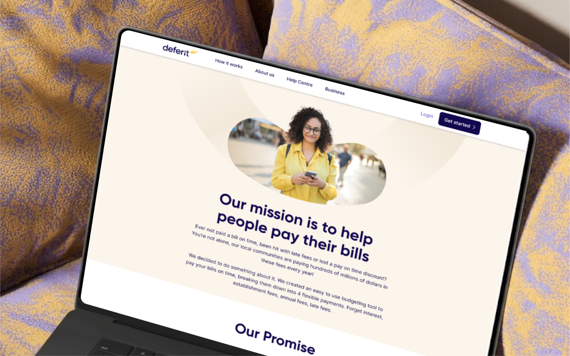
After scaling to over 500,000 active users in Australia, Deferit required a strategic plan to expand into the US market. However, the original brand identity and website structure lacked the scalability needed for global growth. The US market demanded distinct messaging, different product features, and unique compliance language that a single localised site could not support. To compete effectively on a global scale, the business needed a comprehensive overhaul of its visual narrative—including colour schemes, typography, assets, and motion design—to seamlessly launch new services and proactively establish its brand voice in the US.
Try it out
FEATURE 1
Renewed Brand Identity
Typography
A modern, approachable serif typeface optimised for diverse platforms and applications.
Colour Palette
A versatile colour scheme designed to represent varied financial solutions and user needs.
Imagery
Blending structural patterns with lifestyle photography to create an accessible, humanised financial service.
Motion Design
Dynamic animation that transforms a standard fintech utility into an inclusive digital companion.


FEATURE 2
Prioritising orientation and trust signals
By prioritising orientation over conversion pressure, the updated homepage hero introduces what Deferit is before prompting cold visitors to sign up. This redesign seamlessly builds trust above the fold by placing key proof points—such as 500k members, 4.9 App Store ratings, and review counts—early in the user journey before delivering deeper product details.
FEATURE 3
Micro-interactions
The 3-step process was redesigned as a single visual flow — upload, we pay, repay in 4. Scannable in under 10 seconds without reading.
FEATURE 4
Feature-led navigation
The US site introduced a feature-led navigation — Credit Builder and Bill Savings became their own pages rather than buried in the homepage. Visitors self-navigate to the product most relevant to them, reducing drop-off from users who didn't see themselves in the core bill pay message.

Business Impacts
After the v2 relaunch, Deferit reported measurable growth across every dimension — sign-ups, retention, and total bills managed.
300K
Sign-ups
190k+
New users
74%
Retention rate
$200M+
Bills managed
FUTURE ITERATION
Strategic Framework: Motion Ads
Disclaimer: This strategic framework outlines a hypothetical brand renewal and website iteration to project future marketing scale.
The Core Hypothesis
Aligning motion design from social ads to sign-up flows creates a unified marketing funnel that converts cold audiences through seamless visual continuity.
Strategic Framework
Targeting cold US consumers, this framework uses a three-pillar motion strategy to build instant brand recall (Who, What, How) and drive conversions through end-to-end visual continuity:
- Emotion: Humanises fintech with fluid animations that replace banking anxiety with relief.
- Education: Uses a 3-second looping hero video and scroll-triggered bill-slicing simulations to eliminate heavy text.
- Conversion: Delivers a seamless transition from social ads to the landing page to eliminate drop-off.


