Driva
Optimising Lender switch experience
- Web Application
- Motion Design
- EDM
Overview
Driva provides automated finance services that simplifies the loan experience by cutting through the paperwork and complexity that typically makes finance feel intimidating. Driva wants to redesign the lender switch journey to feel less like a bureaucratic hurdle and more like a guided, human experience to decrease drop-off rate from user whose lender has been changed.
Key Results
- 11%Conversion rate from referral leads
- 4.8★App store rating
Role
Team
Timeline
CONTEXT
New auto assessment system led to lower loan settlement
After Driva adopted a new auto credit assessment system, this change led to a lower loan settlement rate (3.94%).
RESEARCH
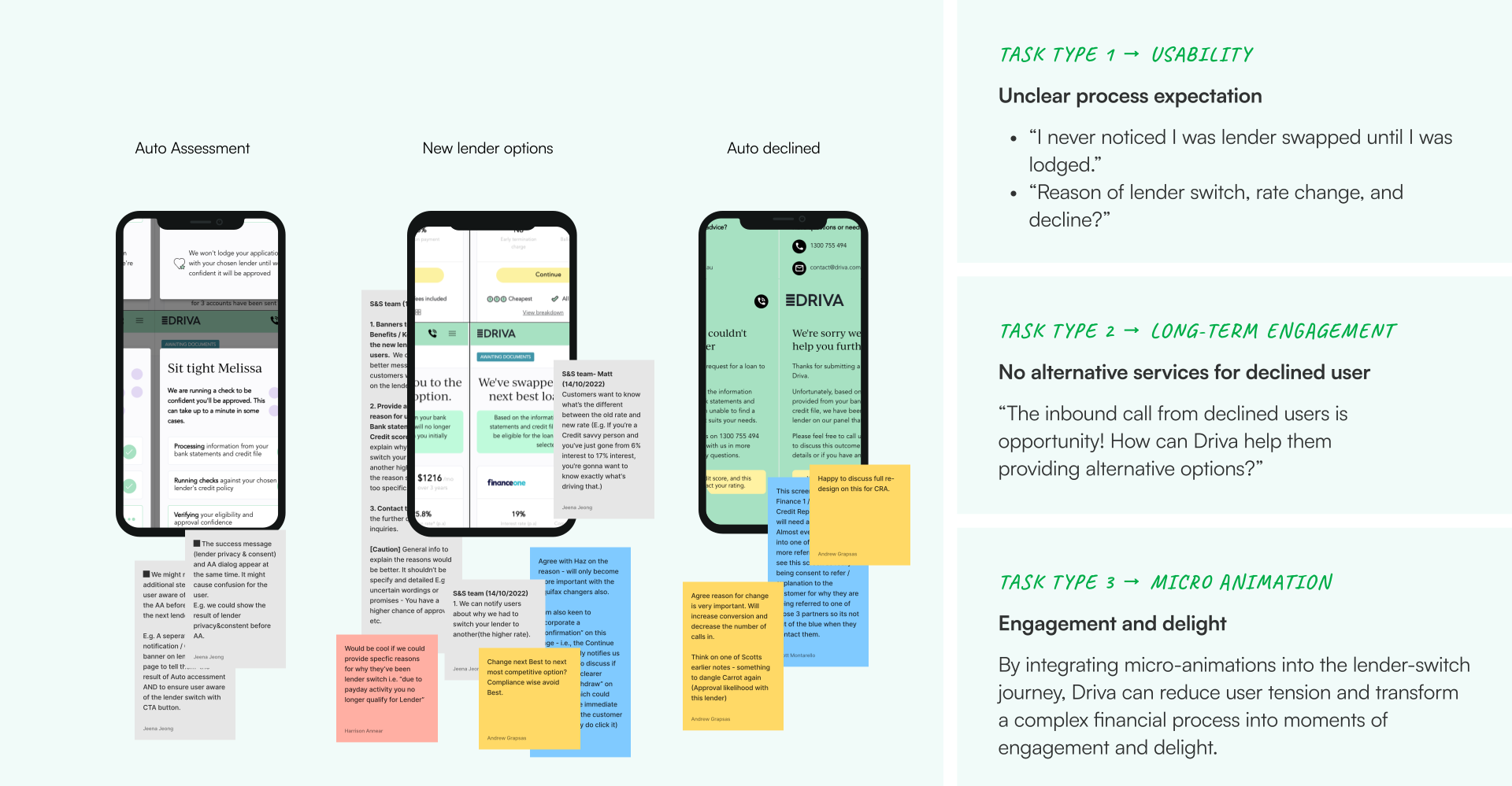
Three types of tasks within constraint boundaries
When a team hits a hard limit like a low credit score, a designer’s role shifts from a direct fixer to an opportunity finder who bridges user reality and business viability. I interviewed the sales team and tested the app to identify usability issues and uncover these opportunities.
Research methods:
- Interviewing the sales team
- Assessing the current design collaborating with internal financial consulting team
CRAFT PROCESS
Designing within an existing system
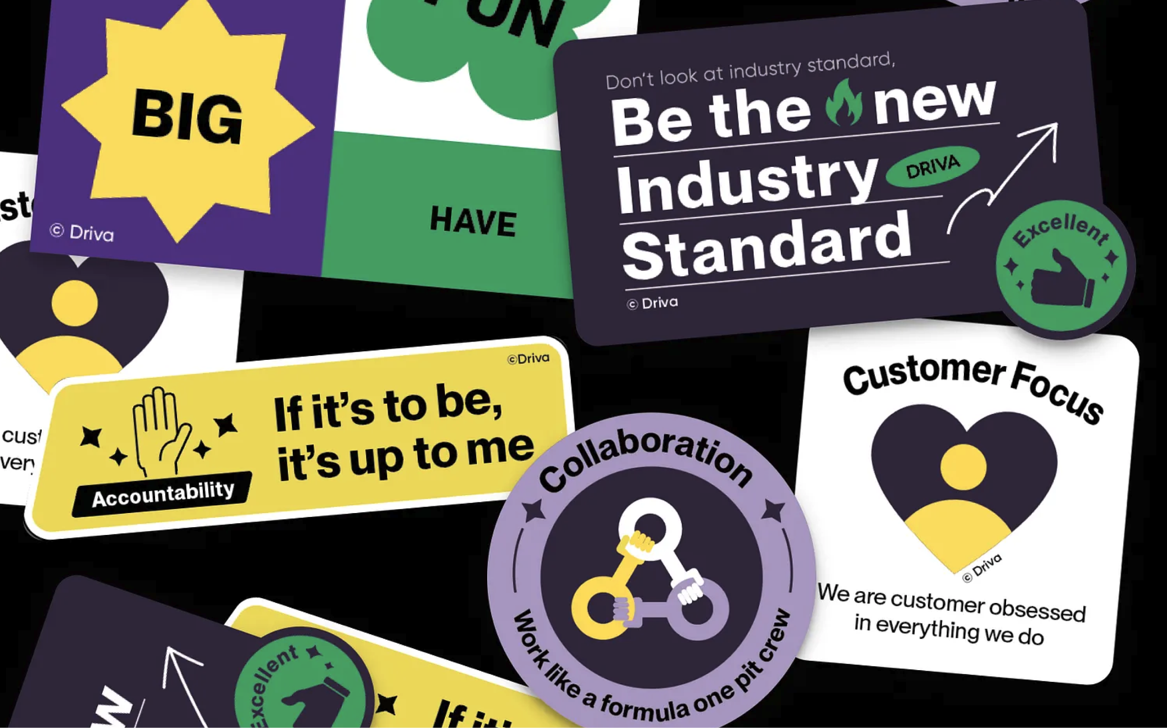
Driva's brand identity — including typography, colour palette, and a defined personality (dynamic and relatable buyers advocate) with a passionate, straight-talking, down-to-earth tone of voice — had already been established by an external brand strategy agency. The challenge wasn't inventing a new visual or verbal language — it was making a new element (the progress stepper icons and motion) feel like it had always belonged to that brand.
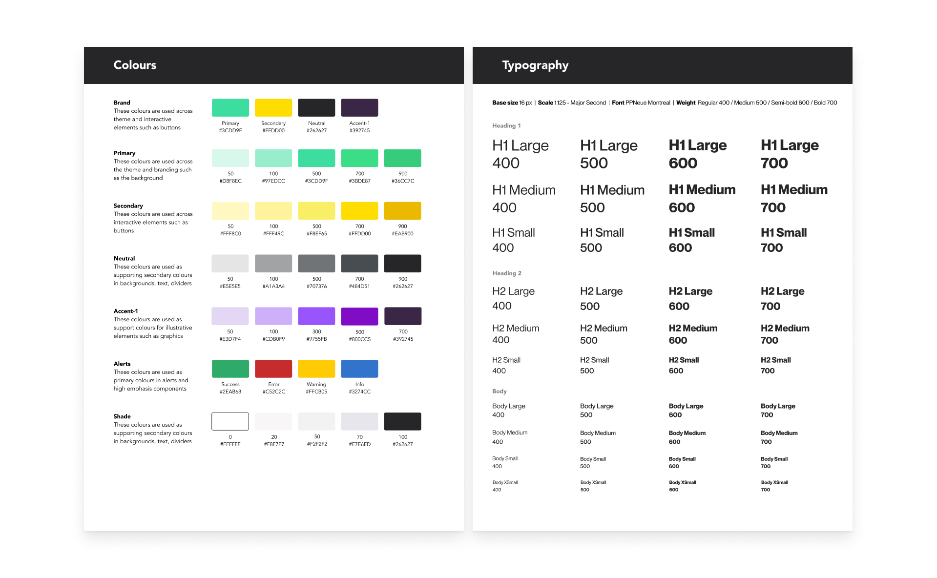
Existing design system

Brand Personality
Icon exploration
- Ran a feedback loop with the PM, marketing team, and founders — to pressure-test the visual approach against the brand's personality and user base before committing to final production.
The team converged around a graphic-set style over straight, simplified finance icons — feedback favoured options that felt distinct and on-brand rather than generic, while flagging a real constraint: Driva's core user base isn't highly technical, so icons that leaned too abstract risked being unclear rather than clever. That trade-off — bespoke and brand-forward, but never at the cost of clarity — became the guiding principle for the final direction.
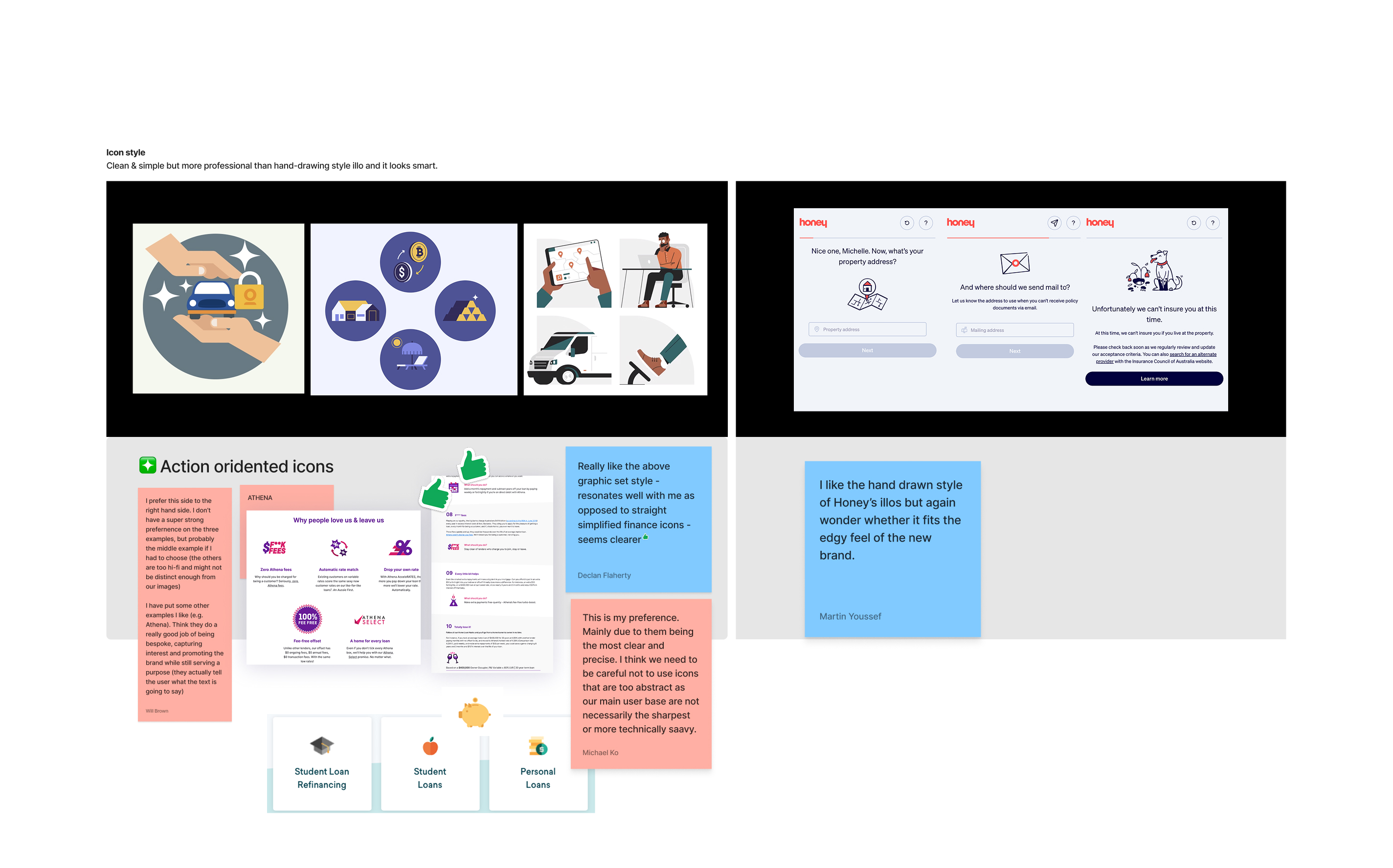
A feedback loop with stakeholders
- Sketched multiple icon directions ranging from literal to abstract — literal (referral sent, the last step, switching lenders etc.) and abstract (geometric shapes representing progress states).
I chose the final icon direction over the others because it explained the literal moments most clearly — the last step, and a swapped rate — through simpler graphics. Diagonal forms with tick and dimensional coin graphics also catch the eye more readily.
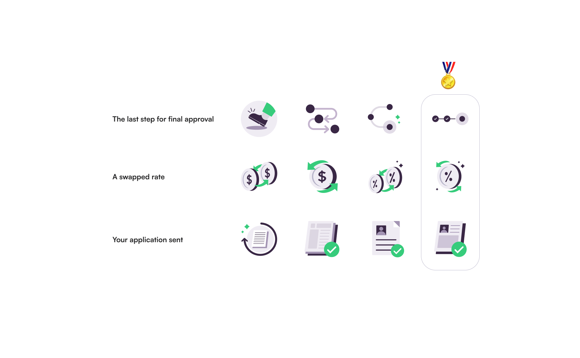
Sketching multiple icon directions from literal
- Tested icons for size, weight, and stroke consistency against Driva's existing UI components to ensure visual cohesion.
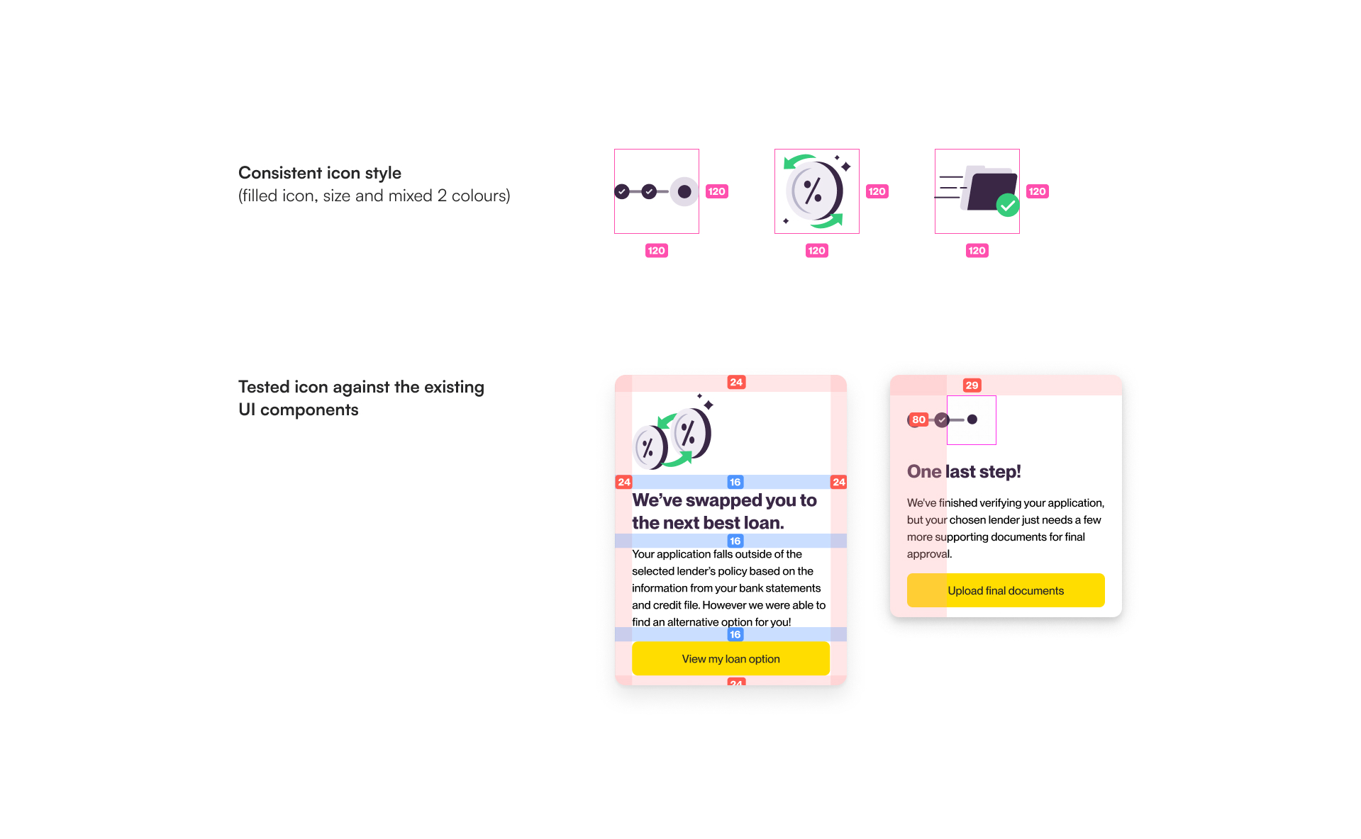
Testing icon against existing UI components
- Prioritised legibility on mobile and desktop, so icons read clearly within a compact stepper
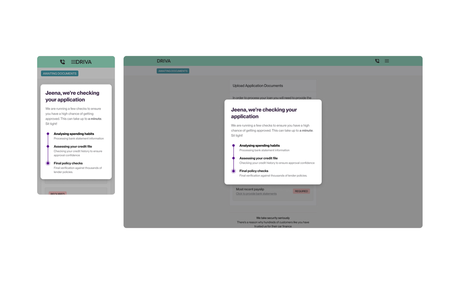
Prioritising legibility on mobile and desktop
From static to motion
Static icons alone didn't solve the core problem — users still felt uncertain moving through a credit assessment process. Motion became the tool to communicate state, not just step:
- Used micro-animations to signal transitions between stages, reducing the feeling of an abrupt or unclear process
- Applied ease-in/ease-out timing to make transitions feel calm rather than mechanical — appropriate for a moment that's already financially stressful for users
- Used dynamic, celebratory animations strictly for important user actions.
Animated icon collection for Driva
Lender Switch Journey with Animated Icons
PROGRESS STEPPER
Breaking the process with a progress stepper
Problem: Unclear process expectation
Breaking the credit score assessment into visible, digestible stages helps users understand the process and reduces stress during this critical journey. By incorporating micro-animations, the interface transforms a complex system into a manageable experience.
Key details:
- Animated Progress Stepper: Clearly communicates each step of the assessment to guide the user.
- Micro-animations: Break down complex tasks, easing the transition between the active process and the final outcome.
- Separated the credit assessment from the assessment result.
REFERRAL SERVICE
Referral service for declined users
Problem: No alternative services for declined users
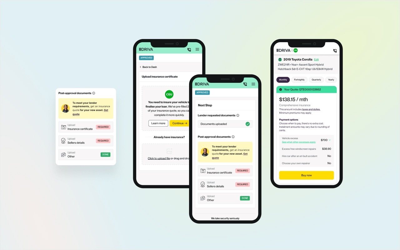
Referral service in the app
Introduced the referral service as an alternative for declined users. This feature includes:
- Privacy assurance
- Partner brand information
- Highlighted benefits and incentives
Referral lead in the web application
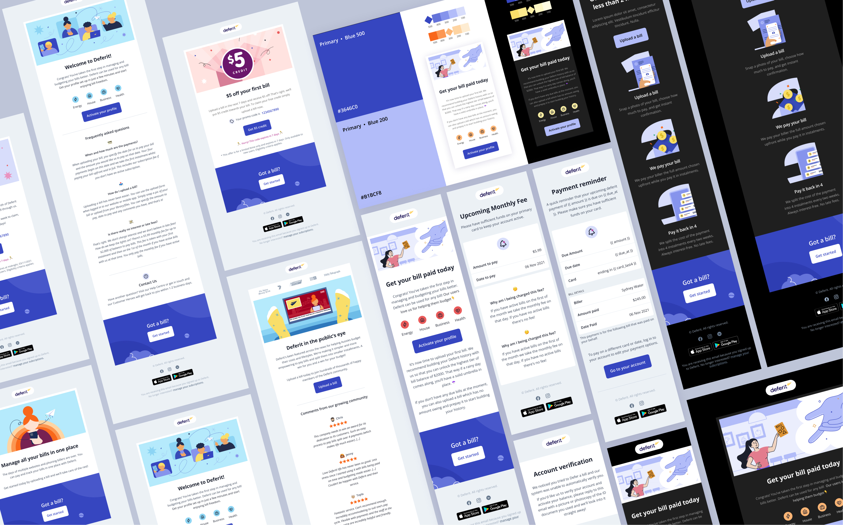
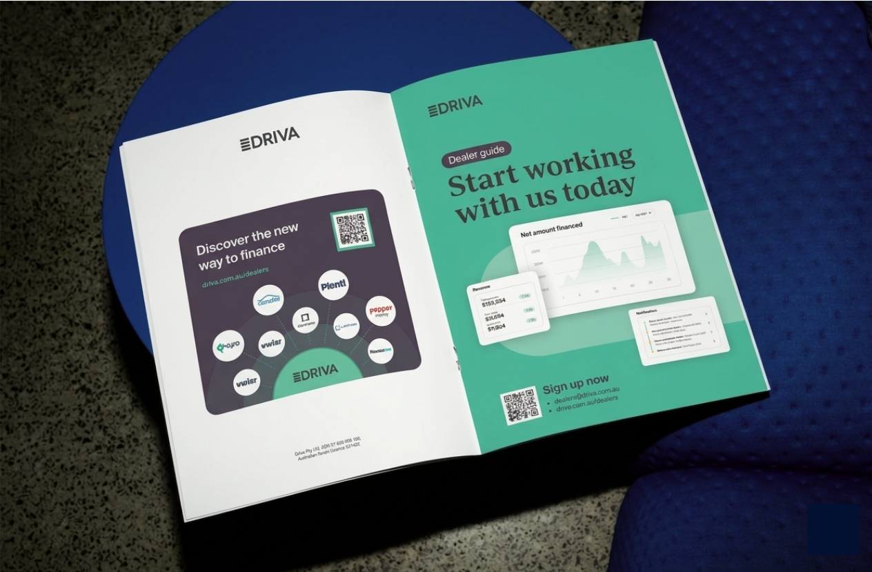
EDM
Referral lead EDMs
Designing a templated email system that turns a declined user into a warm handoff — protecting the customer relationship while unlocking a new revenue stream for Driva.
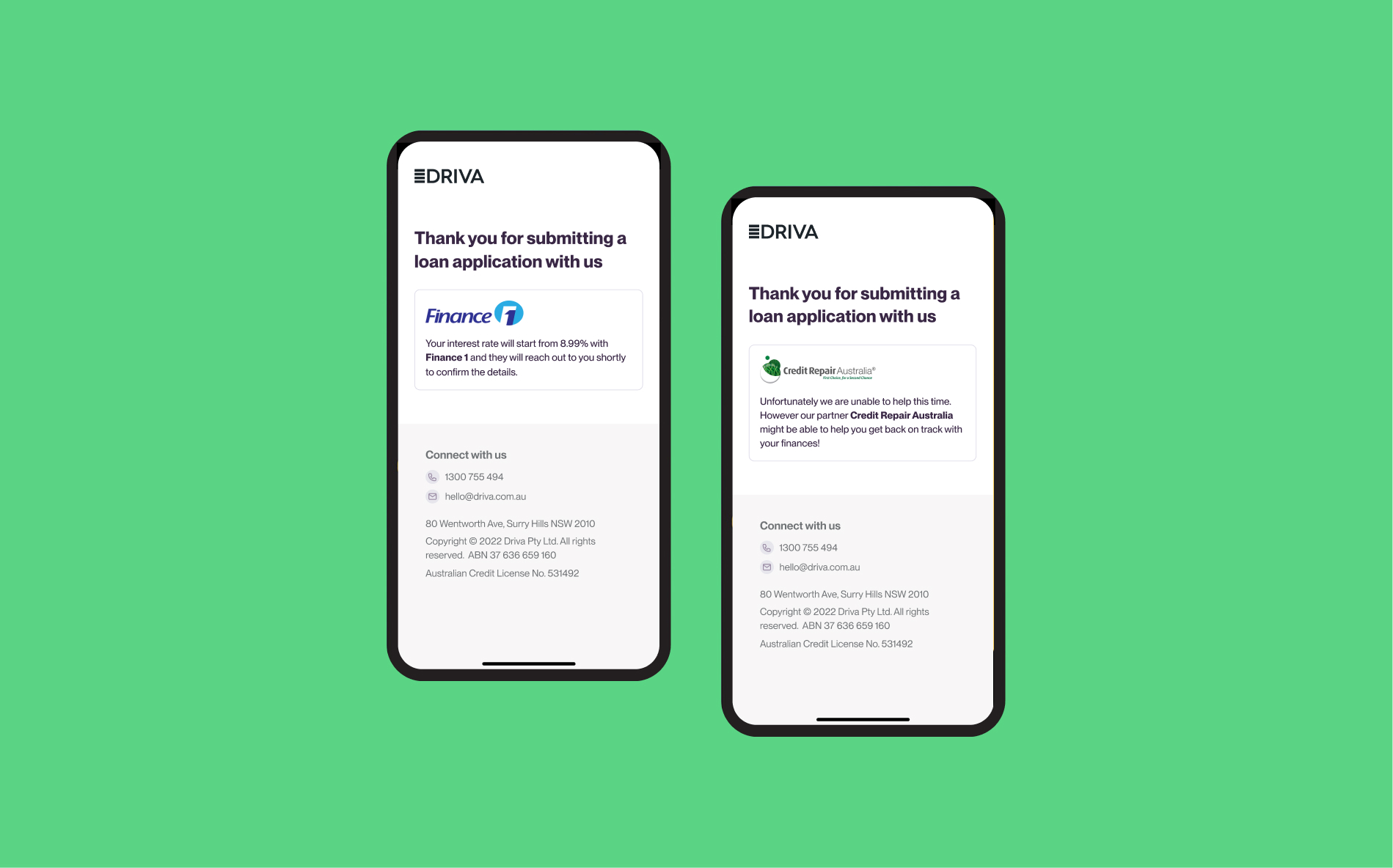
Referral lead EDMs
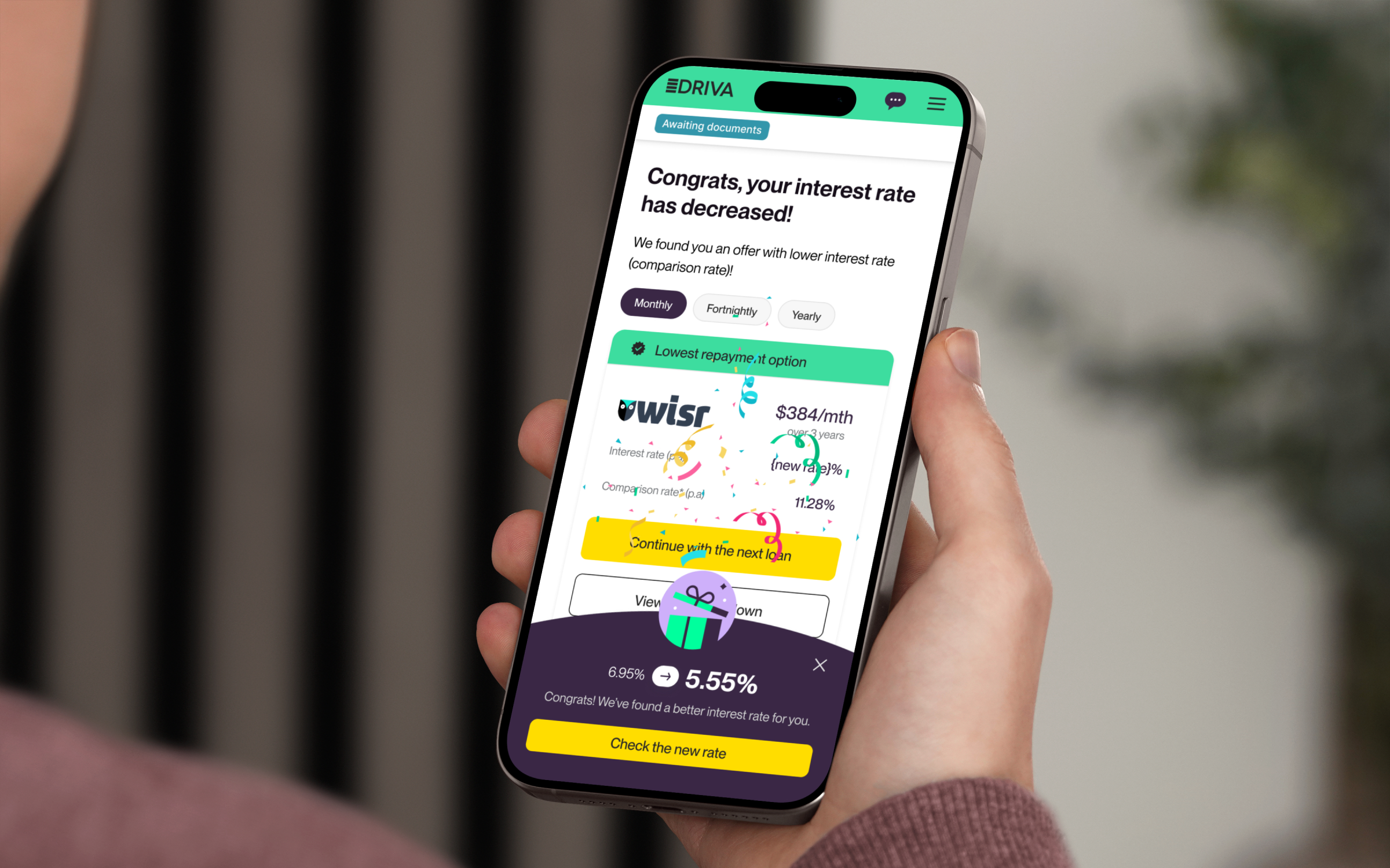
GOOD NEWS MOMENT
From data to delight: animating the "Good News" moment
Problem: Transform a complex financial process into moment of engagement and delight
I used a separate celebratory animation for the 'good news' moment when someone gets a strong lender match. This feature turns a standard data screen into a positive, emotional experience for the user.
IMPLEMENTATION
Lottie-file JSON elevates experience efficiently
All animations were built using Lottie, optimised for web performance without sacrificing quality. This approach allowed Driva to elevate its product experience efficiently.
HAND-OFF
Responsive Design on mobile and desktop
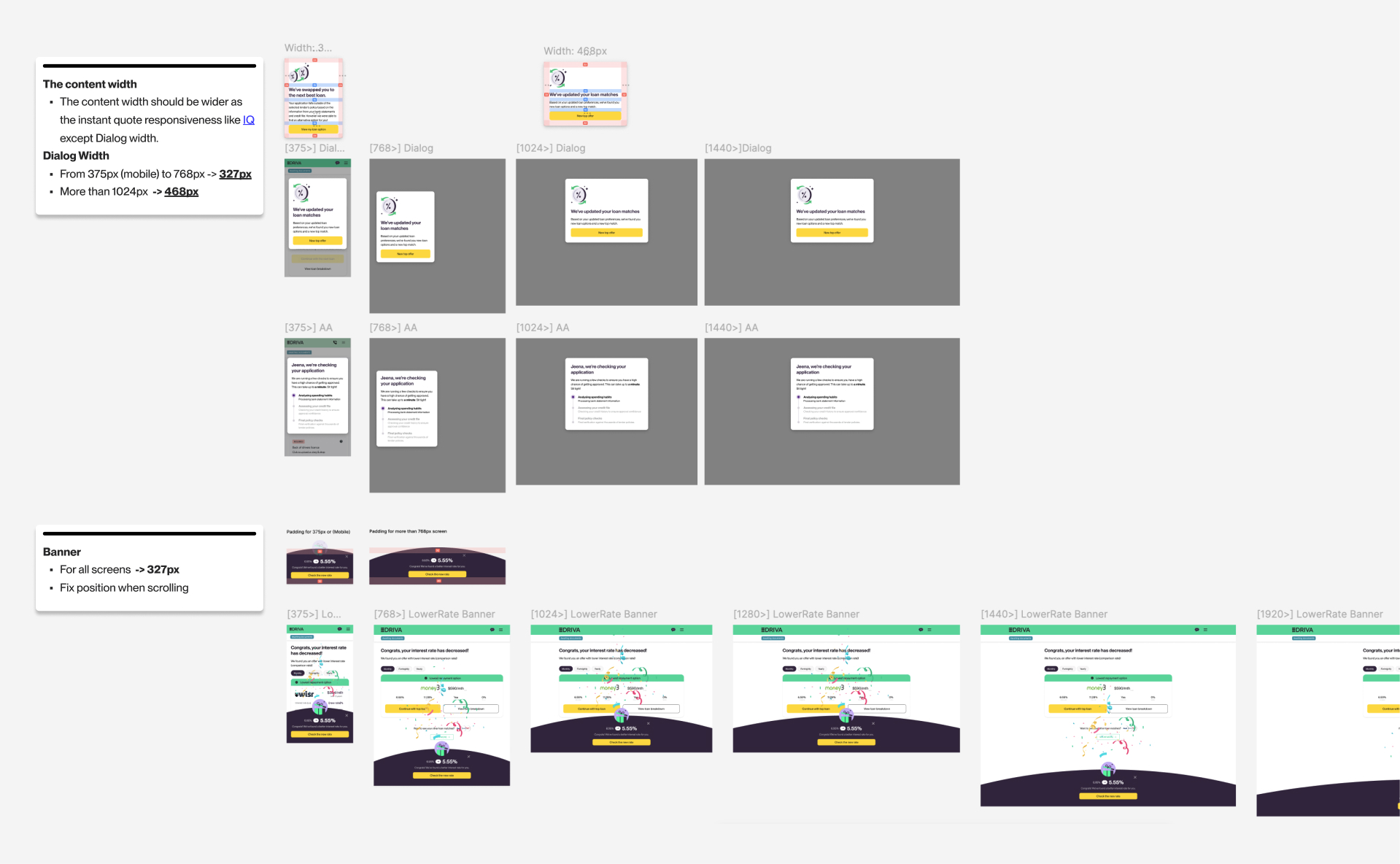
Responsive design on mobile and desktop
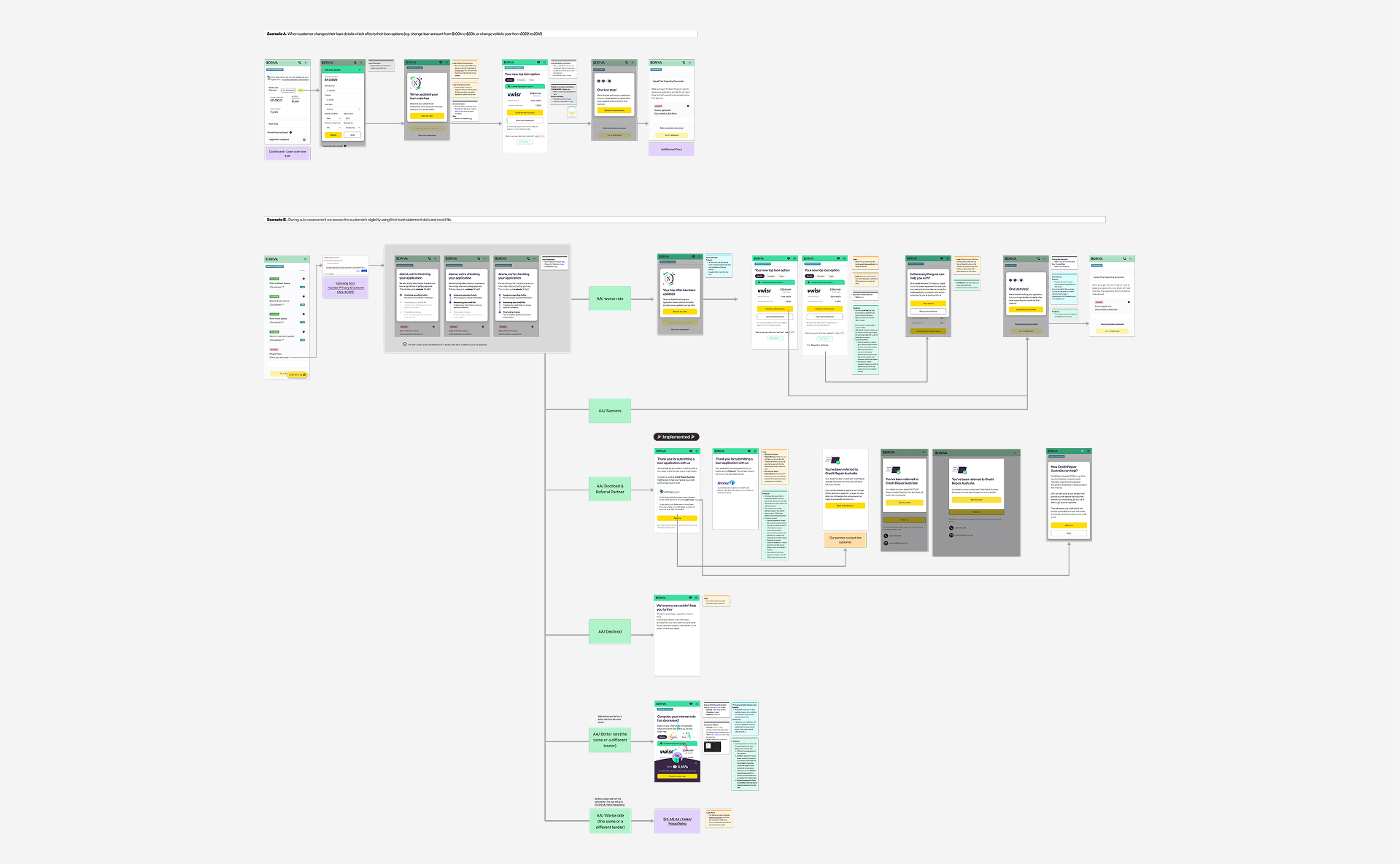
Lender switch whole flow
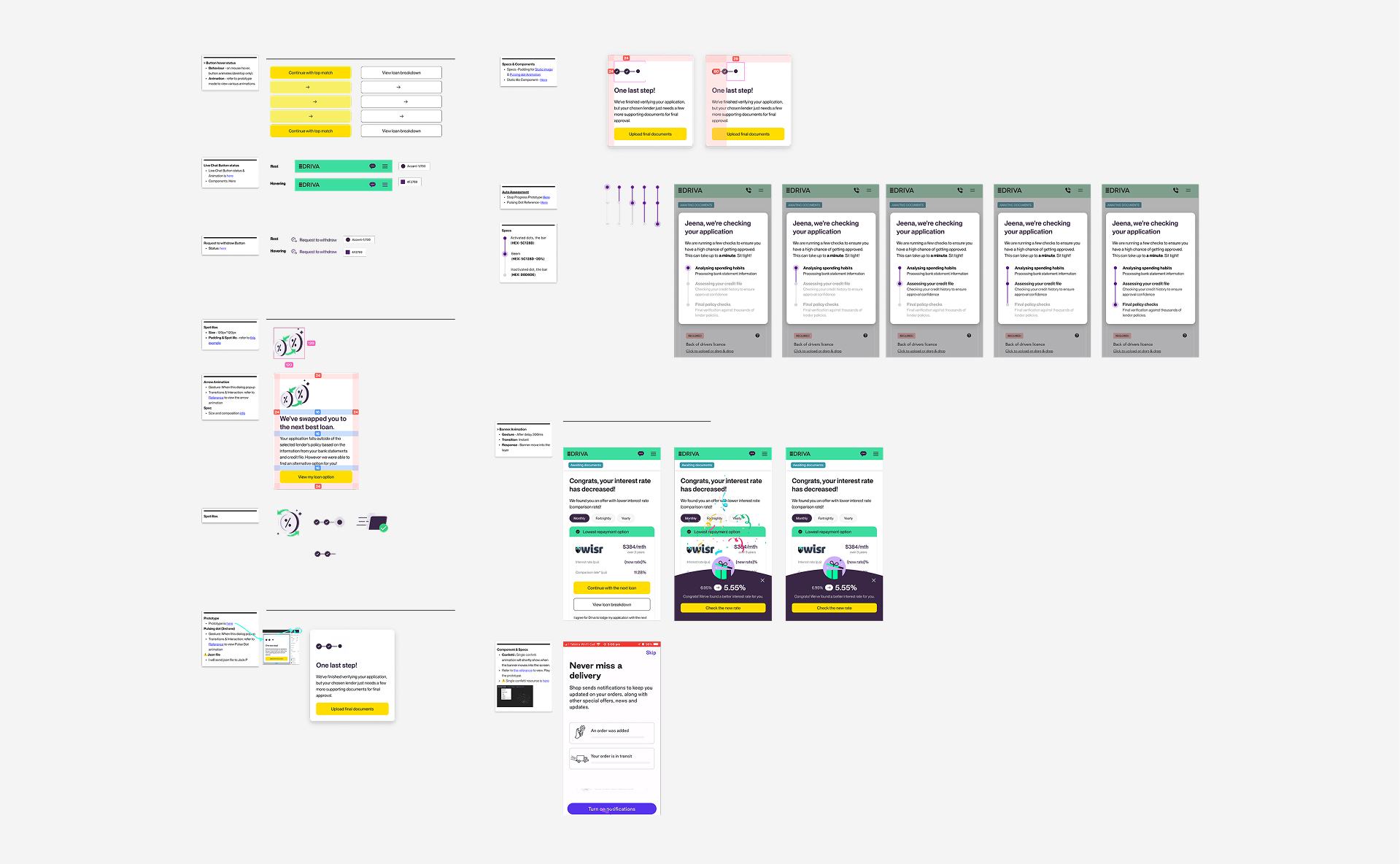
Components, motions and notes
BUSINESS IMPACTS
From engagement to recognition — building a brand viewers remember and return to
After launching the referral feature as a part of lender switch journey, the conversion rate from declined users increased by 11%.
NEXT ITERATION
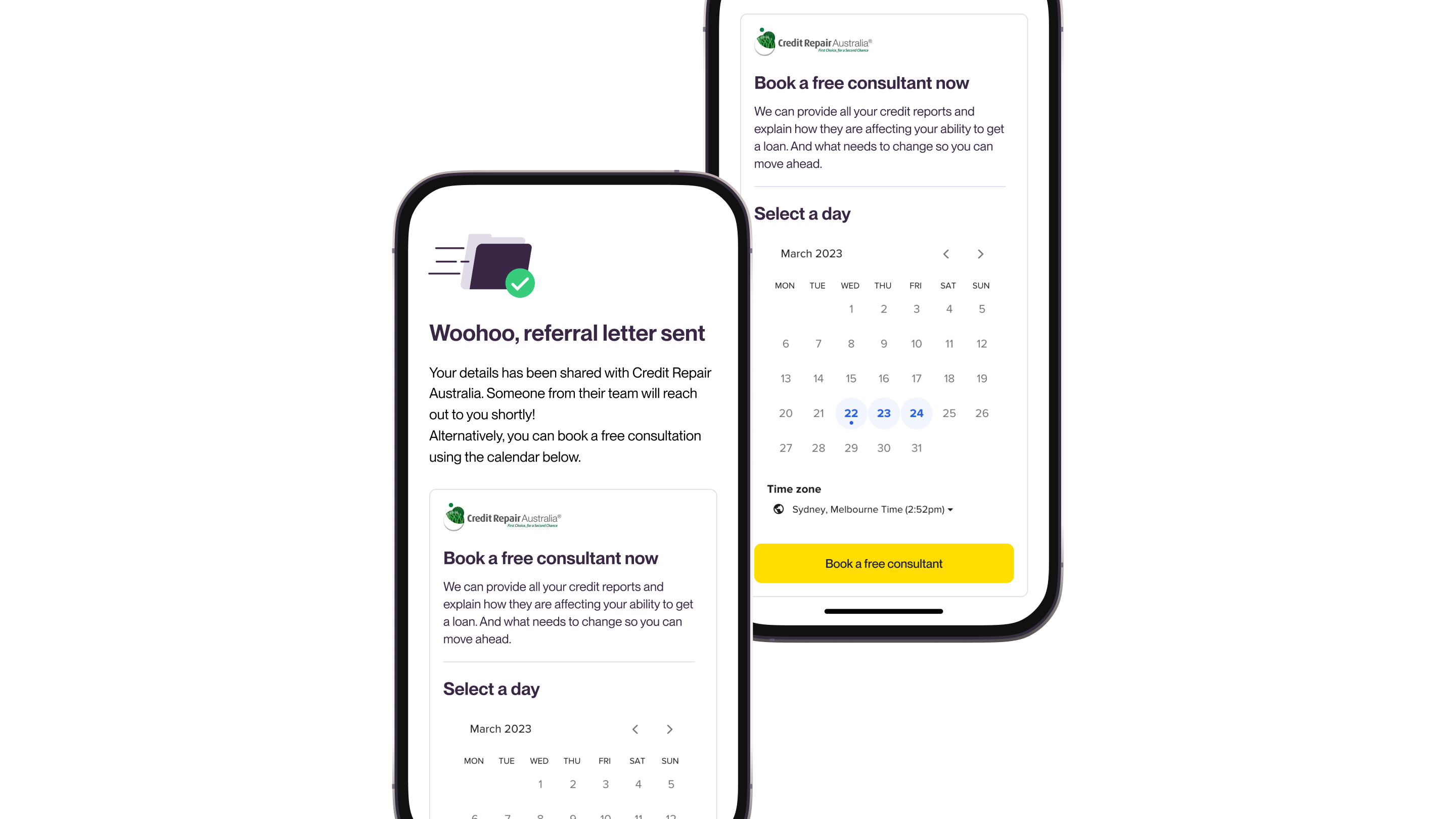
Streamlining referrals with partner calendar integration
After launching Driva’s referral program, we leveraged post-launch monitoring to track user behavior and engagement metrics. The data revealed a high drop-off rate during the scheduling step, indicating friction in the process. Based on these insights, we iterated on the design by integrating the partner’s calendar into the referral flow, streamlining scheduling and improving referral completion rates.