Jeena's Kitchen
Jeena's Kitchen Redesign Branding
- Brand identity
- Illustration
- Motion Design
- Website
Overview
Jeena's Kitchen is a cooking YouTube channel with a growing audience but no consistent brand identity. Despite strong viewer engagement, the brand wasn't memorable enough to convert viewers into returning subscribers. This project involved a full brand renewal — mascot design, visual system, motion animation, and website — to build a distinct, cohesive identity that works across every platform.
Expected Impact
- 4%
Role
Delivery
Timeline
PROBLEM
Engagement without identity doesn't build an audience.
Growing a viewer base means nothing if those viewers don't come back. The data showed strong engagement — but without a clear brand identity, Jeena's Kitchen was attracting viewers who watched once and left, rather than building an audience that genuinely connects with the channel.
GOAL
One brand. Every platform. Instantly recognisable.
Build a single, cohesive brand identity that allows viewers to instantly recognise Jeena's Kitchen — and feel emotionally connected to it — regardless of which platform they encounter it on. The renewed identity is applied consistently across YouTube, social media, and the website, with the website serving as the central space where the identity is most fully realised.
Try it out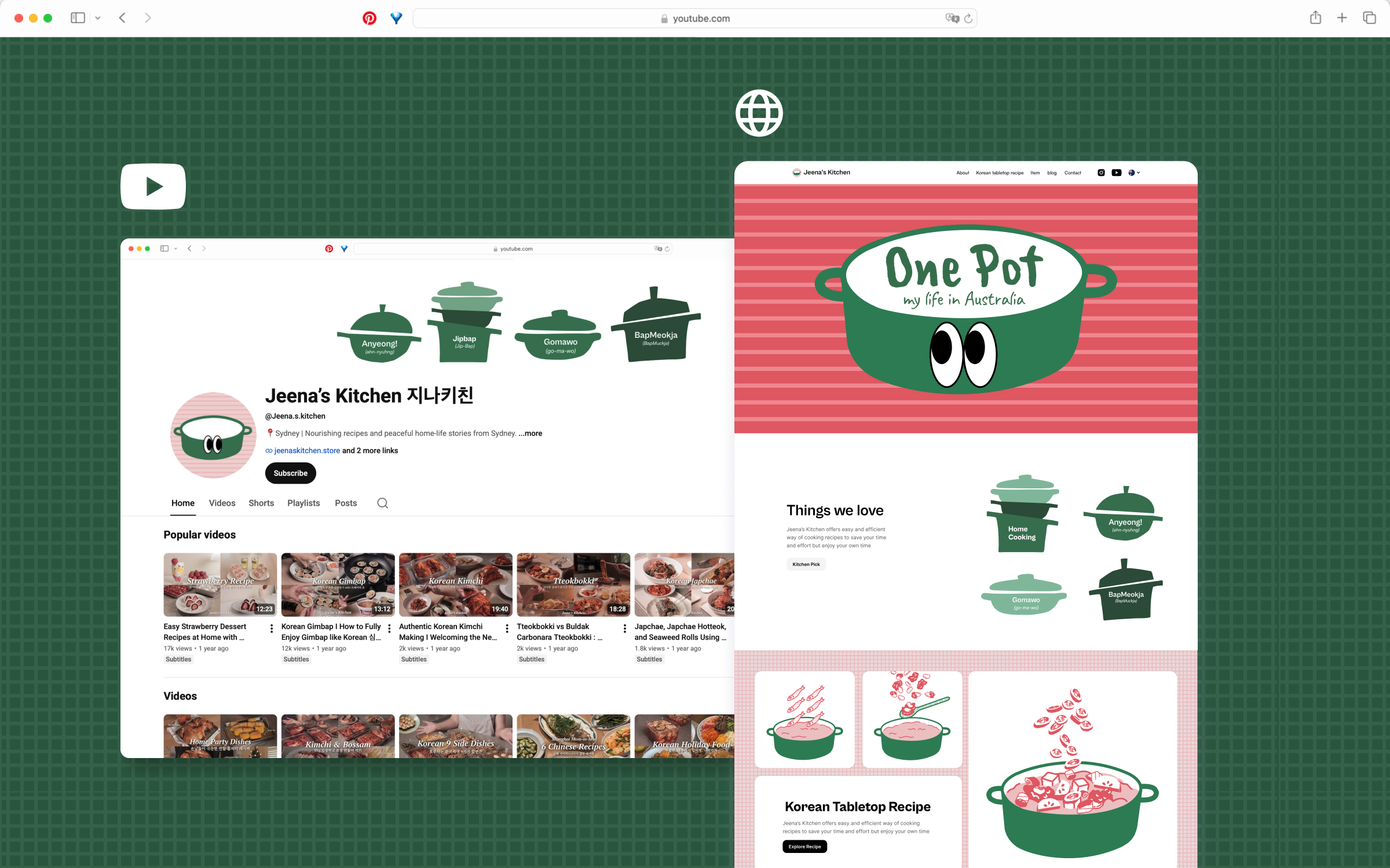
BRAND IDENTITY
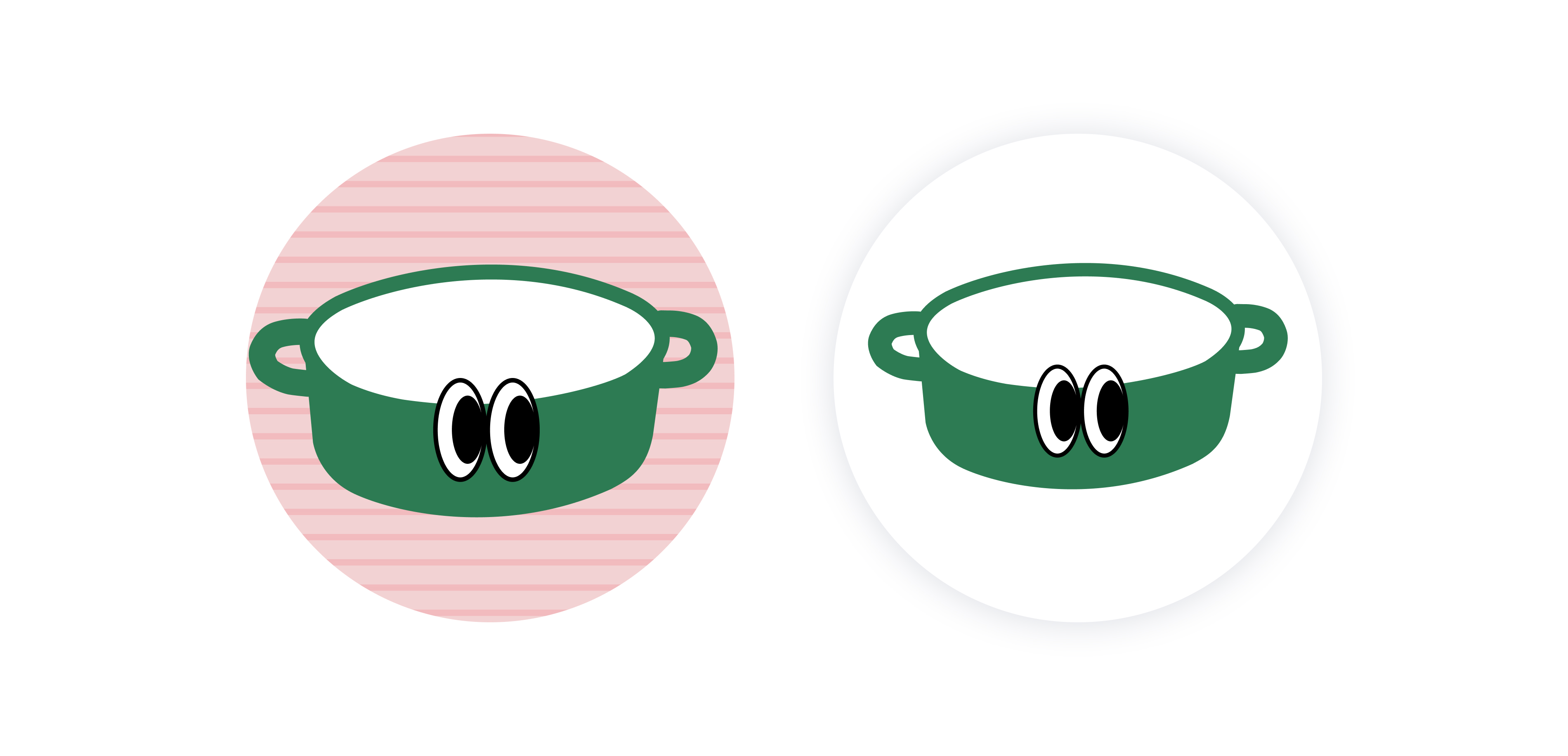
Logo Mascot
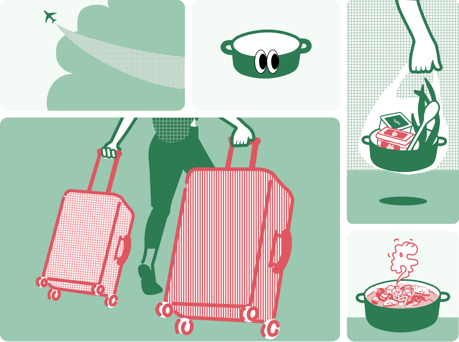
The mascot functions as the core branding element across all touchpoints — YouTube channel profile, banners, video content, social media, and the website — making it the most efficient vehicle for communicating brand personality consistently. The existing mascot lacked narrative and personality, so this renewal gave the character a distinct persona and universe.
Choosing a one-pot as our mascot was driven by two key inspirations. Functionally, it represents a versatile cooking tool capable of creating a wide variety of dishes. Emotionally, it served as a comforting companion that helped me recreate hometown flavors for healing and comfort when I relocated to Australia.
BRAND IDENTITY
Visual Concept & Mood
The overall visual concept is intentional imperfection — simple yet warm, unpolished yet human. This visual language is applied consistently across all channels, ensuring viewers experience a connected brand no matter where they first encounter it.
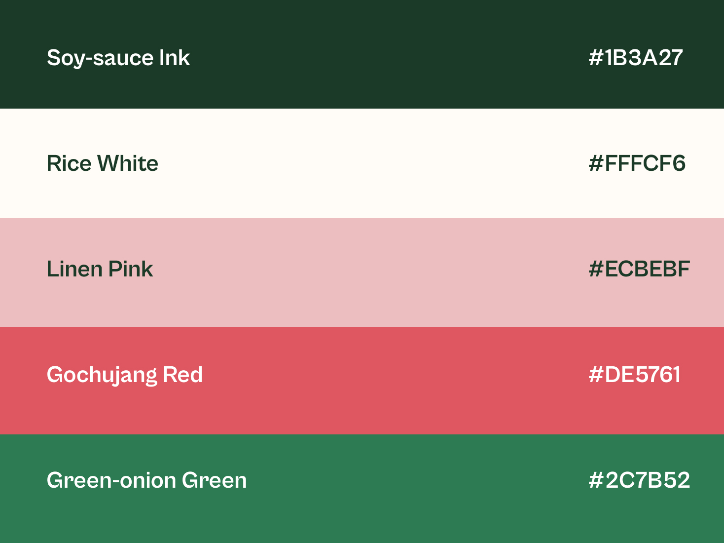
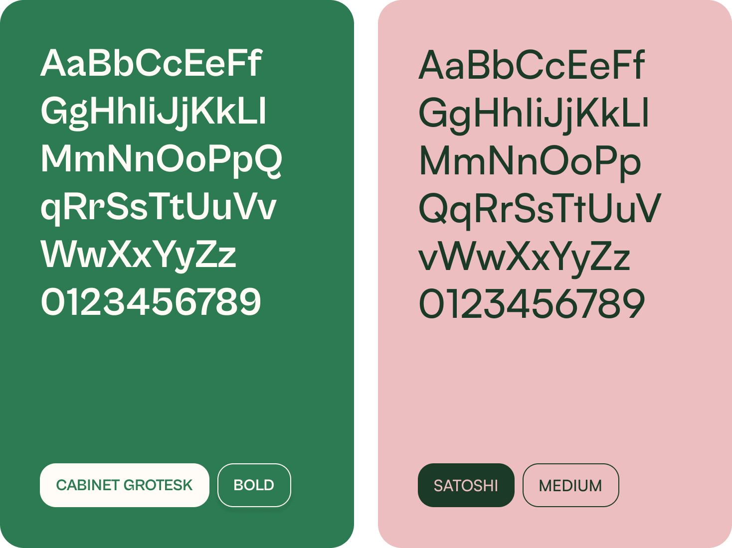
The Korean Pantry Palette
Cabinet Grotesk — headlines, logotype, key emotional moments (About page intro, page titles). Satoshi — body text, recipe instructions, navigation.
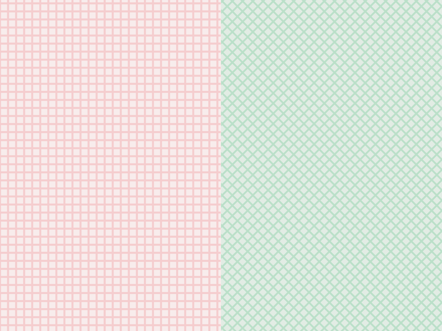
Imperfectional Illustration as wayfinding
A pot, spoon, rising steam, food ingredients — small recurring motifs mark sections without needing heavy decoration.
Typography
Cabinet Grotesk — headlines, logotype, key emotional moments (About page intro, page titles). Satoshi — body text, recipe instructions, navigation.
Intentional Imperfection Illustration
Every shape, line, and texture in this system is deliberately irregular — no perfect circles, no perfectly even line weights, no flawless gradients. This isn't a limitation; it's the core principle. The brand should feel like something made by hand in a real kitchen, not generated from a template. This imperfection is what signals warmth, authenticity, and care — the same qualities viewers describe feeling when they watch Jeena's videos.
MOTION DESIGN
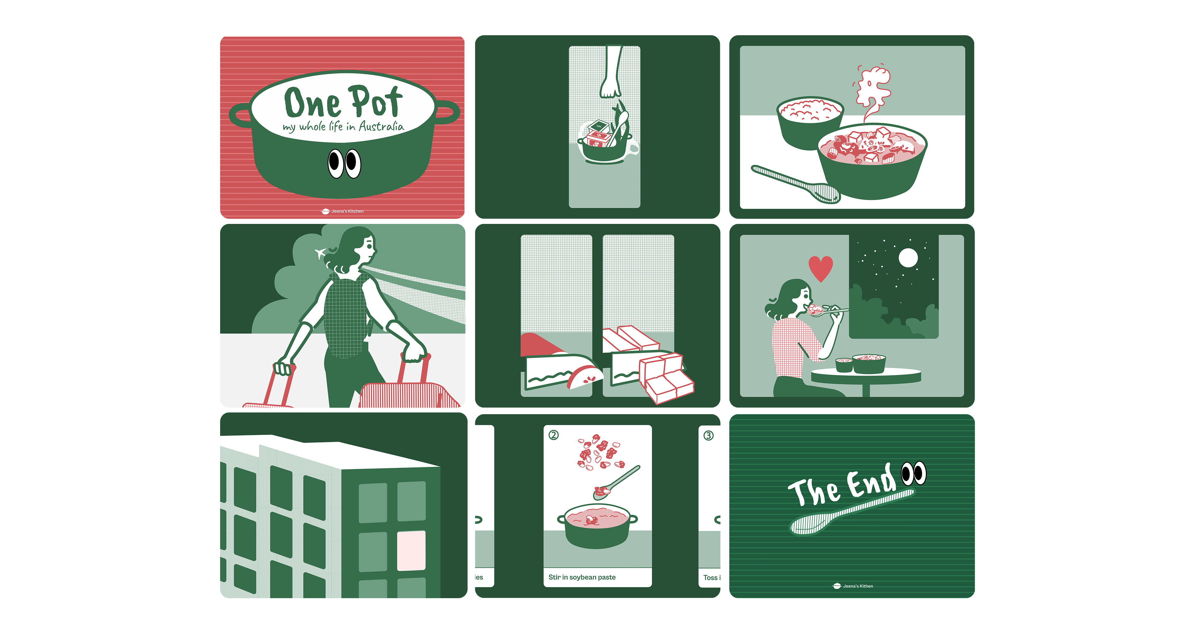
One-Pot, My Life in Australia
The motion animation is the most concentrated expression of the brand's personality. Unlike static text or images, video engages both sight and sound simultaneously, drawing deeper emotional resonance from viewers.
The animation serves three roles at once:
- Communicates brand identity and narrative intuitively
- Delivers practical recipe information in a short, focused format
- Produces reusable assets for social media ads, website brand introductions, and banners
The result is a piece of content that does more than inform — it gives viewers a reason to remember Jeena's Kitchen in diffeent platformsand come back.
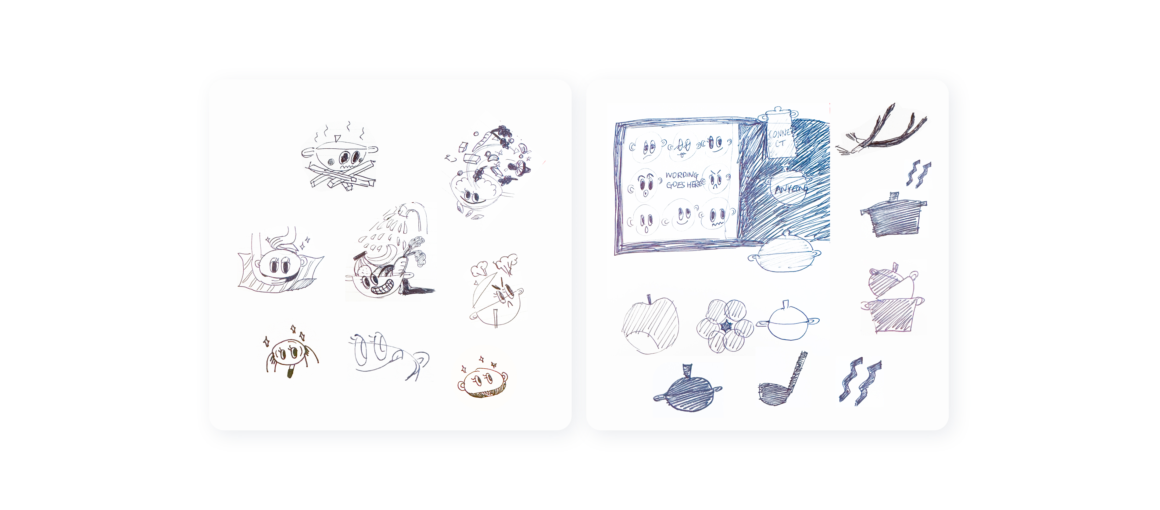
Storyboard
Visual materials mapping out all sequences during the pre-production stage to design the storyline, pacing, and camera angles.
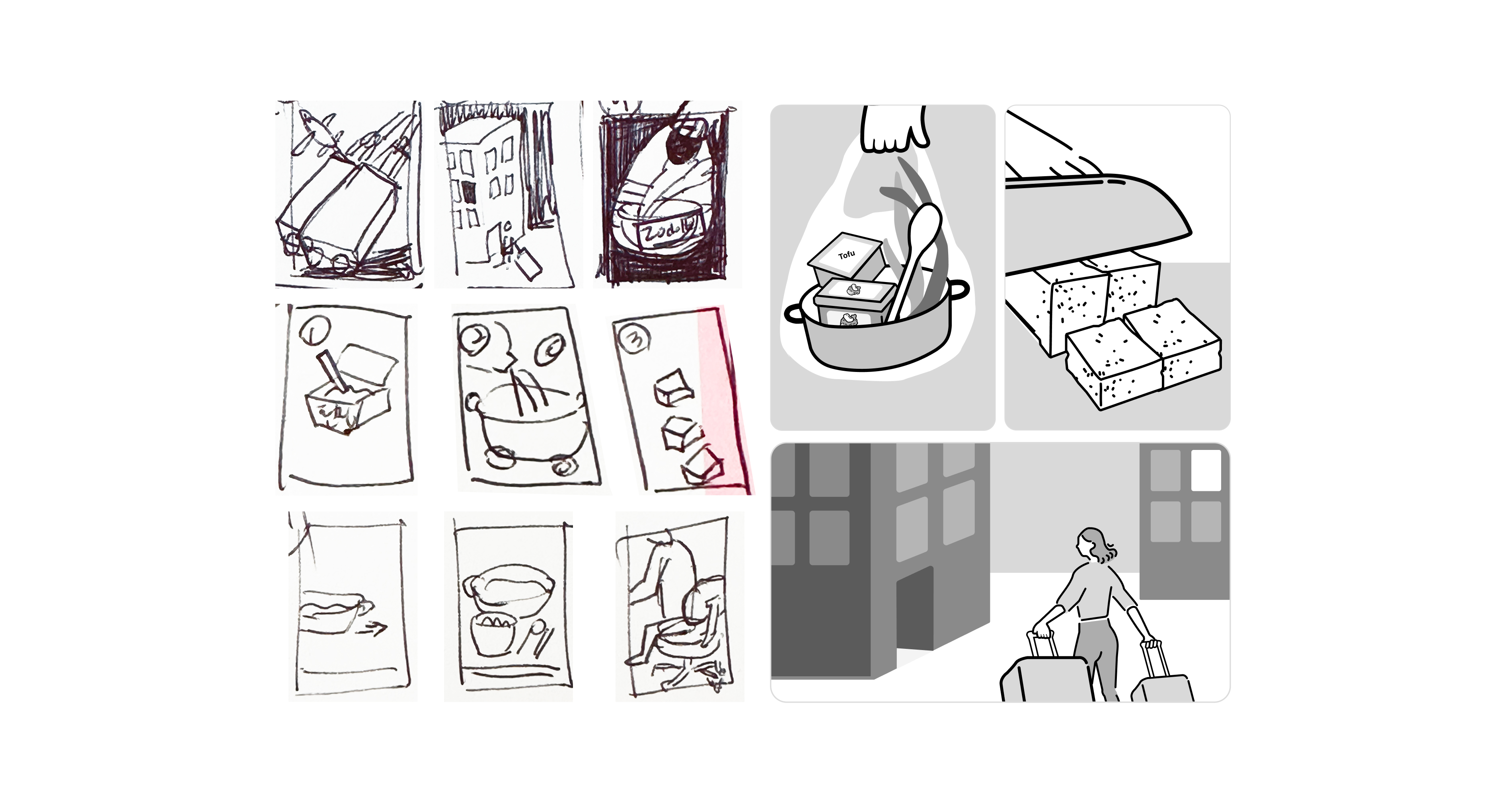
Storytelling
The narrative structure of this animation is beautifully simple. Centered around cooking soul food, the story delivers comfort and healing, alleviating feelings of loneliness and isolation while celebrating life's small joys.
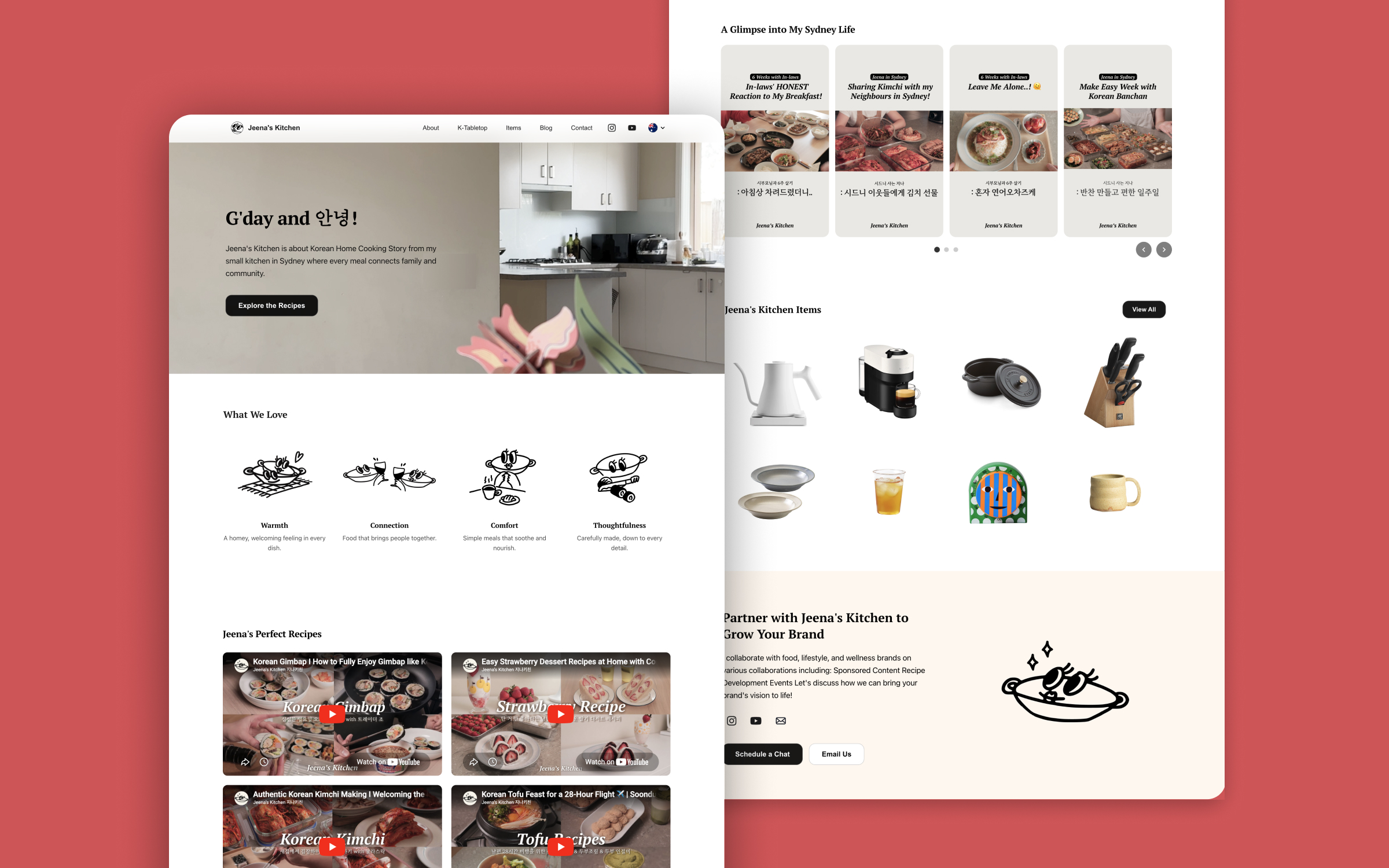
WEBSITE
The Full Realisation of the Rebranded Identity
YouTube and social media are constrained by platform formats and algorithms — the brand cannot fully control how it appears. The website is the only space where the rebranded identity can be implemented without compromise, and it serves as the central hub that all other channels point toward.
Where this animation sits?
The animation is leading the About page with this story, rather than a plain text and image, effectively conveying the brand's personality and story in a visually engaging way.
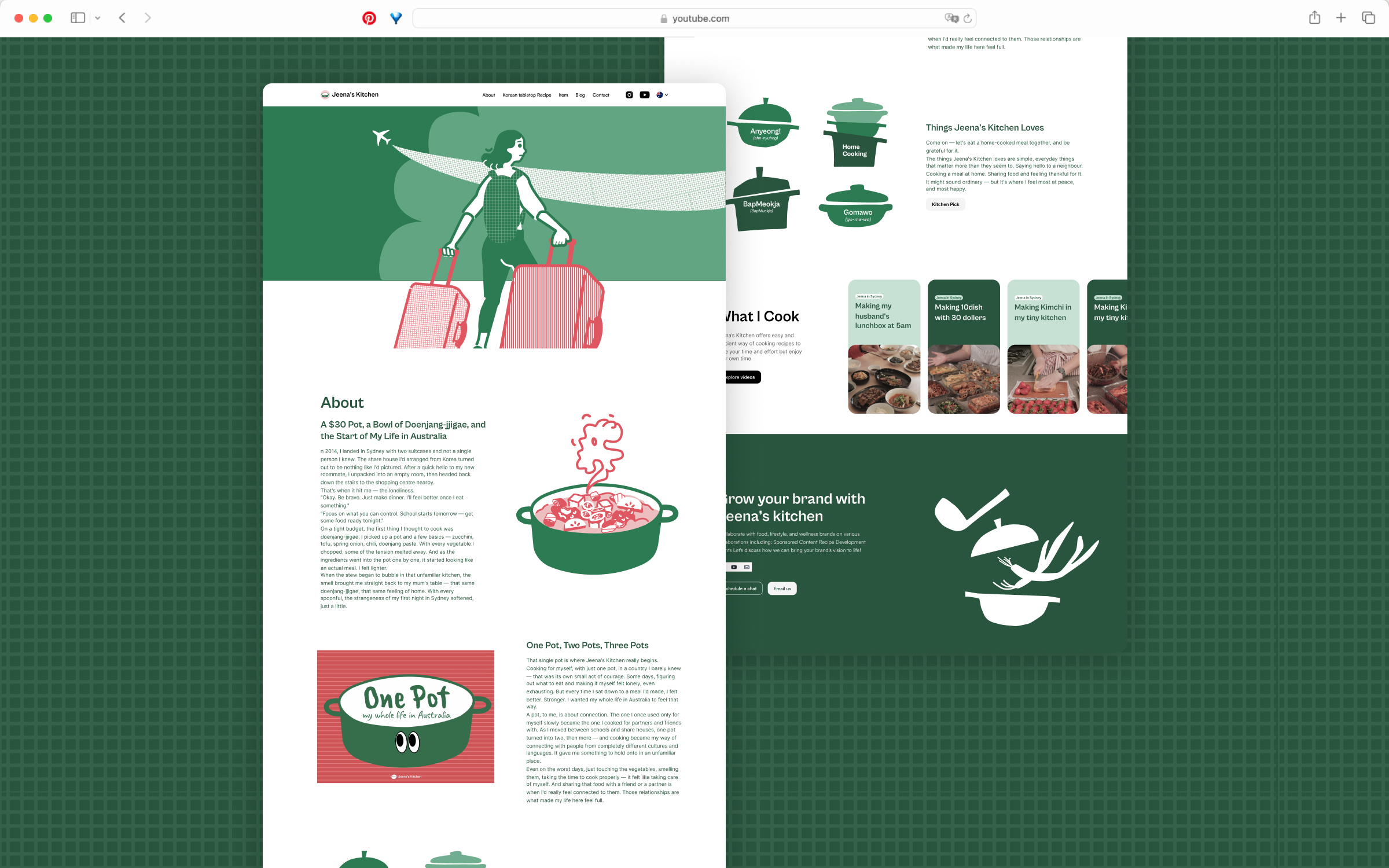
Brand consistency
The rebranded visual system is applied directly, ensuring viewers landing from YouTube experience an uninterrupted brand flow.
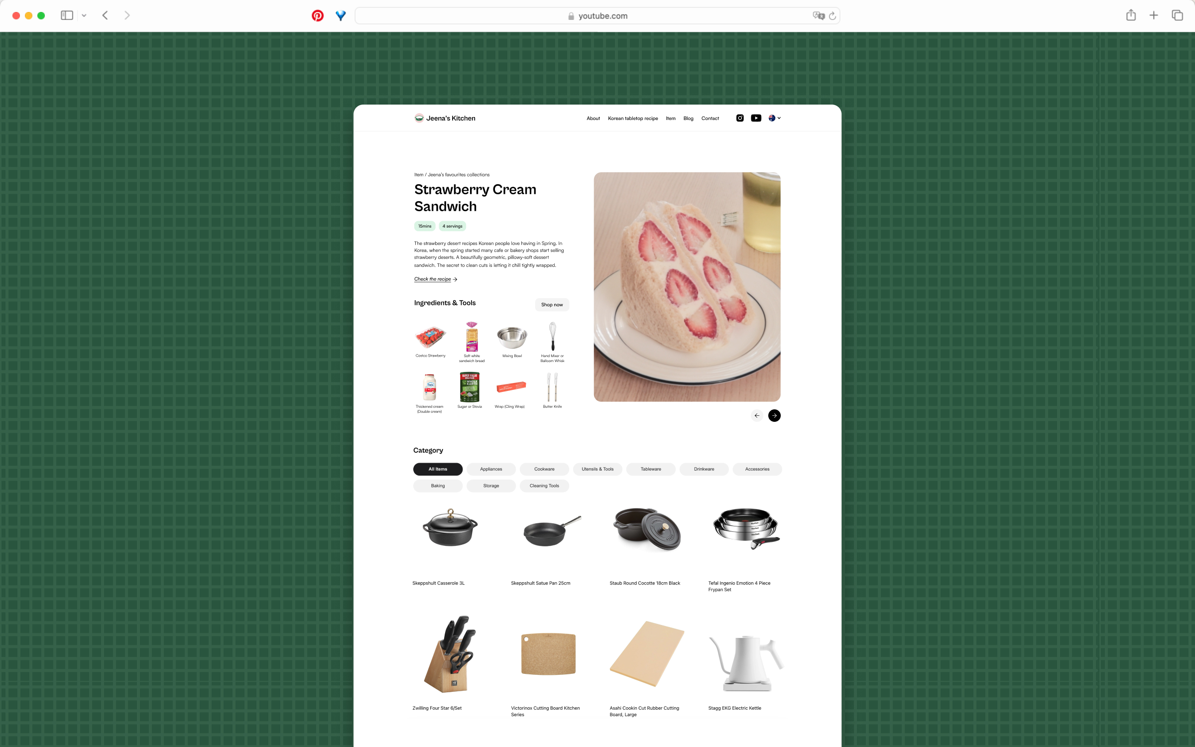
Favorite Collection — rather than listing items
Recipes are placed at the centre, with kitchen items related to popular channel recipes woven in naturally, so that the brand experience flows seamlessly into information discovery. Recipes, channel information, and partnership enquiries are all consolidated into one platform.
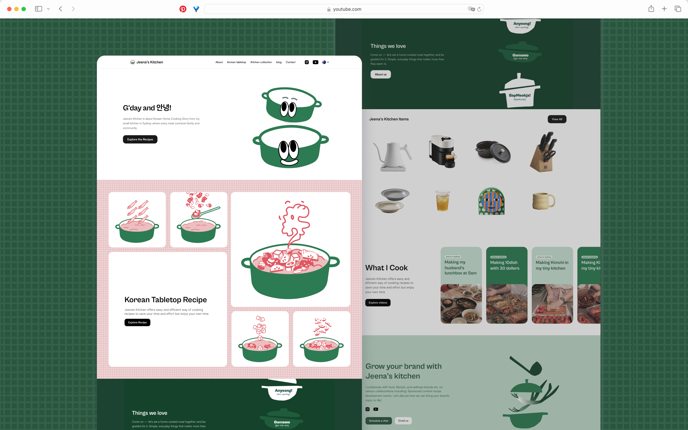
Reusing a Mascot for Website System States
The mascot isn't just decoration — its expression communicates system state across the website. A hand-drawn pot character with eyes anchors the logo, then becomes a UX signal: sleepy eyes while loading, wide eyes on errors, content eyes on a successful save or signup.
Loading state
Error State (404 Page)
Sign-in/out
Success state
EXPECTED IMPACTS
Stronger brand recall across platforms
- Consistent visual language would enable viewers to recognise 'Jeena's Kitchen' instantly across YouTube and the website.
- The new brand identity could boost the subscriber watch rate by 4%.


