Deferit
Email Design System for Lifecycle & Transactional Scale
- Design System
- Email Design
- Accessibility
Overview
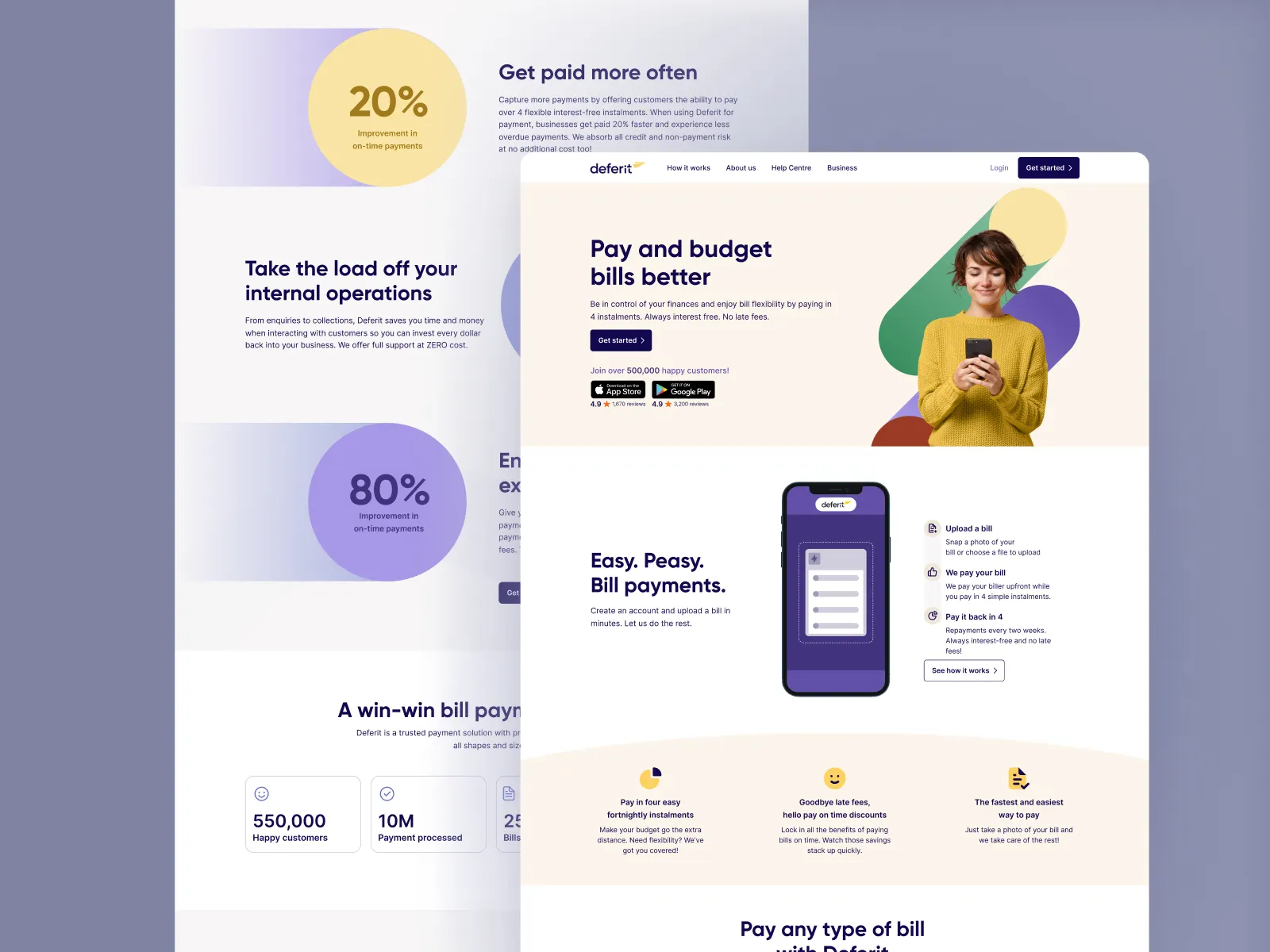
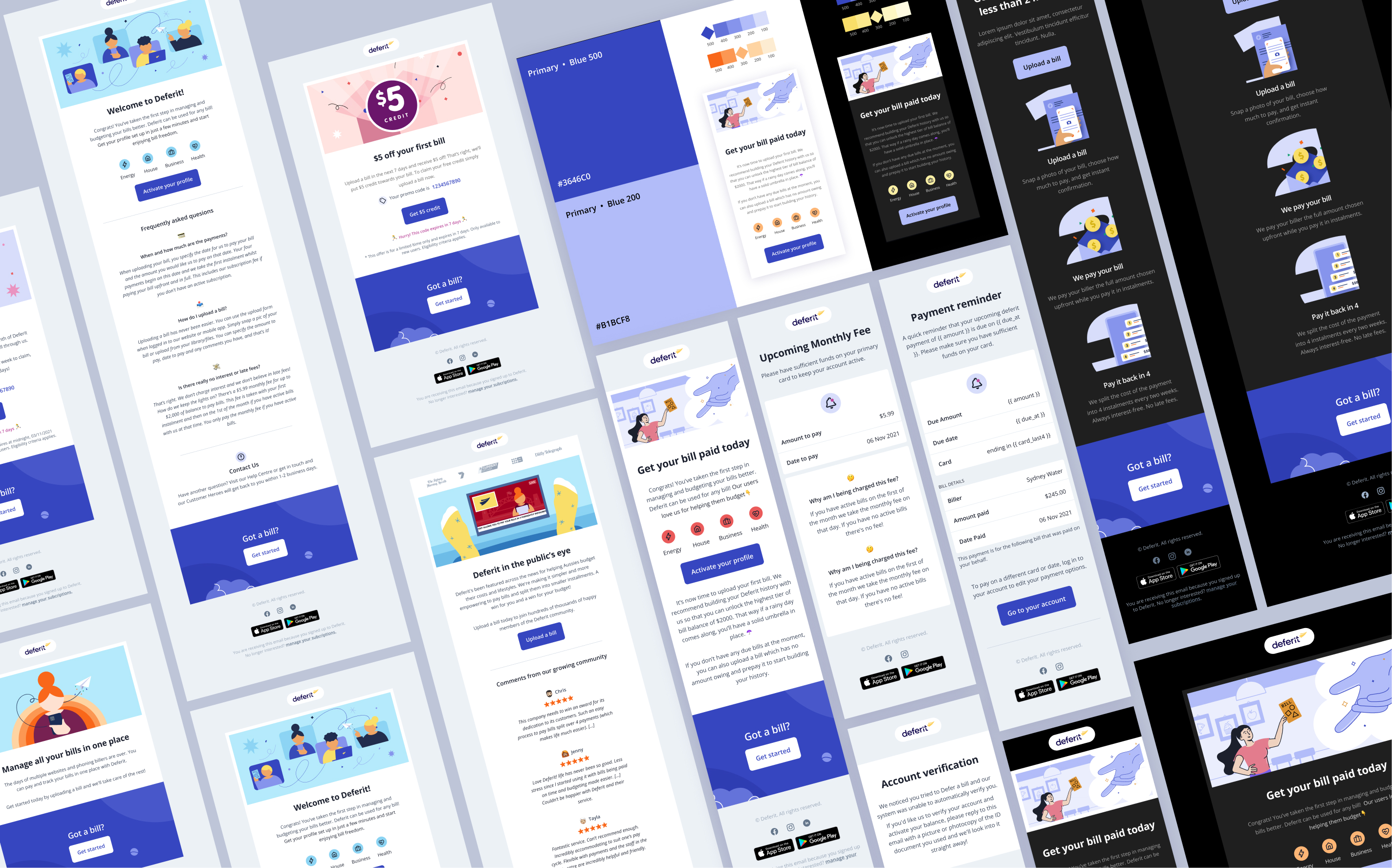
Following the successful launch of Deferit's web platform, user acquisition surged past 200,000 sign-ups. To support this rapid growth, Deferit needed a scalable email design system to handle high-volume lifecycle and transactional communications. As the solo digital designer, I mapped the entire email ecosystem—spanning onboarding, bill reminders, and payment confirmations. I engineered a modular component system that keeps every broadcast on-brand, accessible, and optimised for speed.
Key Results
- 200K+Users supported with seamless communication
- 100%Brand consistency across scalable EDM campaigns
Role
Delivery
Timeline
PROBLEM
Scaling Email Production Beyond 200K Users
Following a major website launch, Deferit acquired 200,000 sign-ups, creating unsustainable demand for manual email production. As the sole digital designer, building every layout from scratch caused severe bottlenecks and fragmented brand execution across lifecycle and transactional communications.
THE GOAL
A Scalable, Self-Serve Email System
The goal was to build a component-based email design system—not static templates—to guide 200K+ users from sign-up to purchase. The system had to meet three clear metrics:
Velocity
Enable lightning-fast deployment for automated marketing flows.
Consistency
Lock in strict brand quality across all customer touchpoints.
Autonomy
Empower non-designers to update copy and launch campaigns independently.
RESEARCH — MAPPING CONTENT
45-Day Lifecycle & Transactional Mapping
Before exploring visual layouts, I conducted a deep dive into our communication touchpoints to understand content hierarchies and user friction points. I split this mapping into two specific user streams:
The 45-Day Drop-off Stream
For users who created an account but did not upload a bill, I mapped a 45-day retention journey designed to rebuild feature awareness, build trust through social proof, and drive them toward their first successful platform transaction.
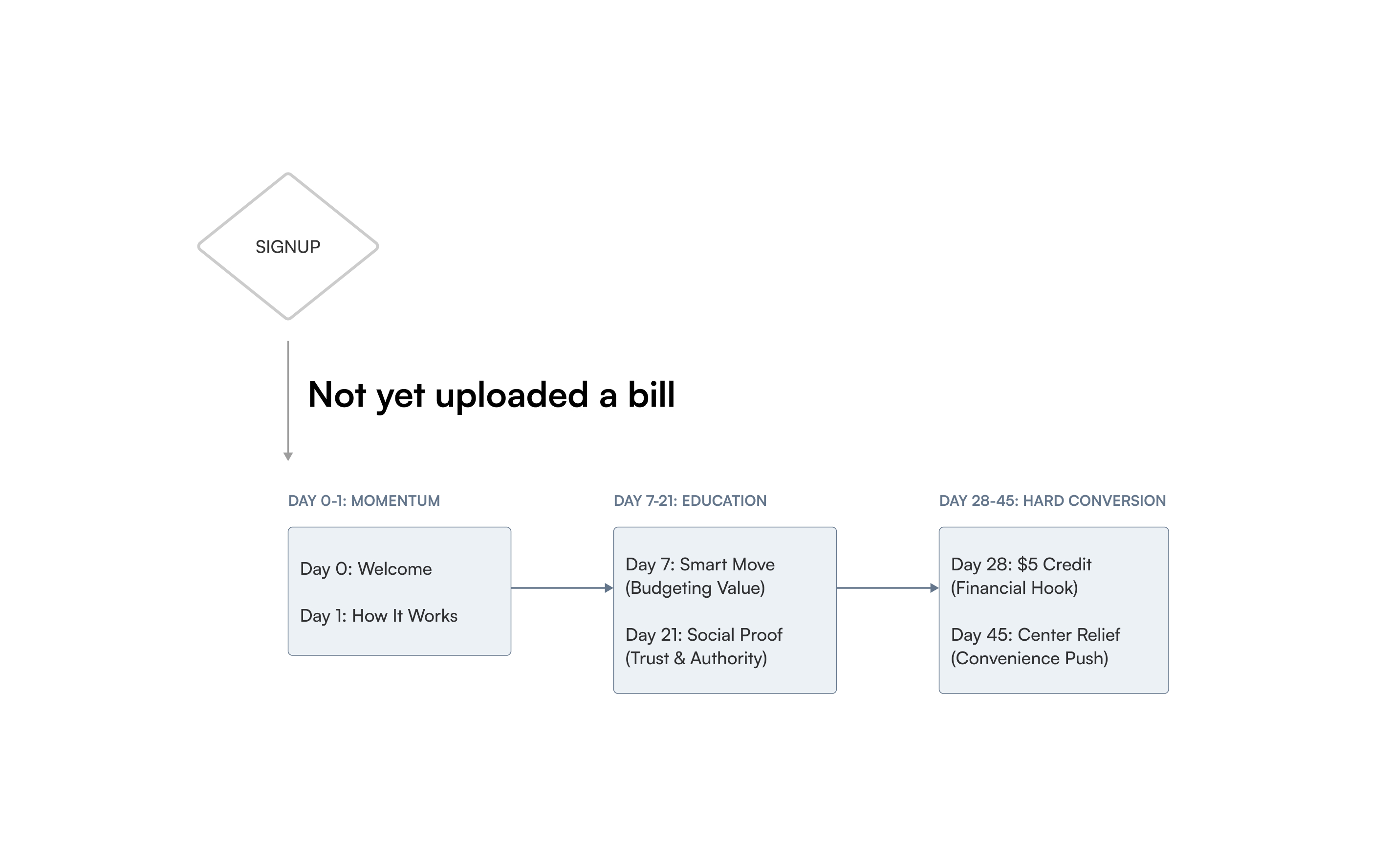
The 45-Day Lifecycle Journey Map
The Active Transactional Stream
For users who successfully signed up and uploaded their first bill, I mapped the automated structural flow of instant payment confirmations, processing updates, and bill schedule reminders.
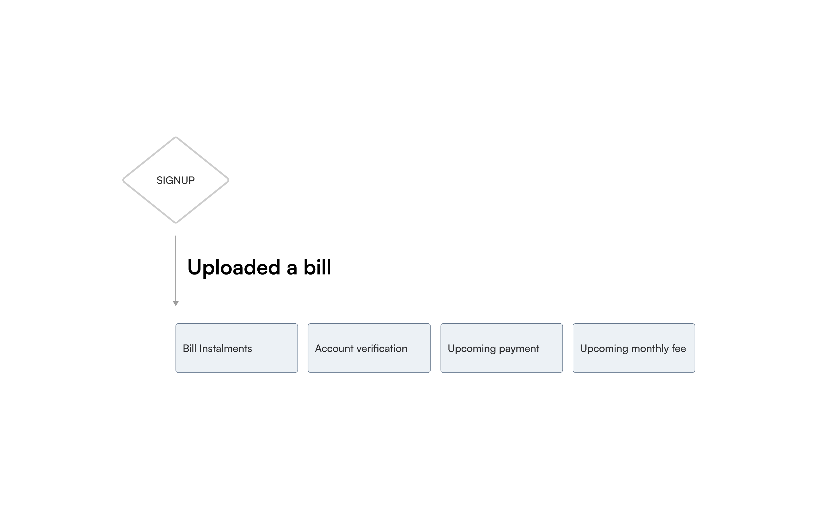
Transactional email map
Wireframe & Design System
Establishing the System Architecture
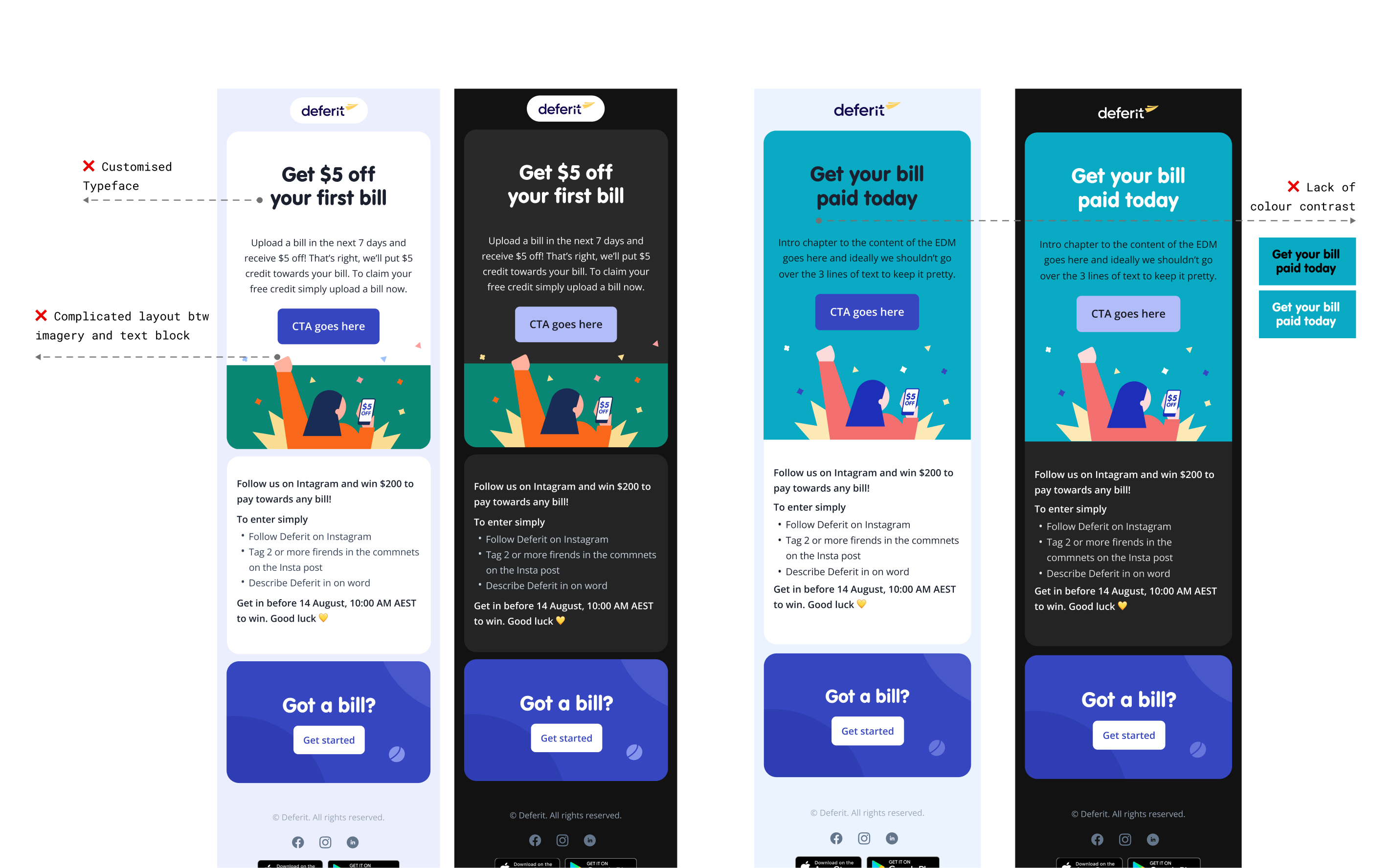
I structured a strict content hierarchy to balance editorial layout flexibility with automated delivery requirements. At this stage, I subjected every layout experiment to rigorous colour contrast testing to guarantee AA web accessibility standards across both light and dark modes.
Content Structure Layout Rules
After analysing cross-departmental email copy, I established universal structural layout zones. This locked-in structure ensured predictable content placement across all screen sizes.
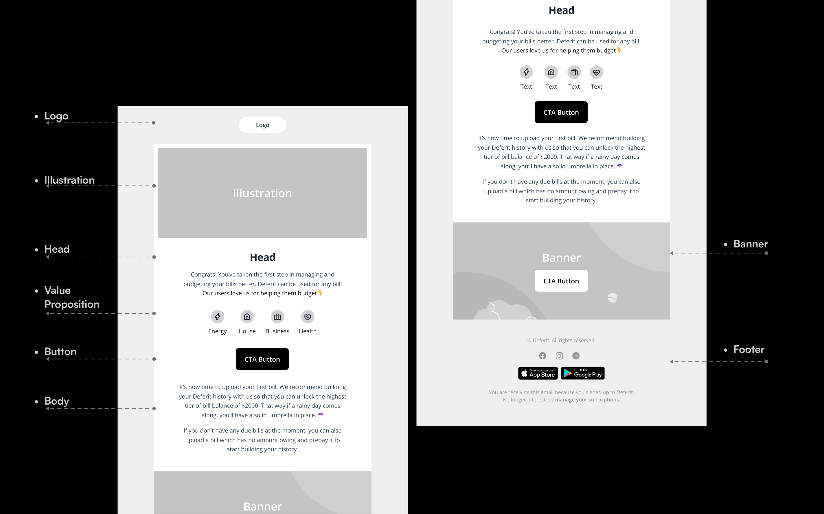
Content Structure for Lifecycle Email
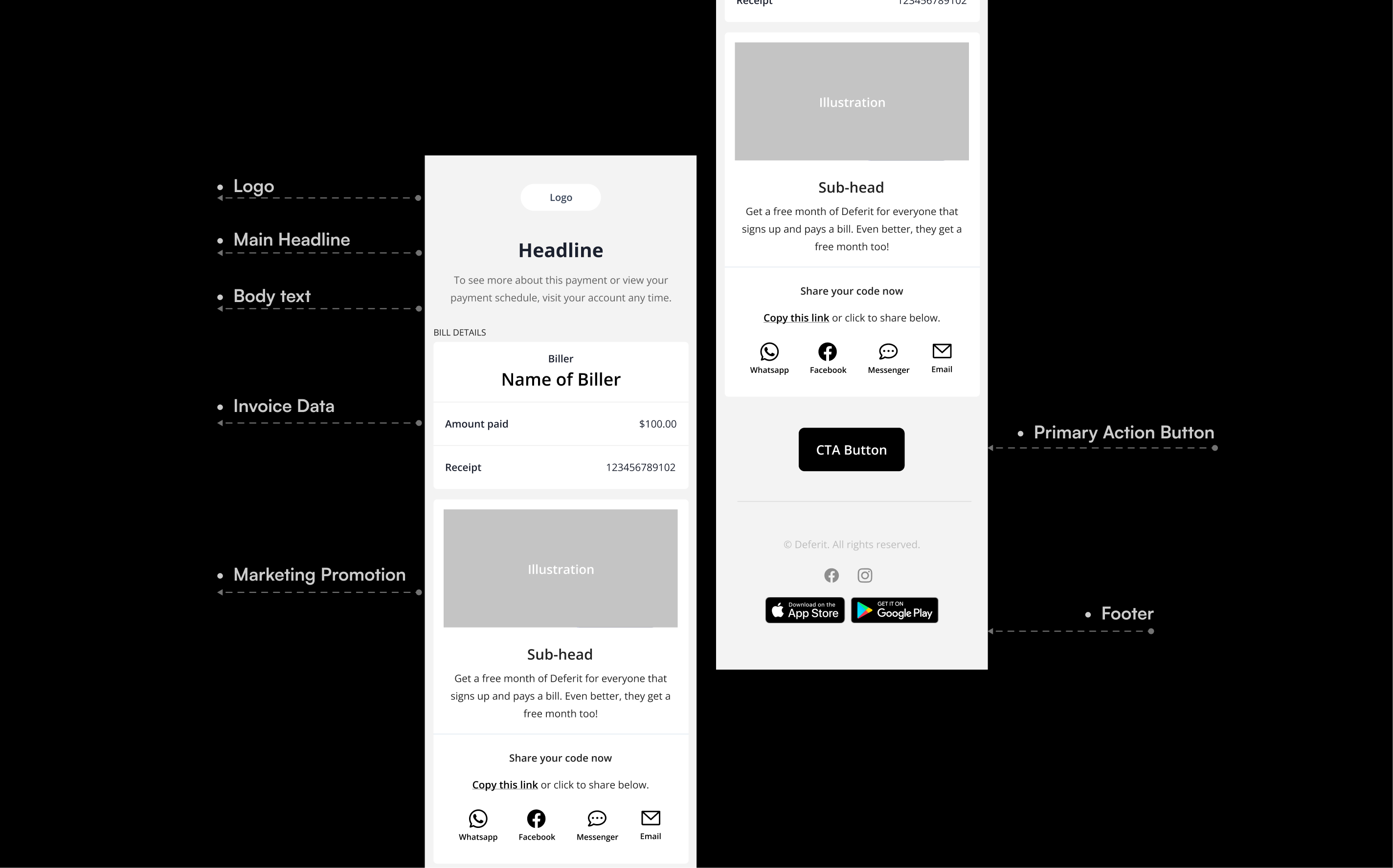
The Structure for Transactional Email
Email Design System
Accessibility-First Colour Library
I built a centralised colour token framework within Figma to manage brand variations.
Contrast Compliance
Every button background, active icon, text tier, and boundary colour was validated against WCAG AA requirements.
Dual Modes
Colour pairings were systematically audited to ensure clean text readability across varied web mail clients and device types.
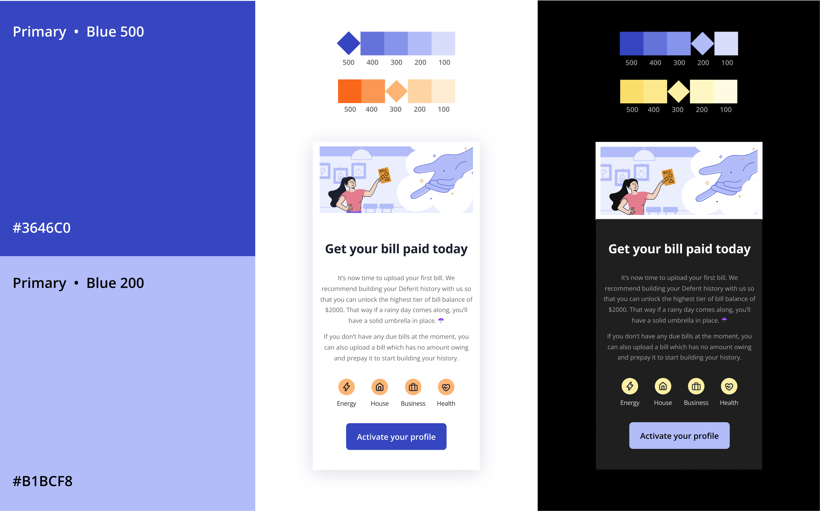
Accessibility-First Colour Library
Modular Component Library
I broke down our visual interface into atomic parts. Component blocks were standardised into reusable Figma variants, including:
- Responsive headers and footers
- High-contrast CTA buttons
- Modular data tables for billing statements
- Specialised high-visibility alert modules
These blocks allowed marketing teams to snap elements together inside layouts like building blocks, without breaking our grid rules.
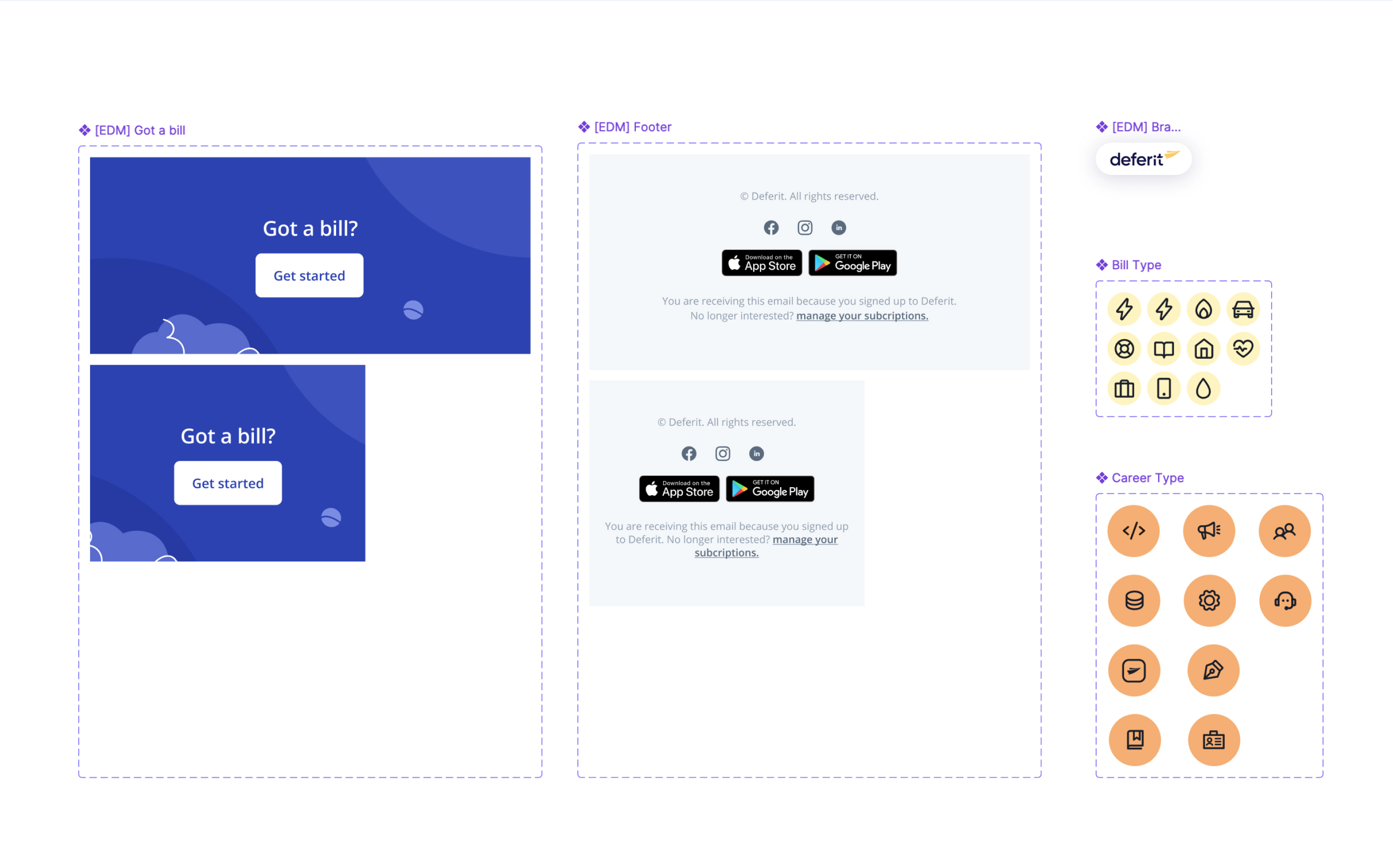
Modular Component Library
IDEATING DESIGN
Accessibility by default
During initial design ideation, I explored how each layout would hold up on mobile—testing structural balance, typography scale, illustration placement, and background colour pairings against the hierarchy defined above. Because email clients often block images or strip custom fonts, I prioritised web-safe typefaces (Inter) over bespoke branding for frictionless rendering. Every variant was checked for colour contrast so the core message and primary CTA stayed legible even under harsh client conditions.
Design exploration
Final Design
45-Day Lifecycle Flow
The final layout iterations balanced clean aesthetics with conversion strategy:
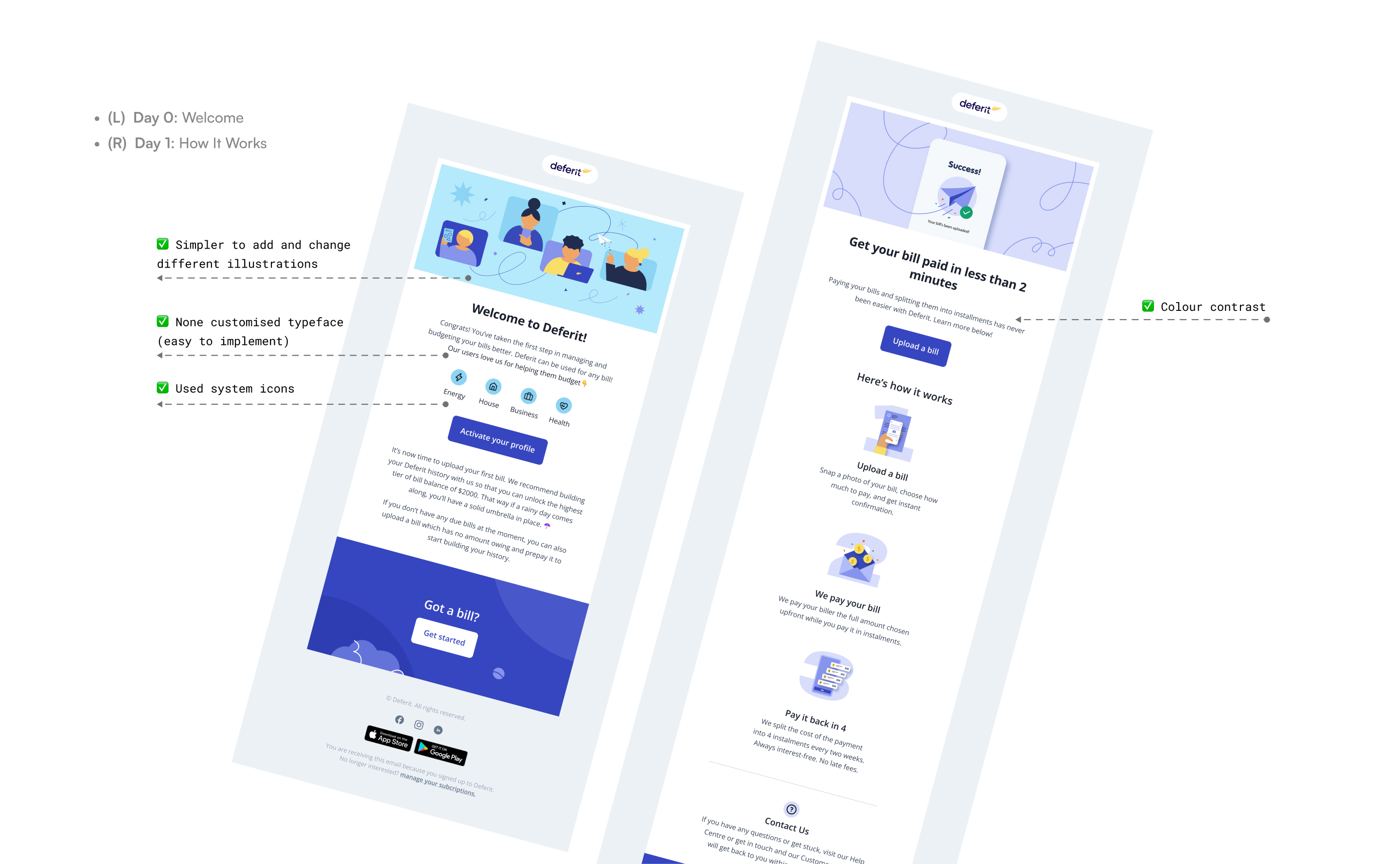
The Welcome Phase (Days 1–7)
Light, welcoming layouts featuring ample white space, simplified typography, and direct value propositions to reduce initial friction.
The Welcome Phase (Days 1–7)
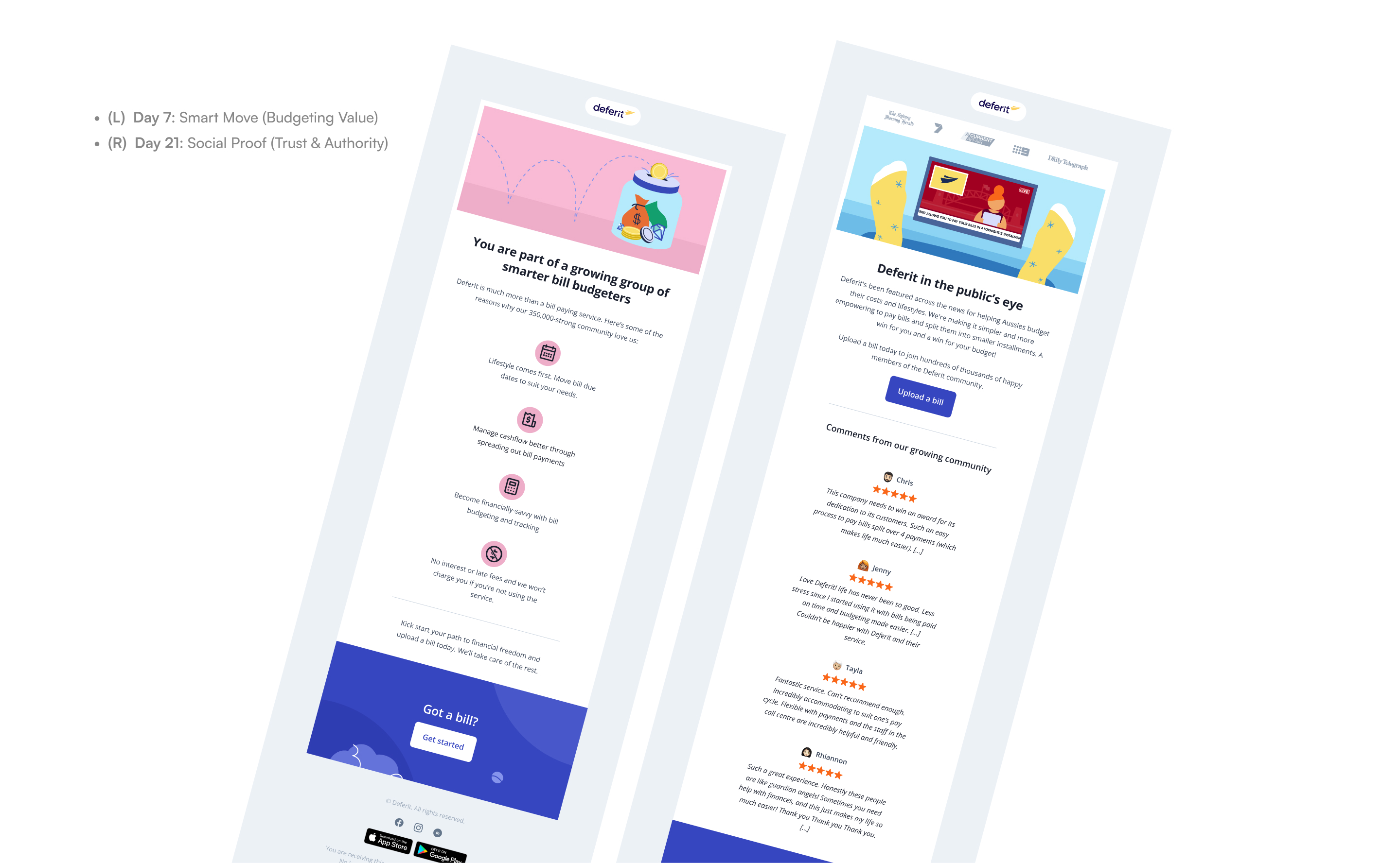
The Trust Phase (Days 8–21)
Modular, structured grids that highlight user testimonials, social proof metrics, and educational feature callouts.
The Trust Phase (Days 8–21)
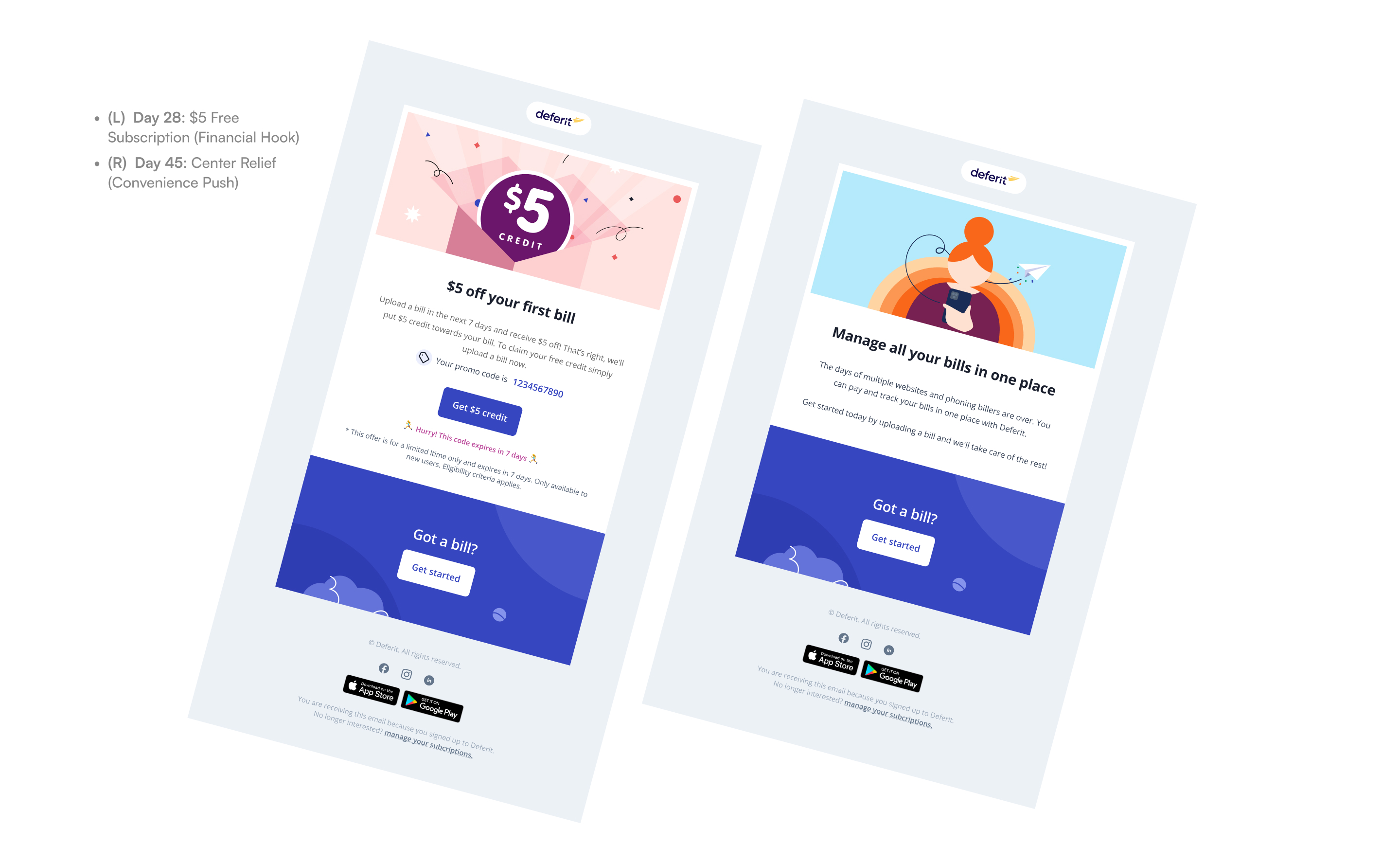
The Urgency Phase (Days 22–45)
High-contrast, focused layouts that eliminate distracting sidebar content, centring entirely on single primary CTAs and clear account actions.
The Urgency Phase (Days 22–45)
Final design
Transactional Email
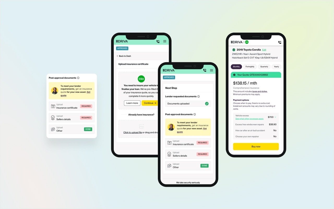
Built with absolute utility in mind. I structured these clean layouts using bold headers and scannable invoice data tables. Confirmation receipts, due dates, payment reminders and upcoming monthly fee were prioritised visually to ensure customers could find key details at a single glance.
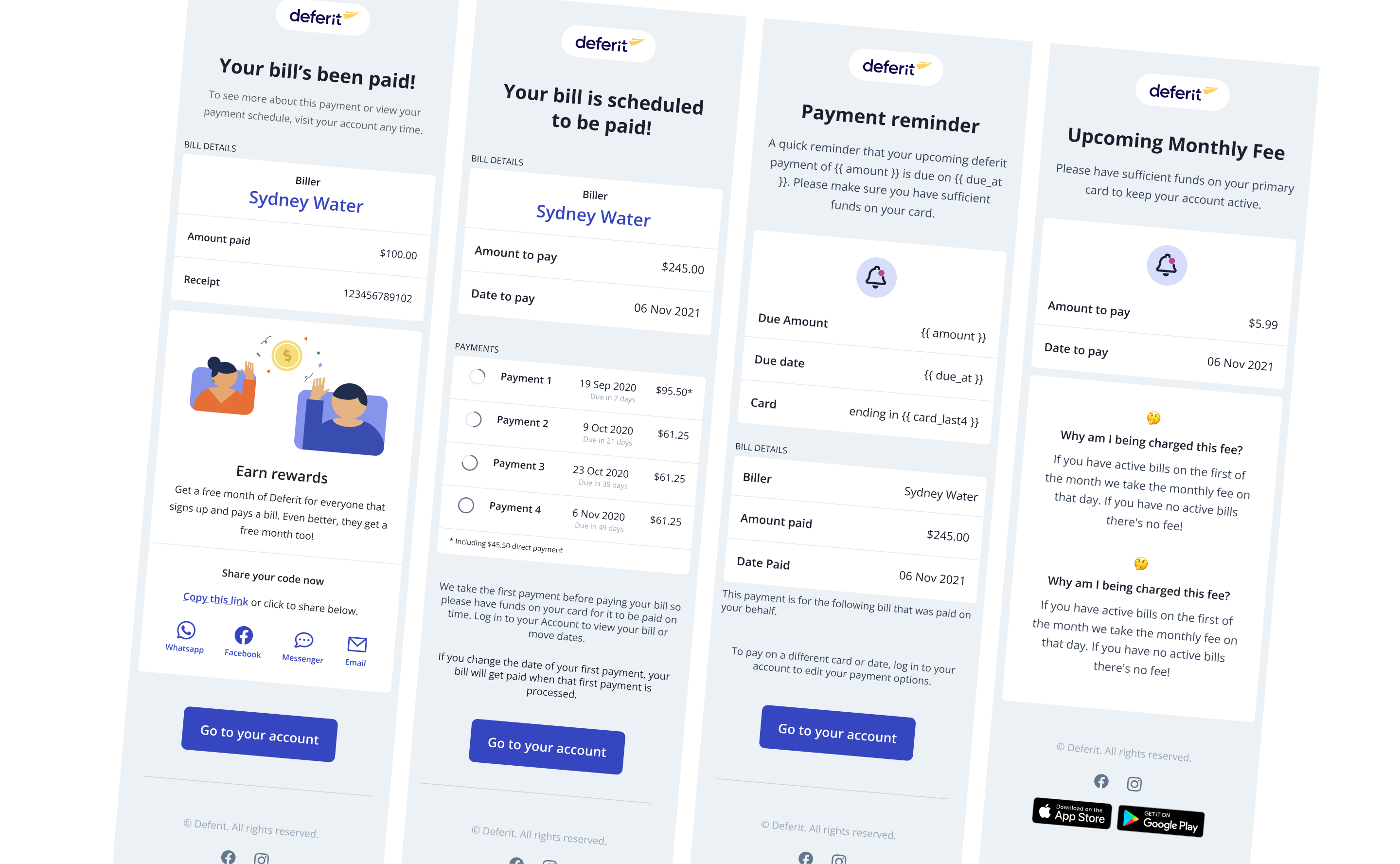
Transactional Email
final design
Native Dark Mode Support
I customised the layout code to automatically react to systemic dark mode triggers. Text colours dynamically flip to high-contrast tones, backgrounds settle into comfortable deep hues, and all graphic assets are exported with transparent layers to prevent awkward box-out rendering on dark user interfaces.
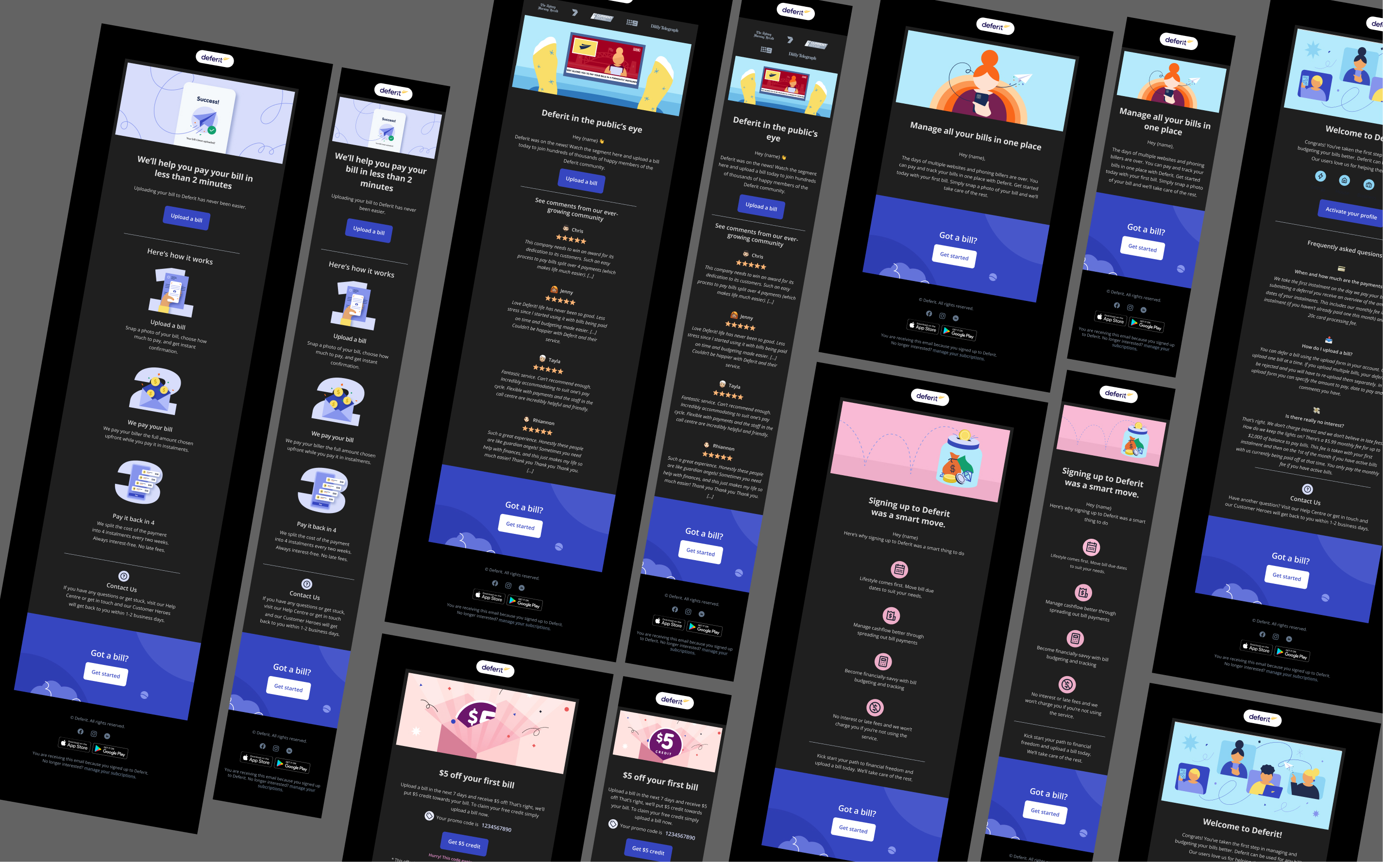
Dark mode
OUTCOME
Automated Production Built for Growth
The modular email design system empowered Deferit's marketing team to rapidly scale future EDM campaigns without design bottlenecks, while ensuring 100% brand consistency and seamless communication across a growing base of 200,000+ users.
Campaign Scalability
Reusable modules gave the marketing team the flexibility to build and expand future EDM campaigns quickly as communication needs evolved.
Fewer Design Bottlenecks
A clear, self-serve framework enabled the team to create and update campaigns independently without relying on repeated design support.
Brand Consistency
The system maintained 100% brand consistency and seamless communication across Deferit's growing base of more than 200,000 users.