Hackers Education Group
Hackers Civil Service: 6-page course & curriculum booklet
- Booklet
- Typography
- Editorial Design
- Education
Overview
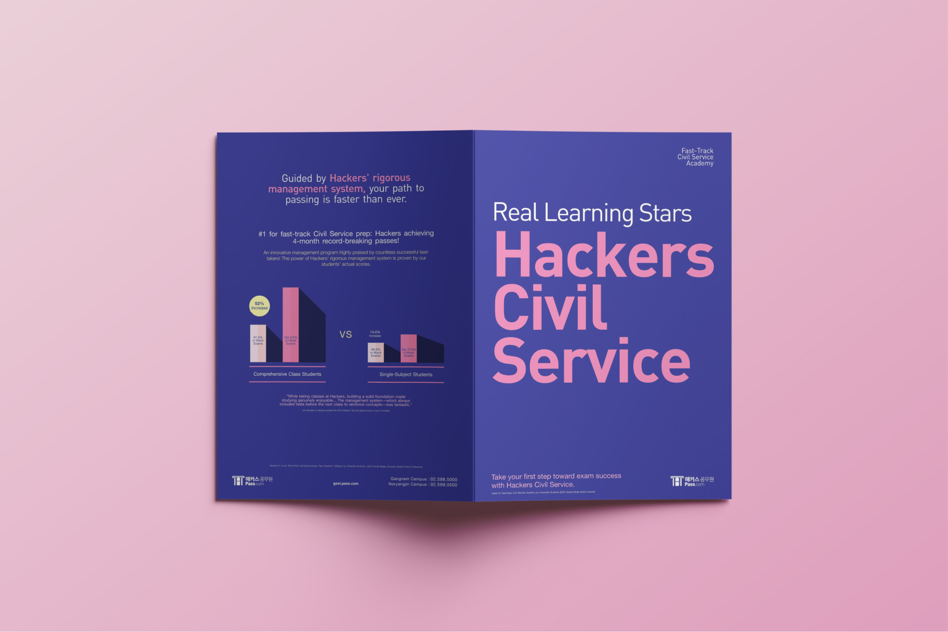
I led the editorial design and visual strategy for a comprehensive 6-page promotional booklet for Hackers Civil Service Academy. The project’s core challenge was digesting high-density academic information—from 1:1 mentorship tracking to multi-tier exam curricula—into an engaging, structured, and conversion-focused print piece.
Key Results
- 40%Lift in booklet-attributed course enquiries in the following intake
- 1 weekFrom kickoff to press-ready files under a tight campaign deadline
Role
Tools
Delivery
Design System & Foundations
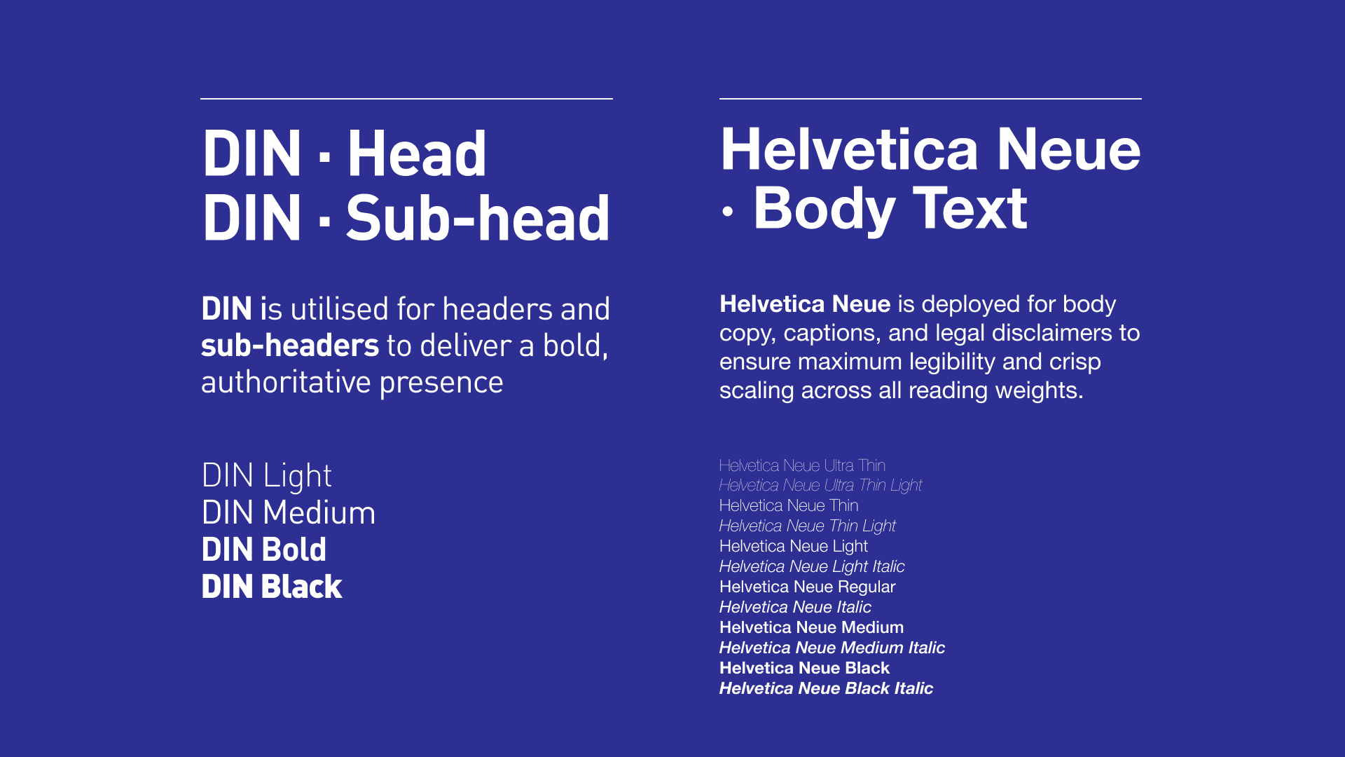
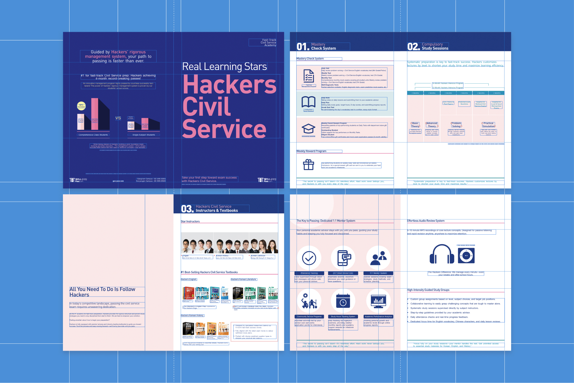
- Typography & Hierarchy: Established a modular editorial grid system to manage dense text layout while maintaining a clean, modern aesthetic. The typographic system relies on a dual-sans-serif pairing to establish strong visual hierarchy: DIN is utilised for headers and subheaders to deliver a bold, authoritative presence, while Helvetica Neue is deployed for body copy, captions, and legal disclaimers to ensure maximum legibility and crisp scaling across all reading weights.
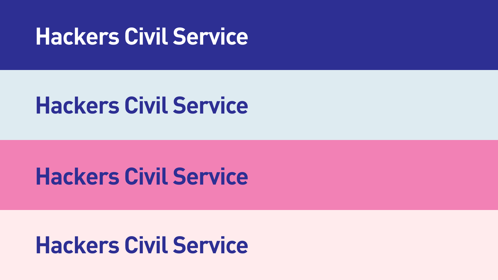
- Colour System & Visual Assets: Utilised bold, high-contrast brand tones to evoke confidence and authority, paired with custom iconography, badges, and structural containers to make key features scannable.
- Information Architecture: Transformed raw academic data into structured comparison tables, visual timelines, and step-by-step progress cards.
EDITORIAL DESIGN & LAYOUT BREAKDOWN
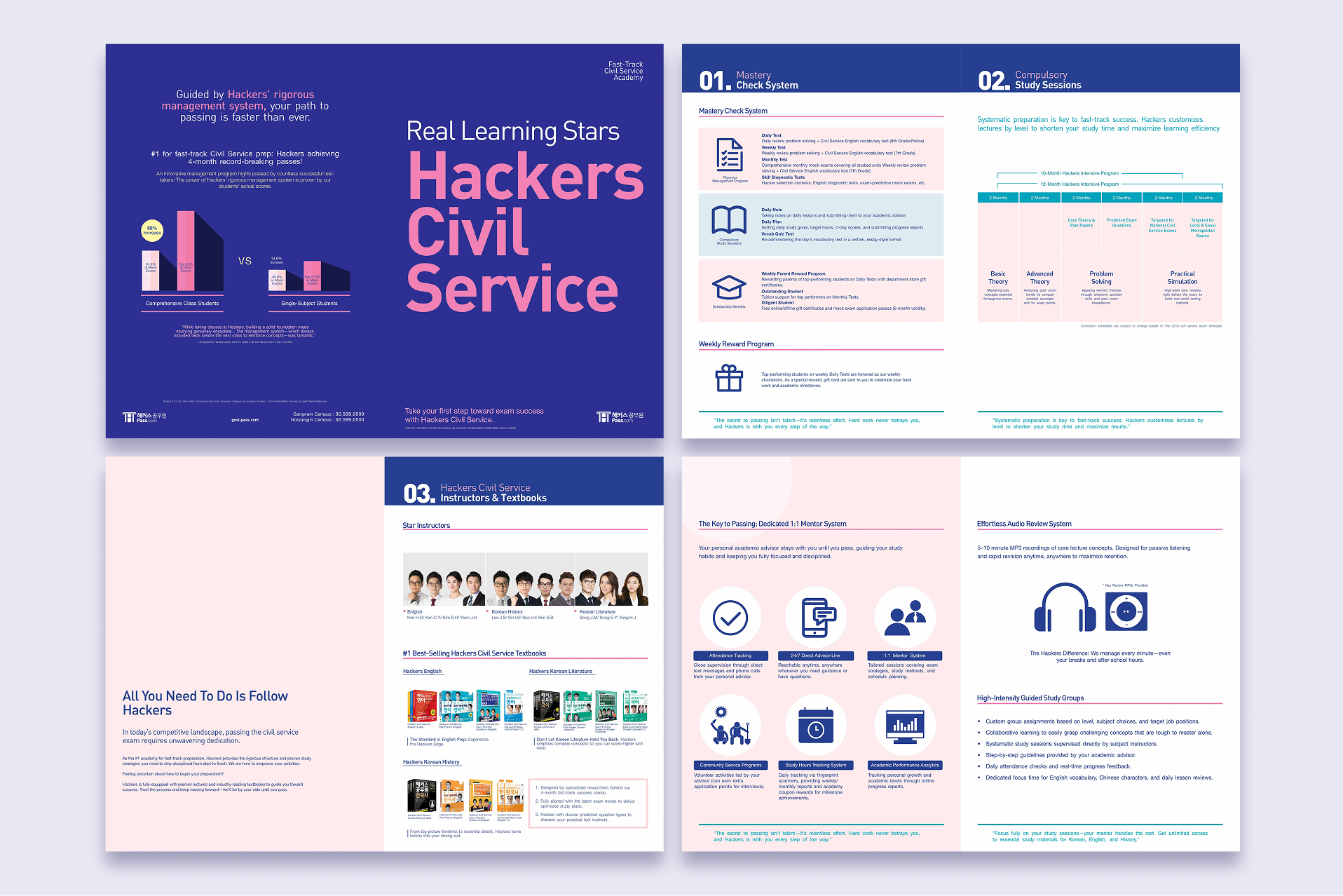
Cover: Front & Back
- Goal: Build instant authority and trust by capturing immediate attention through bold branding and leveraging clear, data-driven evidence of student success.
- Design Approach: The front cover commands attention with bold brand typography, while the back cover uses objective data to drive prospective students toward a confident final decision.
Front Cover
Designed with a bold typographic headline layout balanced with the official 2016 Herald Media award accreditation badge at the footer to establish immediate credibility.
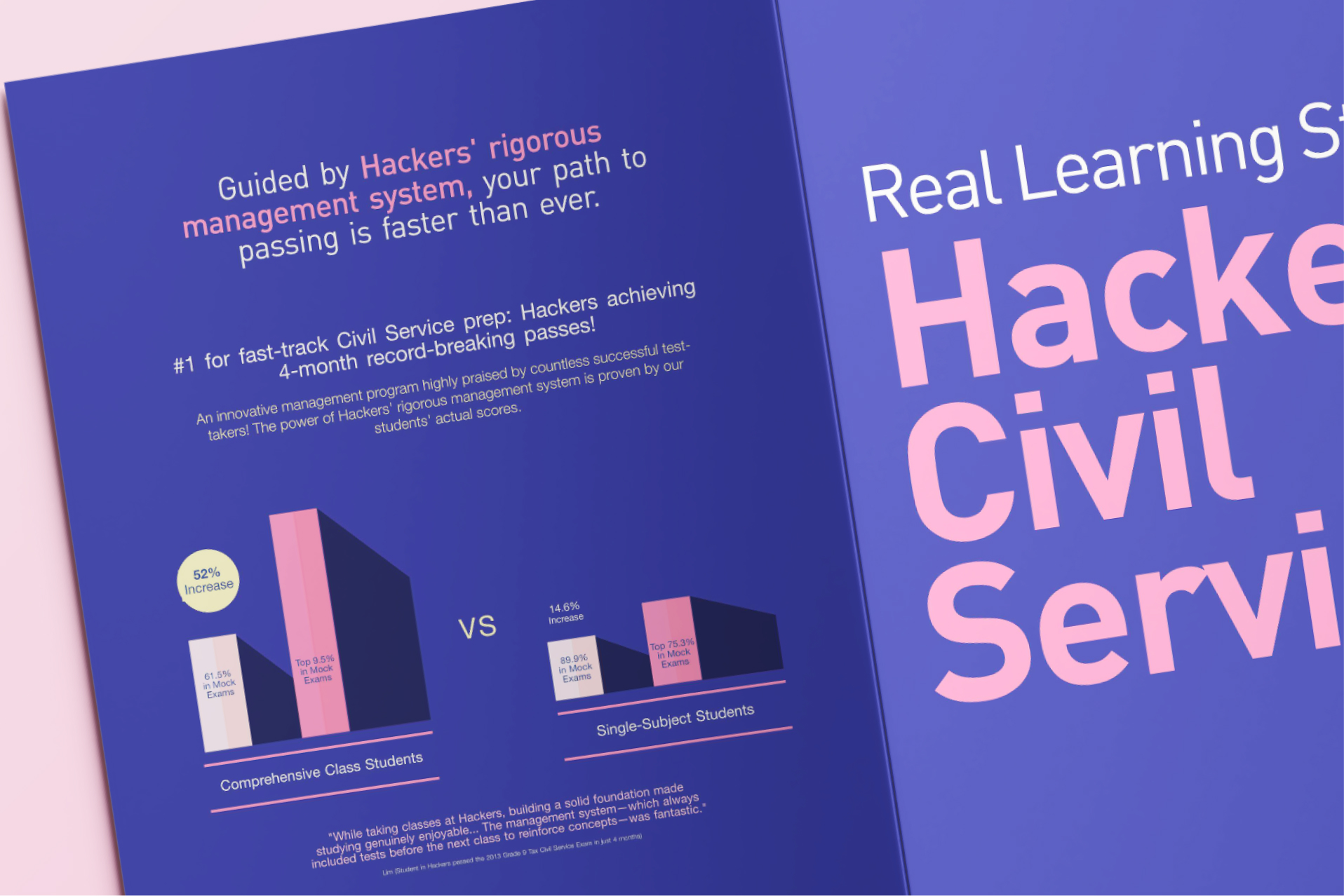
Back Cover
- Bar Graph Visualisation: Transformed complex academic statistics into a high-contrast comparison chart.
- Highlight Colour & Layout: By pairing a bold visual breakdown (Comprehensive Class vs. Single-Subject) with student testimonials and accent badge callouts, the layout guides the reader’s eyes directly to the core benefit: faster results through rigorous management.
Page 1: Mastery Check System & Weekly Rewards
- Goal: Map out the rigorous testing loops, compulsory study sessions, and scholarship benefits within the Mastery Check System and Weekly Reward Programme.
- Design Approach: Structured the Daily, Weekly, Monthly, and Diagnostic Test tracks into a clear vertical progression stack. Balanced dense text inputs (Daily Notes, Daily Plans, Vocab Quizzes) using scannable sub-headers and custom icon markers. Highlighted the incentive-driven Weekly Reward Programme in a dedicated layout section to motivate future students towards their goals.
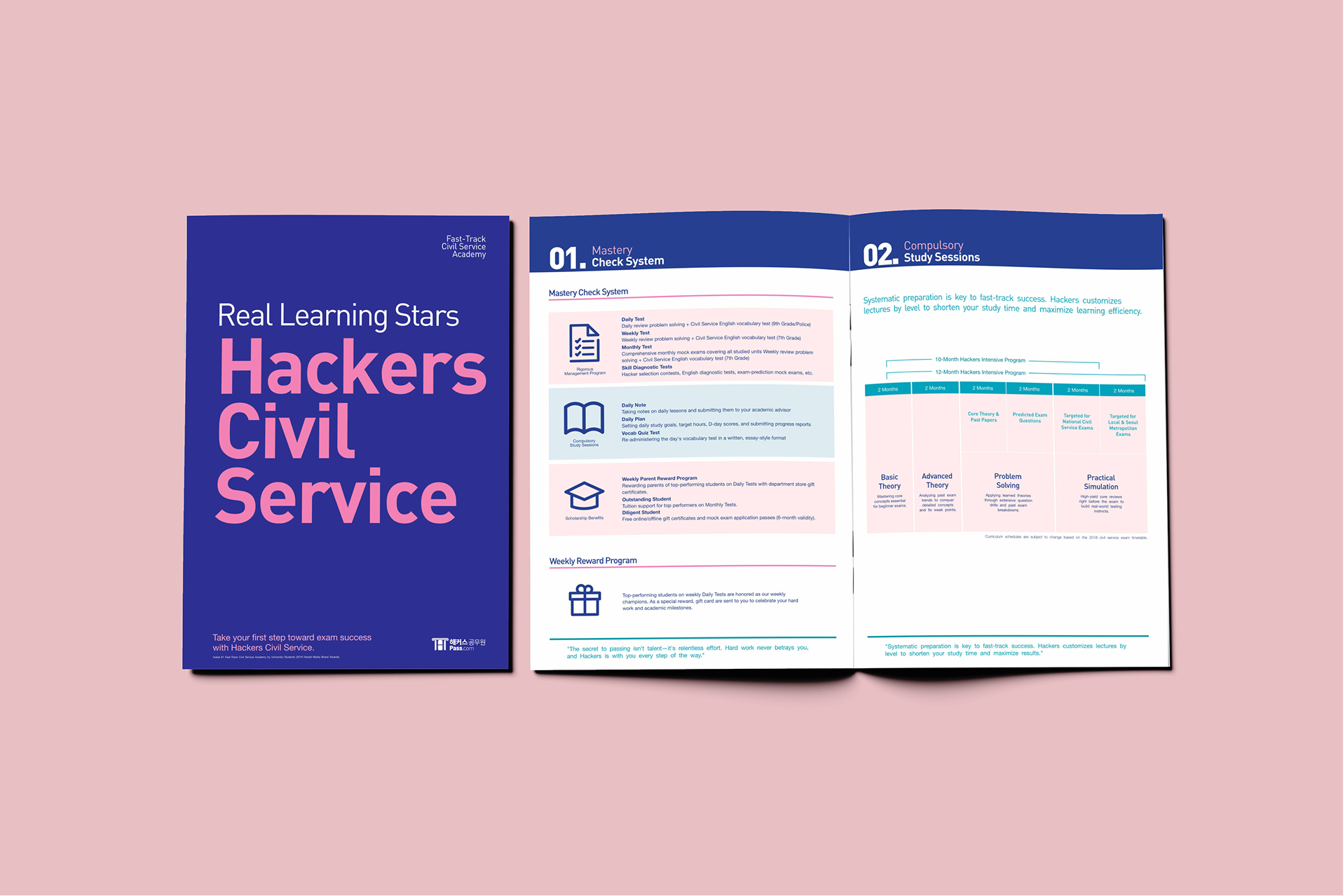
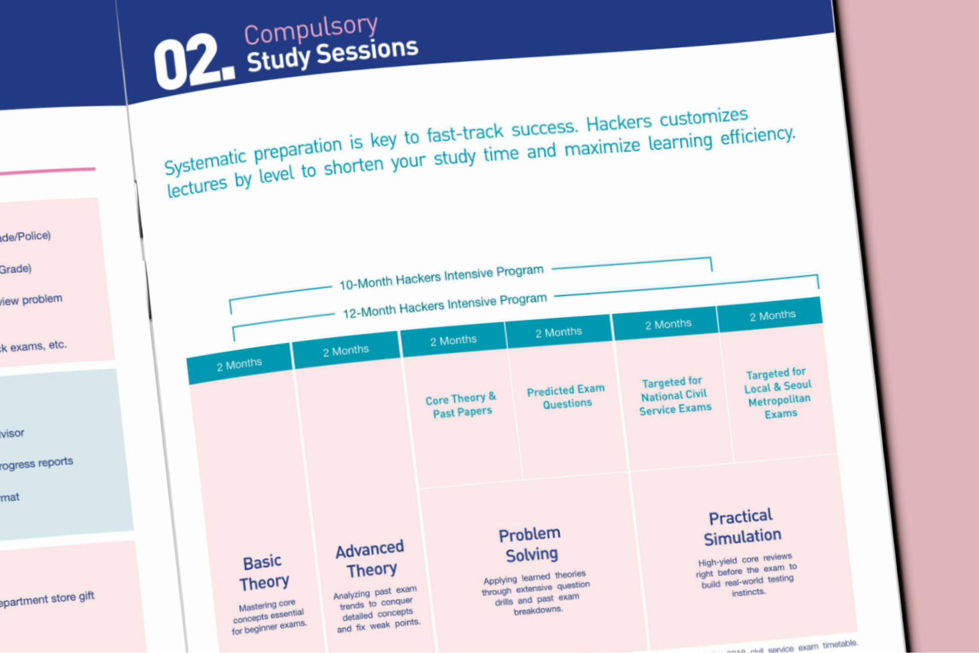
Page 2: Systemic Curriculum Schedules & Table Charts
- Goal: Drive decision-making with clear, structured study tracks.
- Design Approach: Built a 4-step linear curriculum table chart (Basic Theory → Advanced Theory → Problem Solving → Practical Simulation). This layout helps readers easily understand customised civil service lectures by proficiency level, neatly organising the curriculum levels, module lengths, and total periods for both intensive programmes.
Page 3: The Dedicated 1:1 Mentor & Management System
- Goal: Communicate the intensity and care of the home-room teacher system as a core supported management channel.
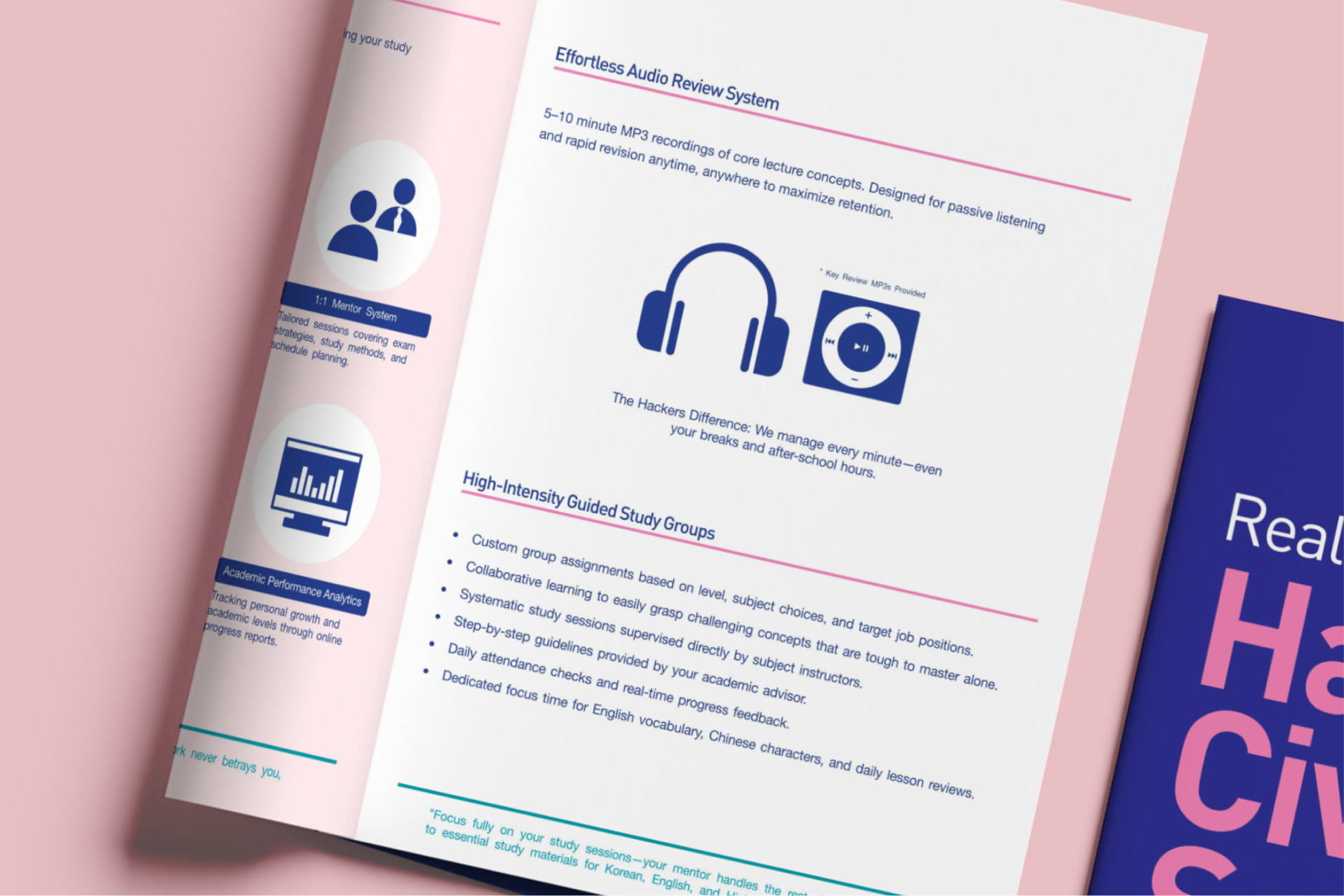
- Design Approach: Designed a clean 6-card feature grid highlighting essential management channels (Attendance, 24/7 Direct Line, Counselling, Hours Tracking, Performance Analytics). Integrated a dedicated highlight banner for the Effortless Audio Review System to establish visual rhythm.
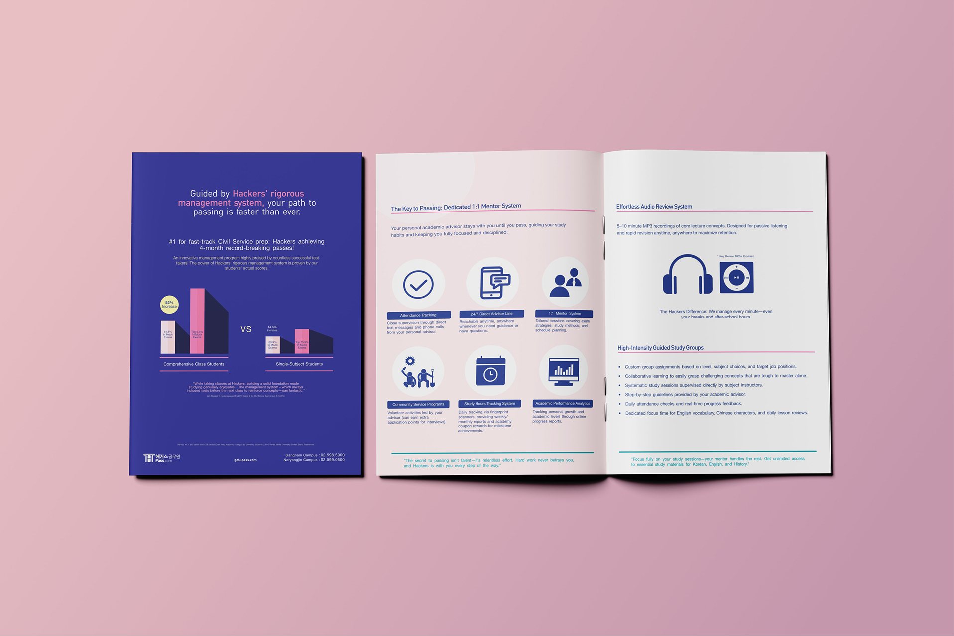
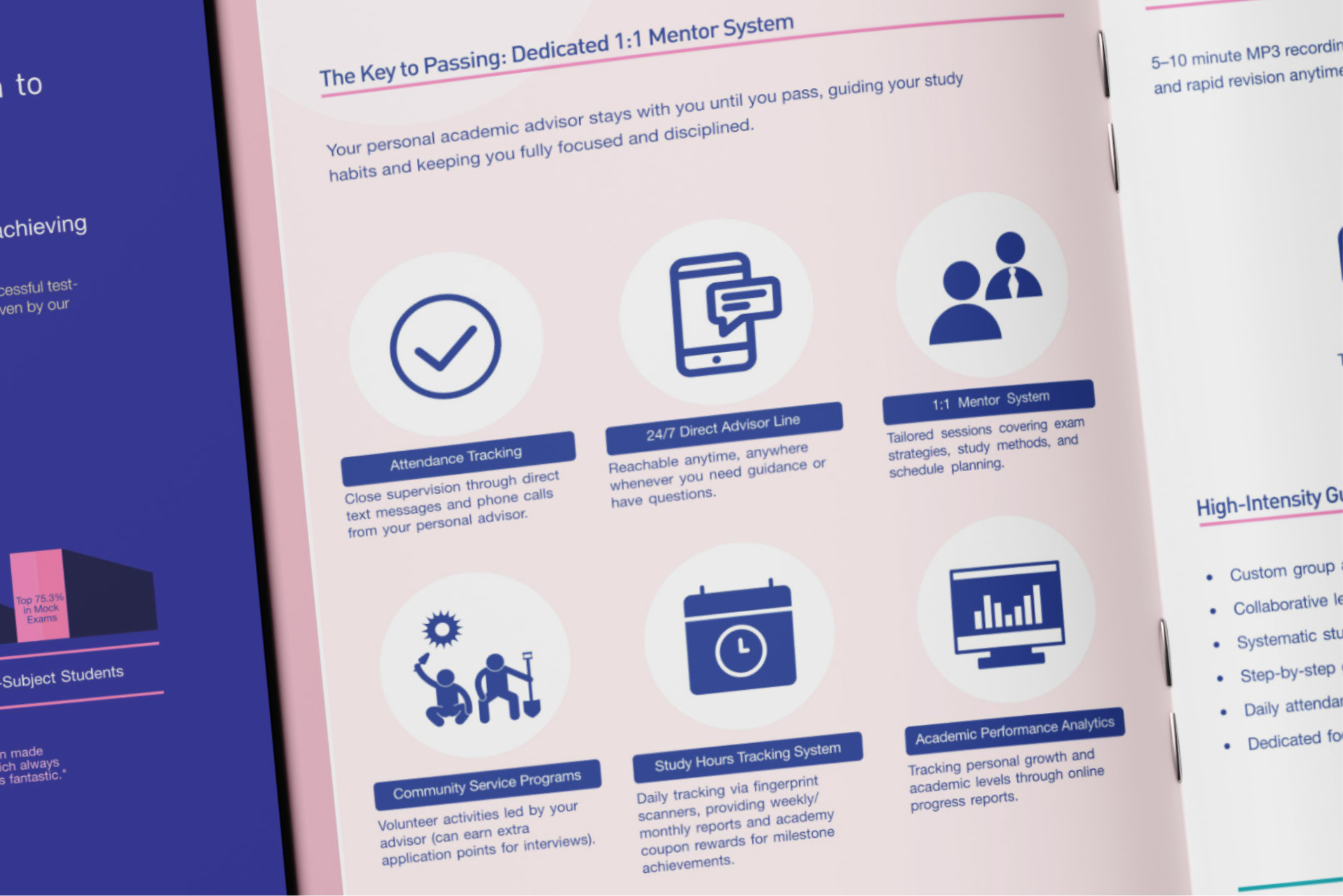
Page 4: High-Intensity Study Groups
- Goal: De-risk the daunting study process and highlight community support.
- Design Approach: Utilised contrasting background containers to separate structured study group details. Structured bulleted benefit lists alongside a prominent callout block (“Just show up and focus”).
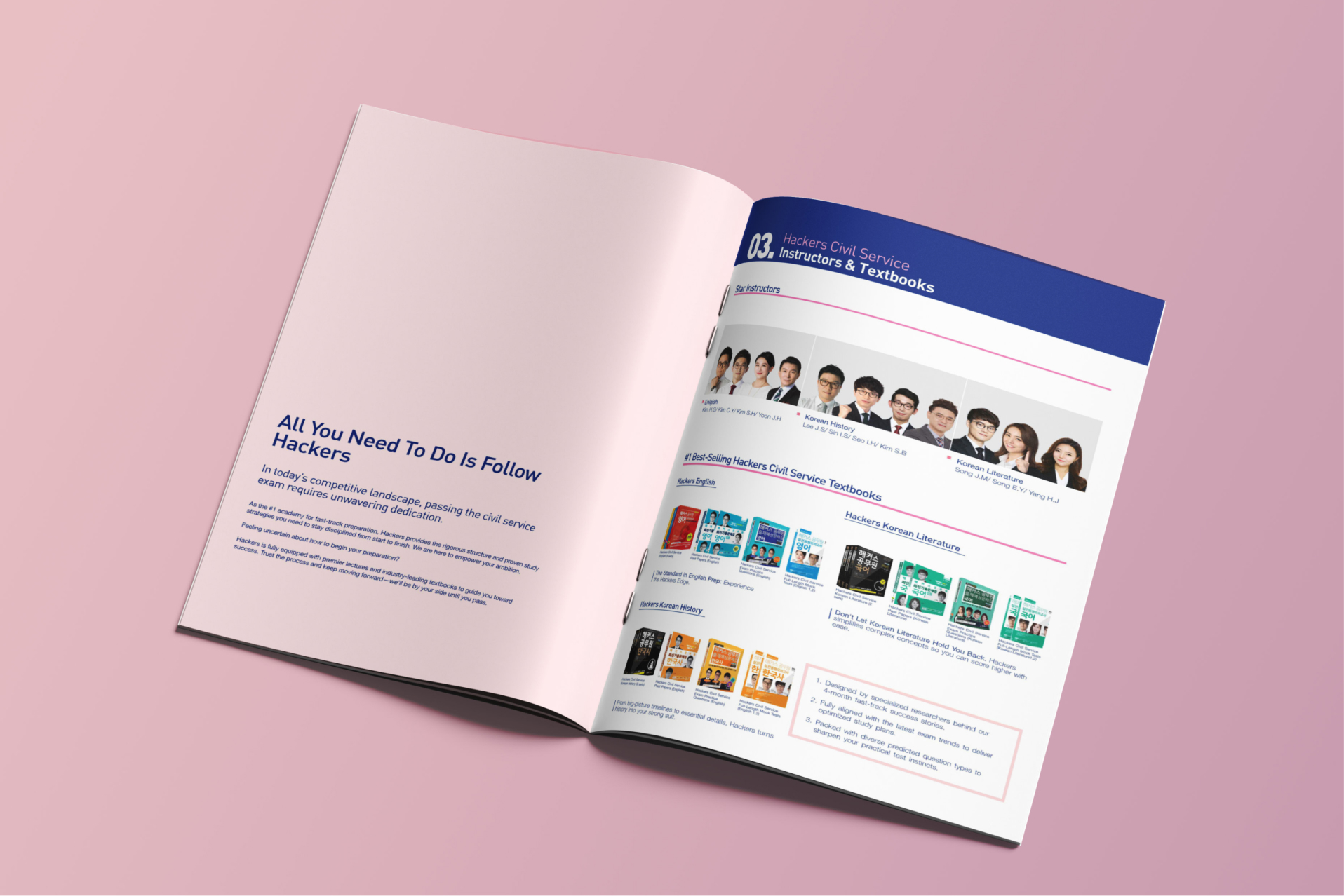
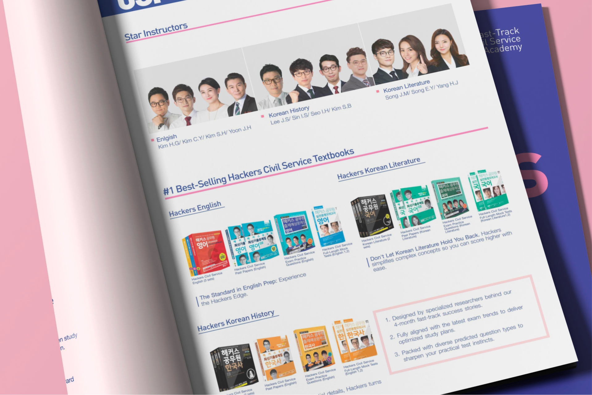
Pages 5–6: Instructors, Textbooks & Call to Action
- Goal: Showcase expert subject-specific instructors and comprehensive learning textbooks to drive lecture applications and book purchases.
- Design Approach: Presented clear, professional instructor profiles and textbook lineups as vital reference resources for students. Concluded the spread with a strong, conversion-focused closing brand mark.
Cross-Functional Collaboration
- Partnering with Copywriting: Worked hand-in-hand with the copywriter to distil long-form academic descriptions into bite-sized marketing hooks. Designed modular layout containers that allowed text hierarchy and visual anchors to guide the reader’s eye naturally.
- Working with Project Management: Maintained strict alignment on production schedules, iterative design feedback loops, and pre-press print specifications under a tight campaign deadline.
Key Results
This project highlighted my ability to handle complex information design at scale—balancing visual polish, strict grid rules, and cross-functional team coordination to deliver a high-converting promotional asset.
40%
Lift in booklet-attributed course enquiries in the following intake
1 week
From kickoff to press-ready files under a tight campaign deadline