Hackers Education Group
Hackers Company Profile Booklet
- Booklet
- Editorial Design
- Art Direction
- InDesign
Overview
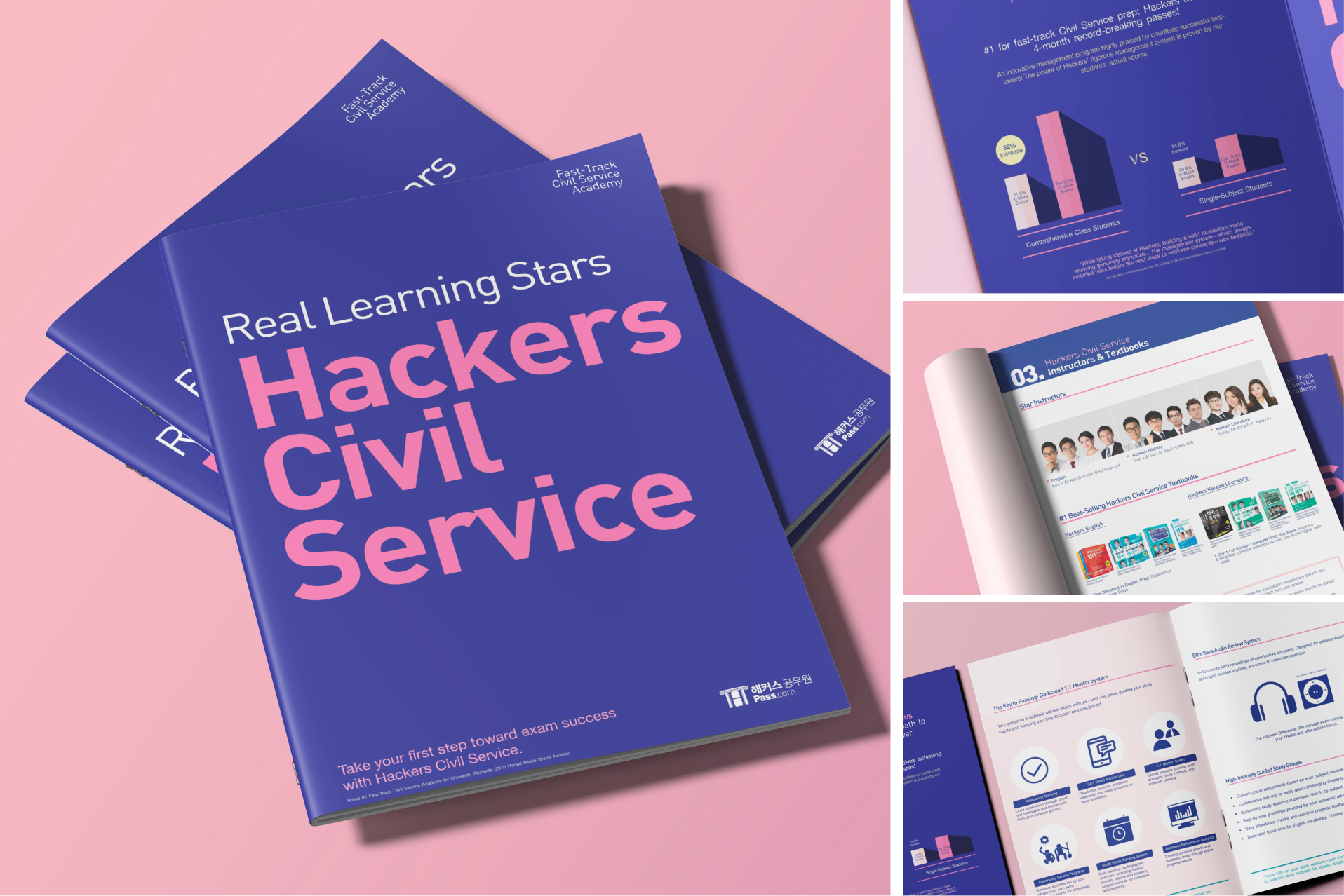
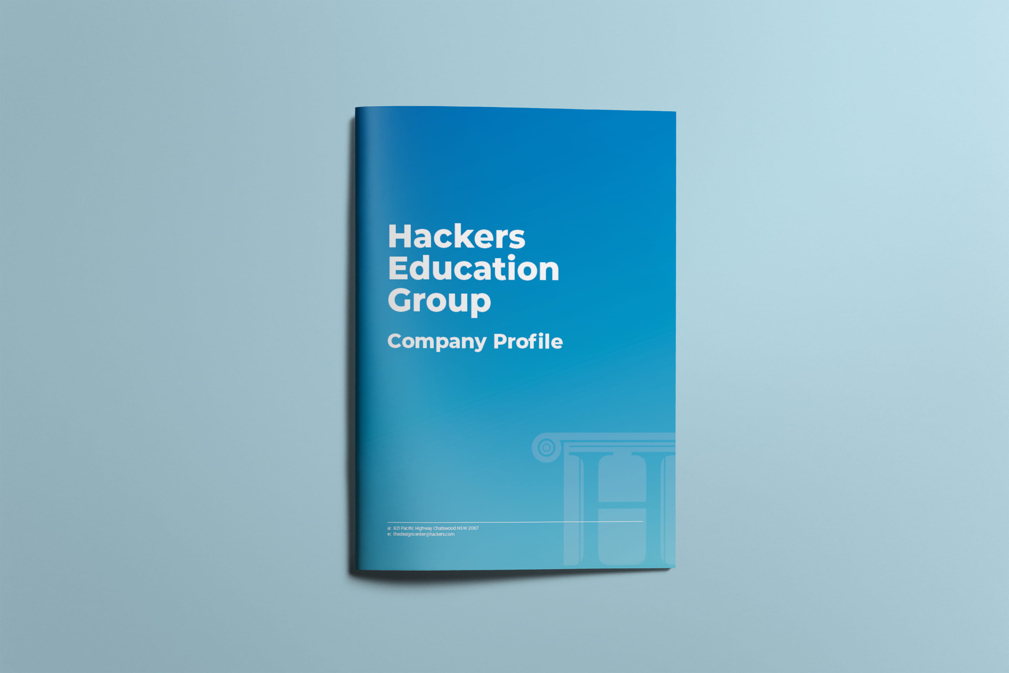
I designed a 20-page company profile brochure for Hackers Education Group to support its expansion into the U.S. publishing market — including retail bookstores — and to reach high school students in the US preparing for the SAT and ACT. I developed the initial design concept from scratch, conducting competitive research on cross-industry brands’ graphic materials to establish a distinct visual identity. I partnered with the marketing manager to align design choices with project goals.
Key Results
Delivered a premium, 20-page company profile booklet to establish Hackers Education Group's credibility in the competitive U.S. publishing market, directly appealing to major retail buyers and American high school students.
Role
Team
Deliverable
Research
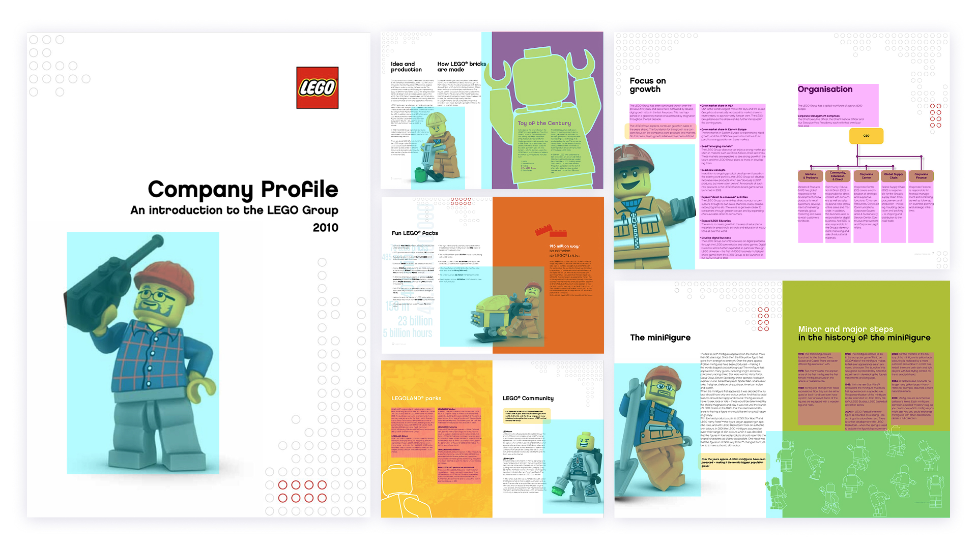
Cross-Industry Benchmarking: To establish a distinct presence for the U.S. market, our team conducted competitive research alongside cross-industry benchmarking. I drew art direction inspiration from LEGO’s company profile—analysing how a heritage brand uses asymmetry in its page elements, vibrant accent colours, and storytelling to make dense corporate history feel human, creative, and engaging.
Art Direction - Structured Modular Dynamism
Inspired by the official LEGO corporate identity, the art direction for the Hackers Company Profile reinterprets the concept of the "building block" into a sophisticated educational narrative. While maintaining a strict underlying modular framework to mirror Hackers' academic authority, the layouts deliberately break rigid symmetry to create rhythm and energy.
Design System & Foundations
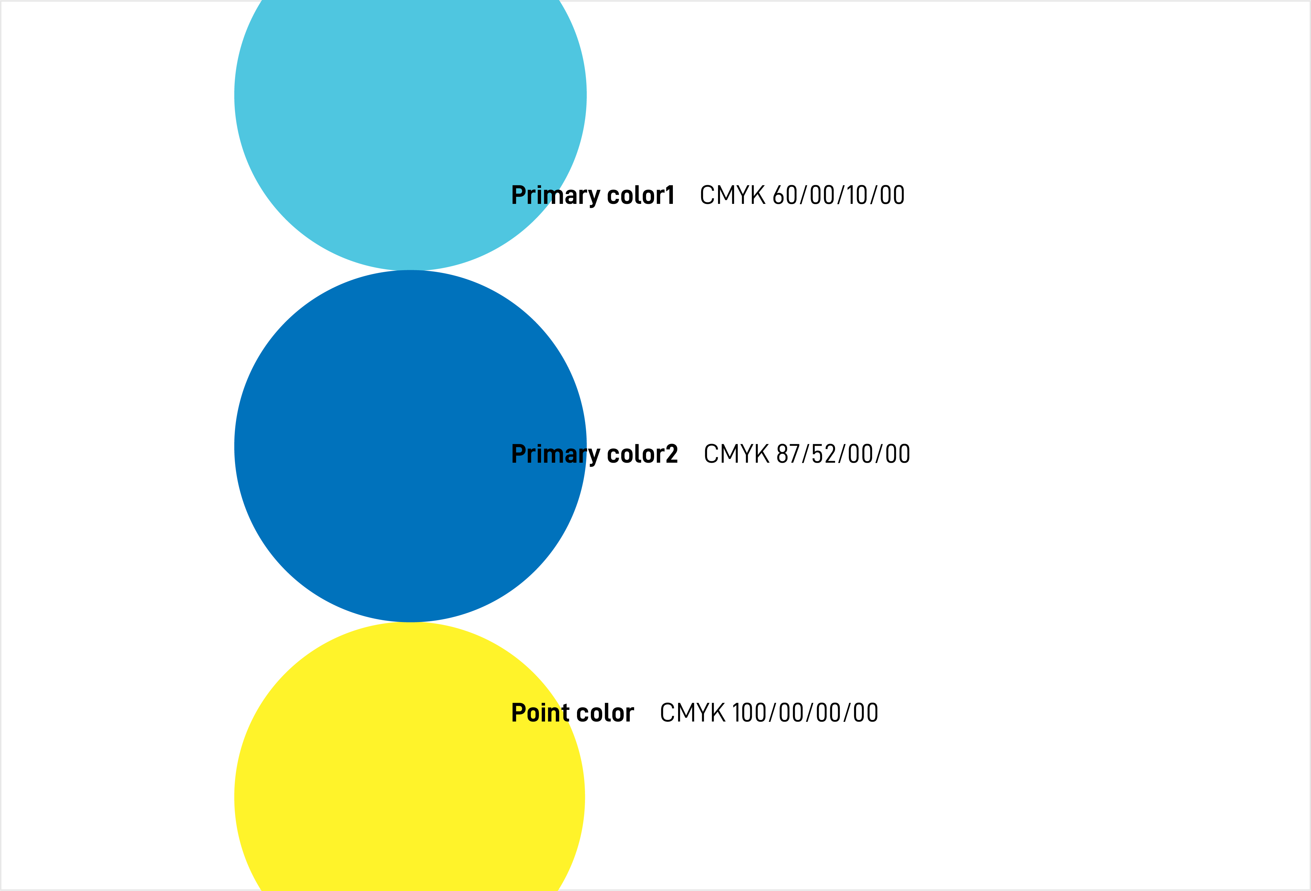
- Colour Palette: Anchored the design with Hackers’ official corporate blue for brand consistency, while introducing a strategic vibrant yellow accent. Used selectively on keywords and key data, the yellow contrast enhances scannability and draws the eye to crucial partnership messaging.
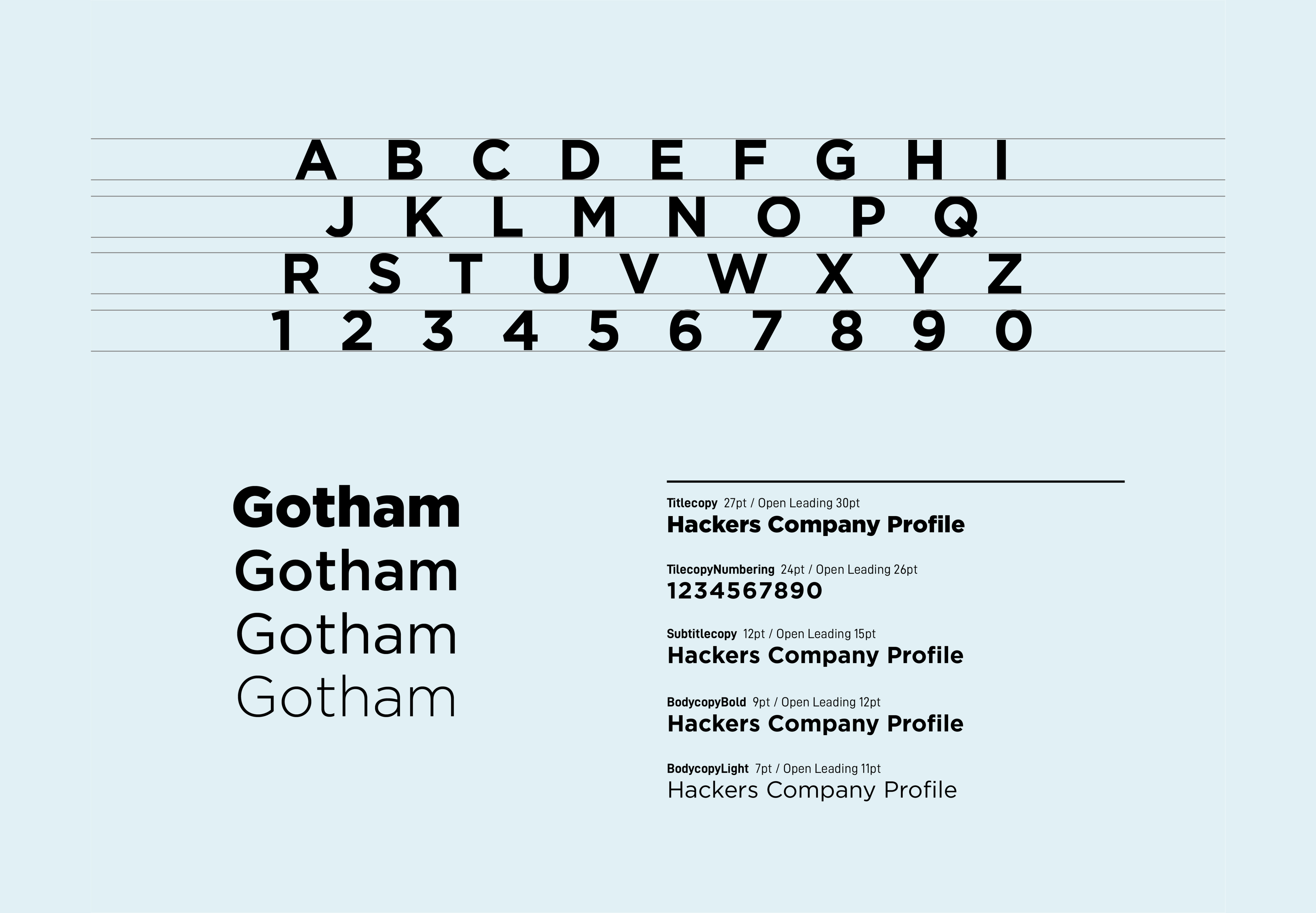
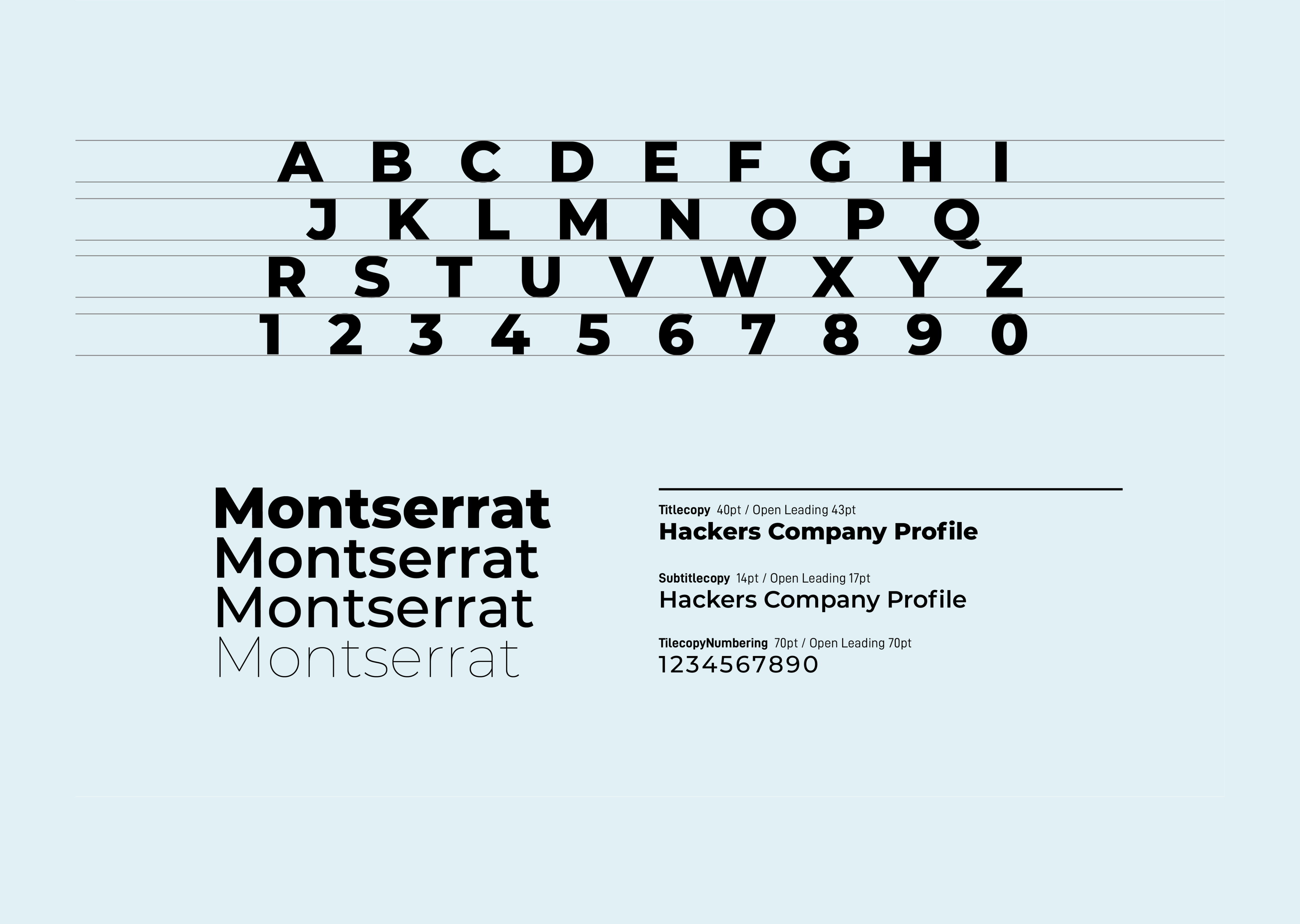
- Typography: Selected Montserrat and Gotham for their clean geometric proportions and wide structure, ensuring formal elegance and high legibility across heavy editorial print layouts.
Editorial Strategy & Spread Layouts
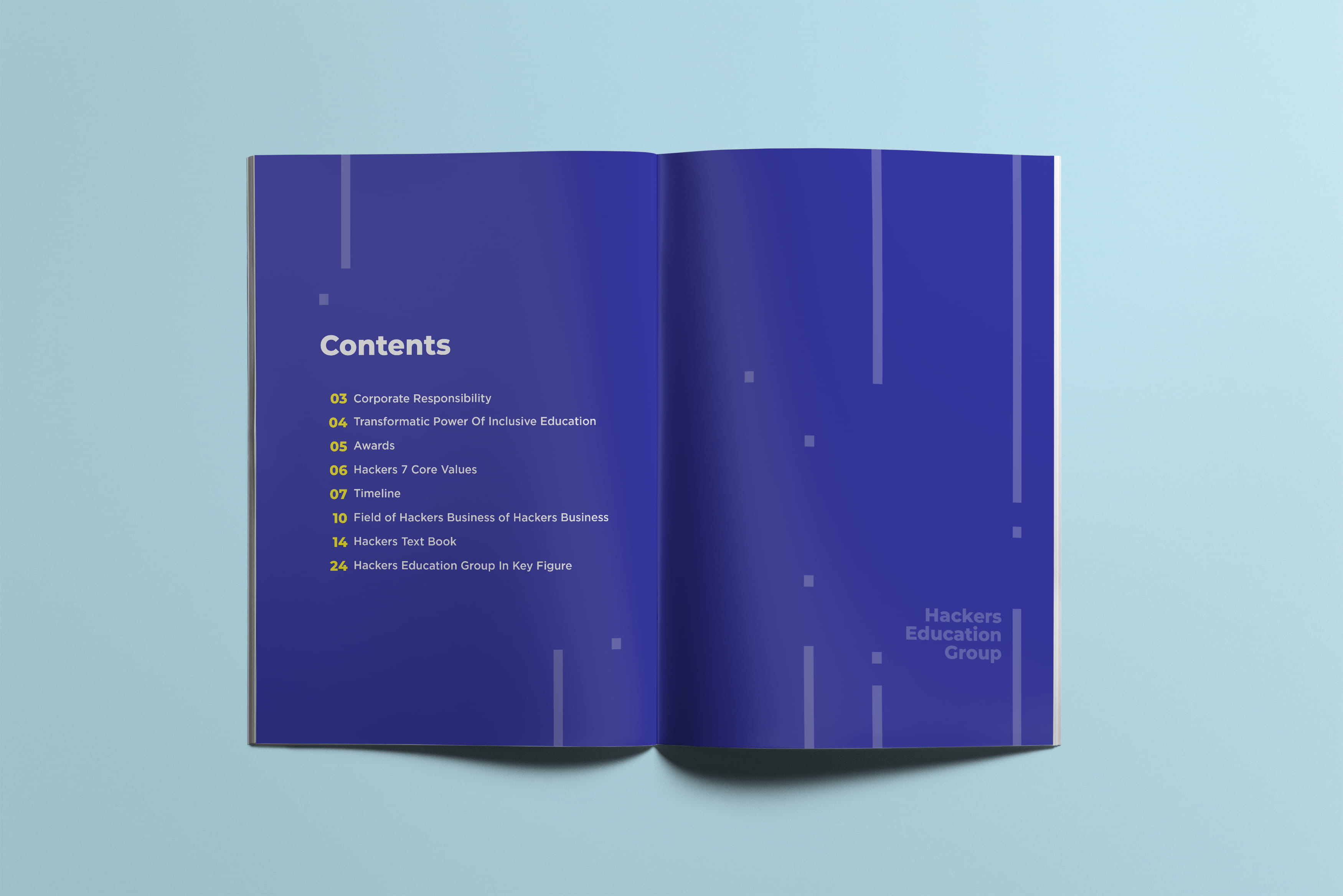
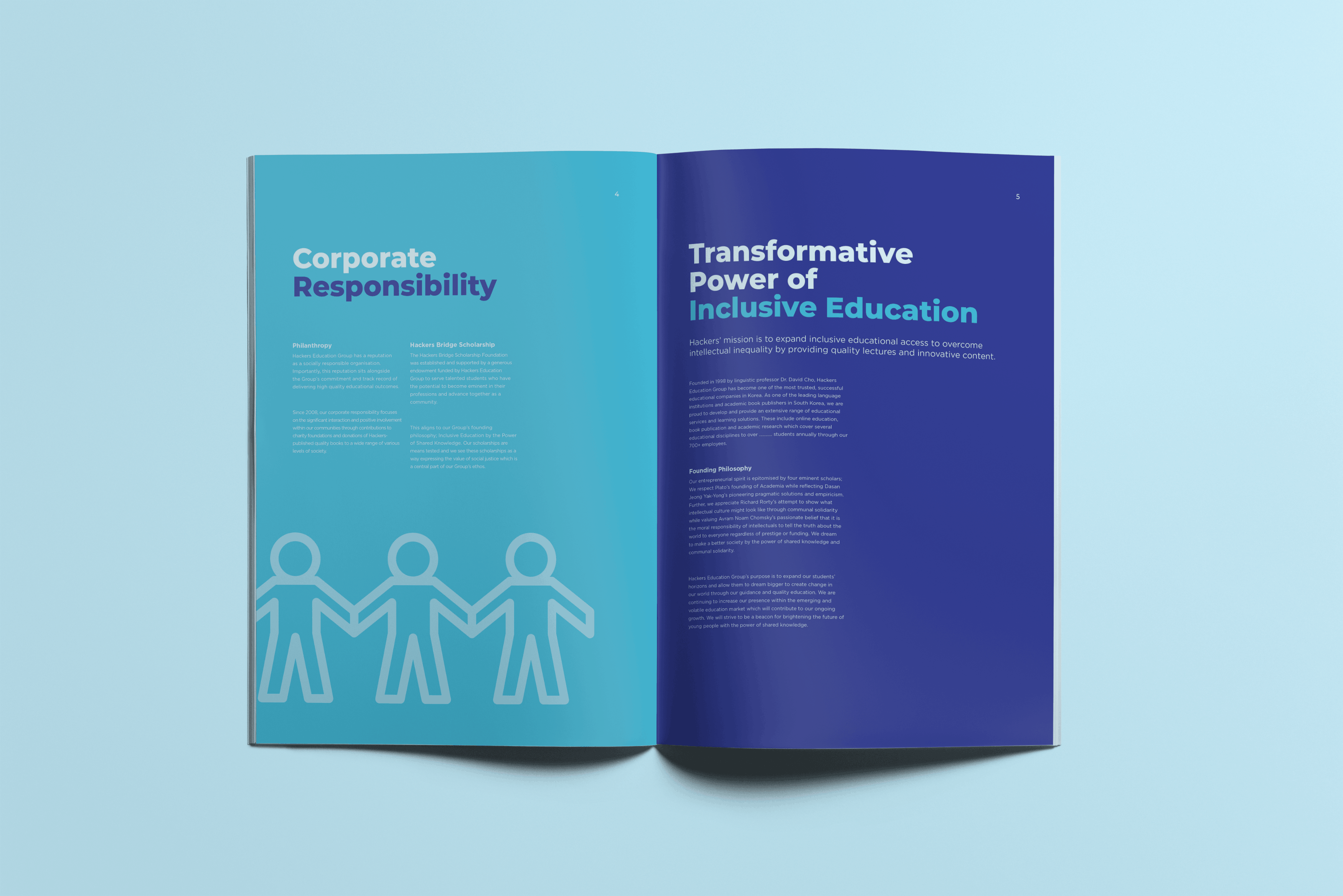
Narrative Flow: Rejected the sterile, uniform layout of traditional educational reports in favour of a dynamic, magazine-inspired asymmetrical grid system. The 20-page journey is paced like a feature story, intentionally shifting between bold, high-contrast visual statements and dense, high-utility data to give the reader an engaging editorial rhythm.
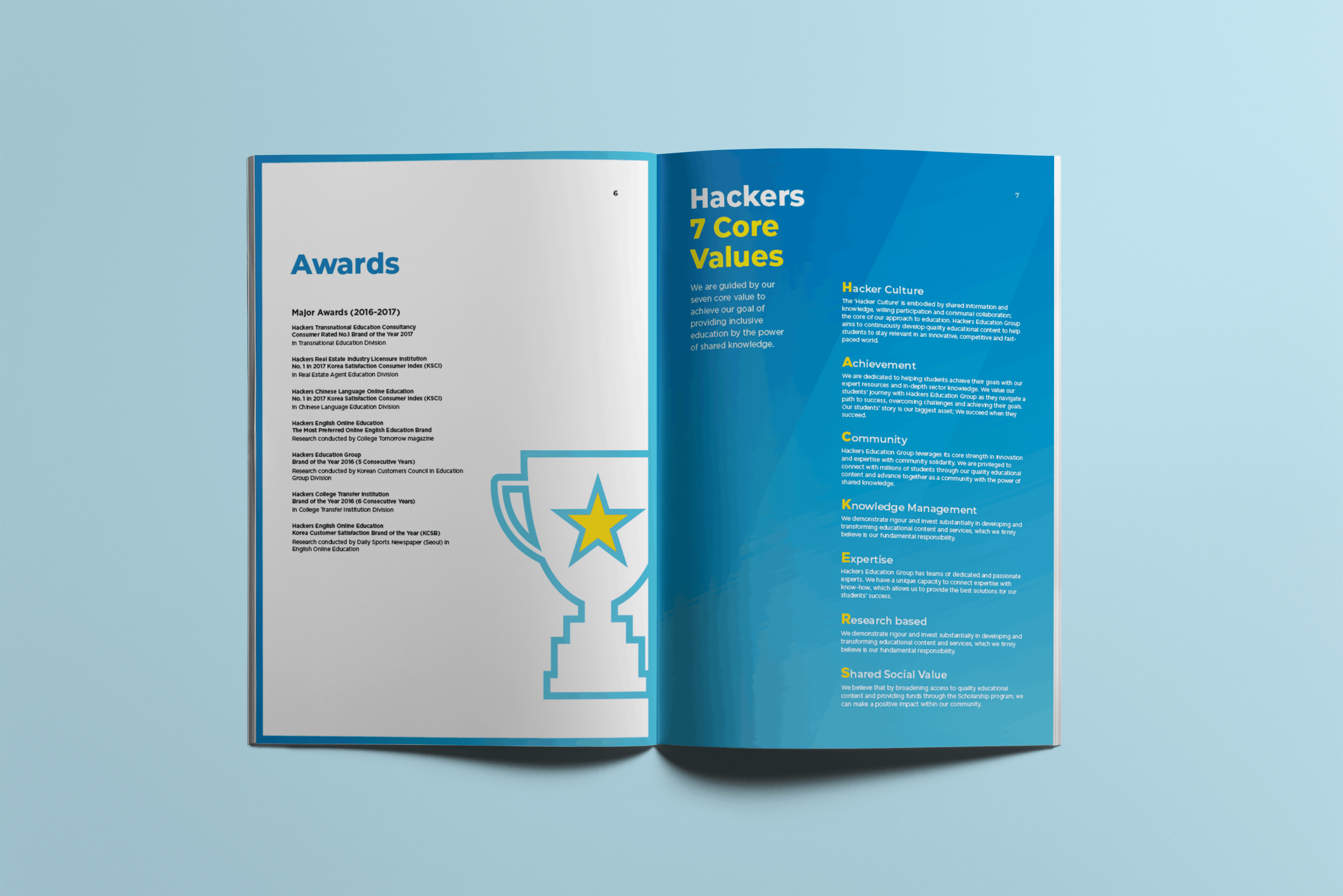
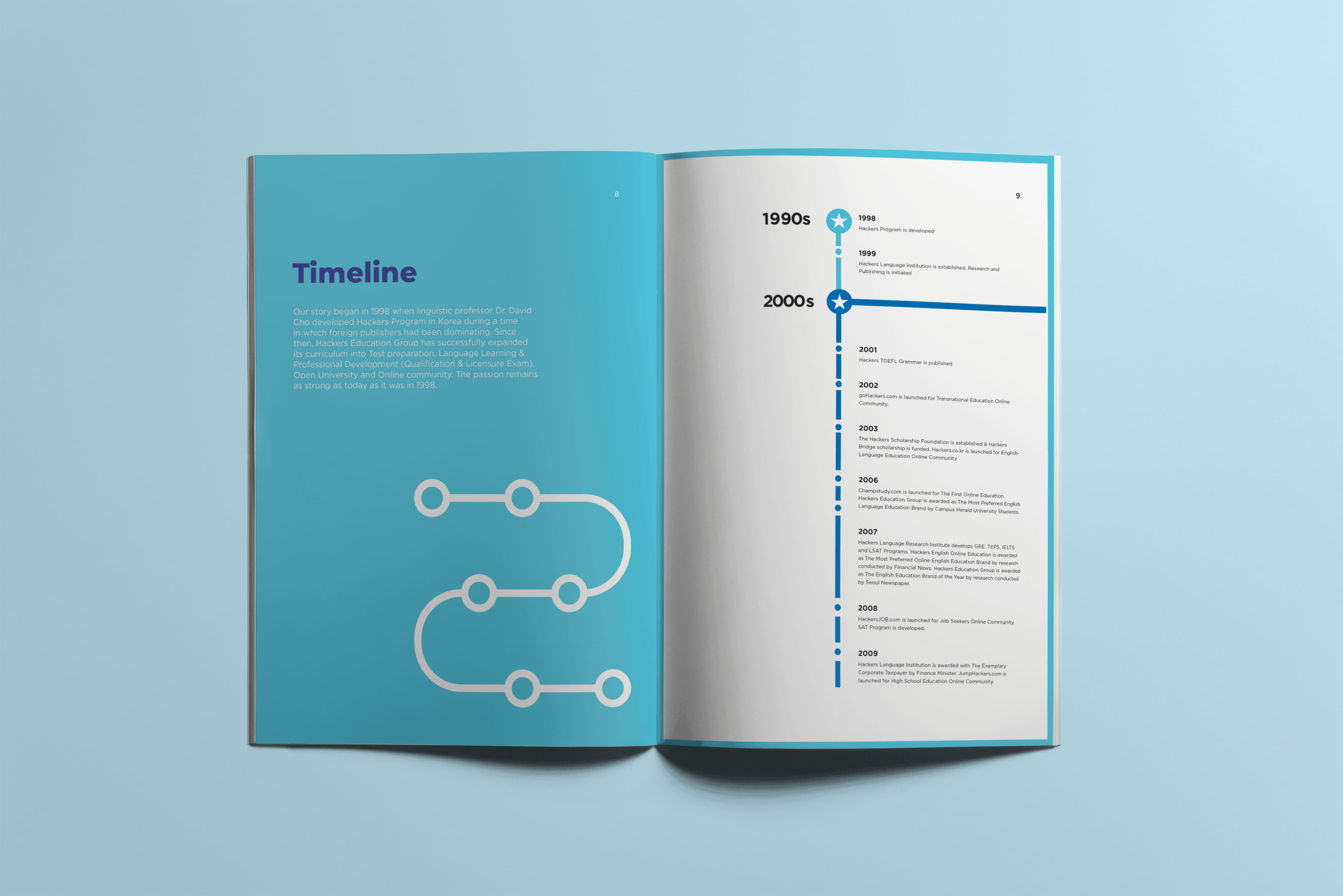
Timeline Architecture (30+ Years History): Solved the challenge of presenting decades of growth without visual fatigue. Grouped milestones by decade (1990s, 2000s, 2010s) along a clean vertical spine supported by an introductory origin path, turning historical data into a continuous narrative line.
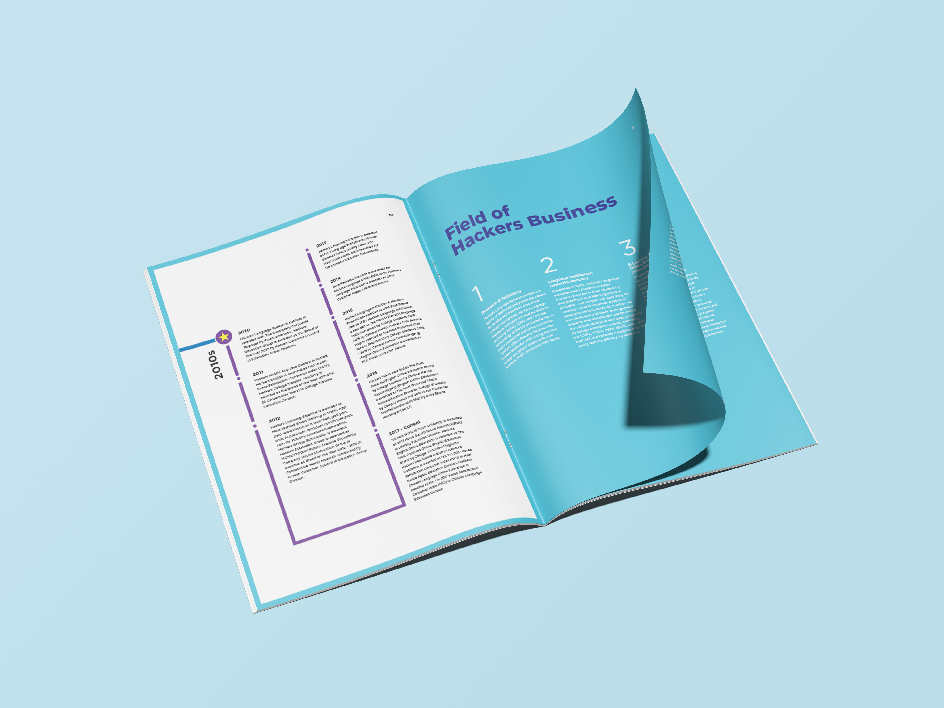
Publishing Catalogue (Hackers Text Book): Opened the publishing chapter with a high-impact section divider—custom line-art book icon, yellow keyword blocks, and a full-bleed corporate blue field—then catalogued the textbook range by exam category (TOEIC, Basic English, TEPS, General English). Repeating yellow labels, ruled product rows, and cover photography turn a dense backlist into a scannable index for publishing partners.
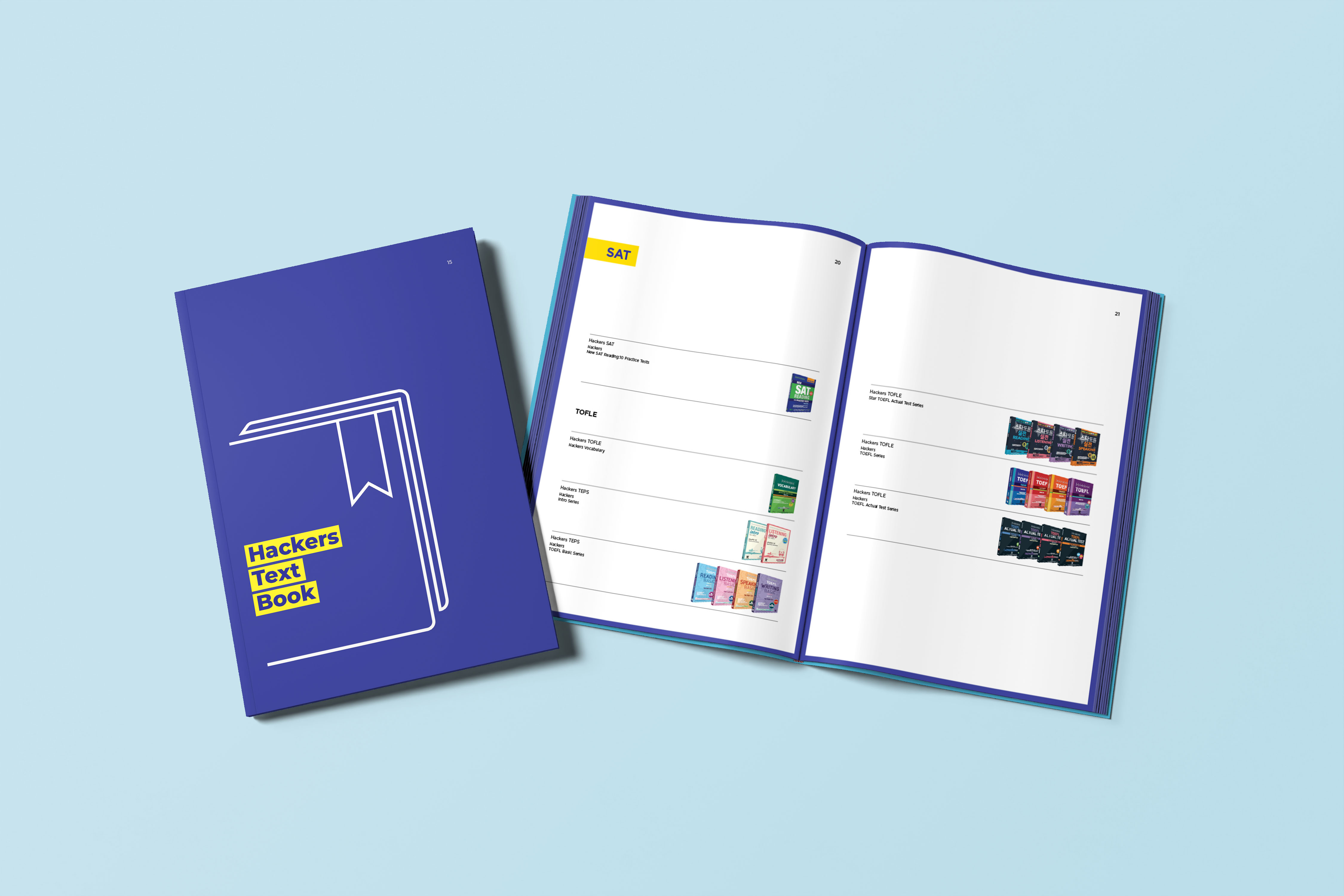
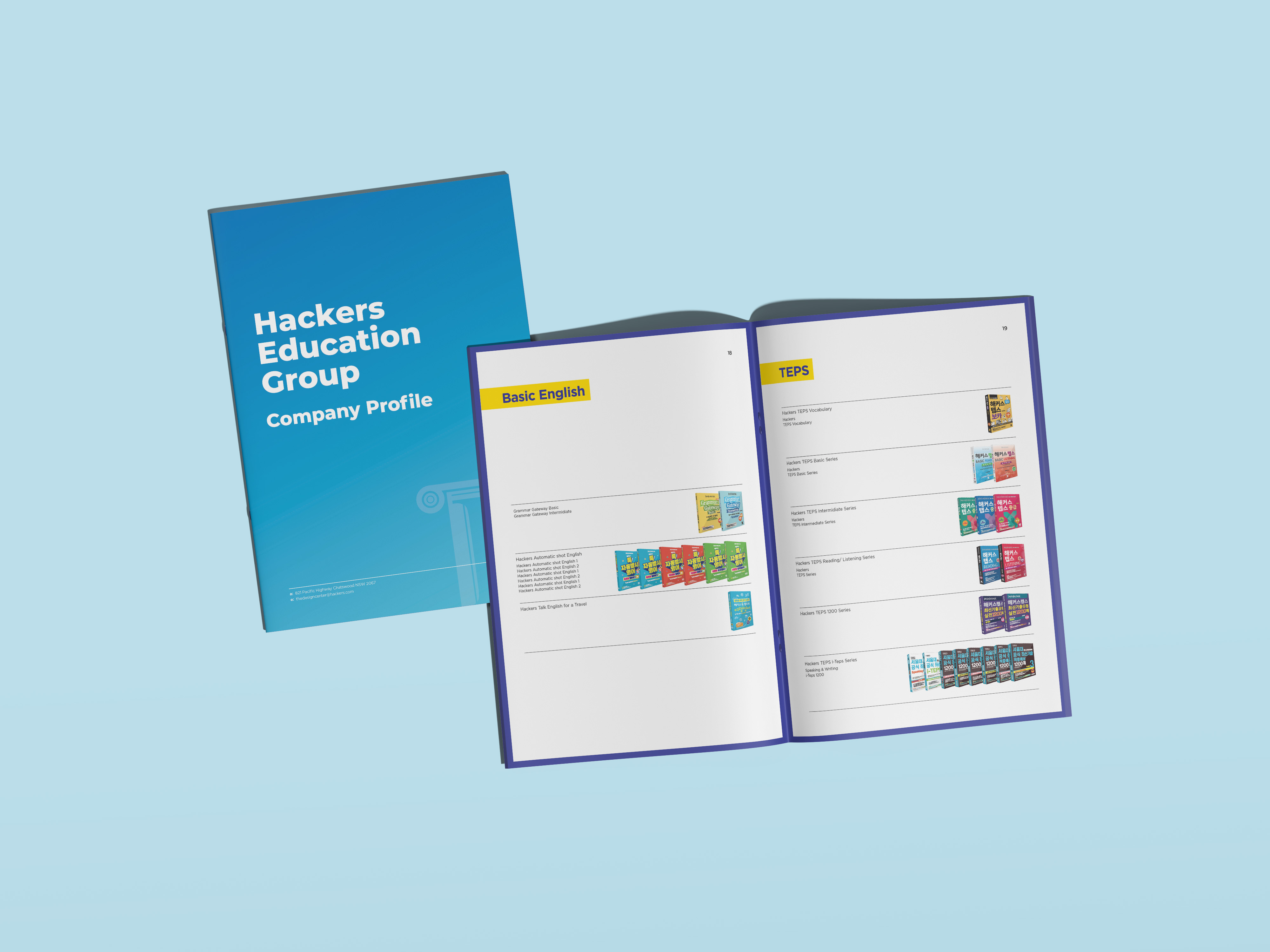
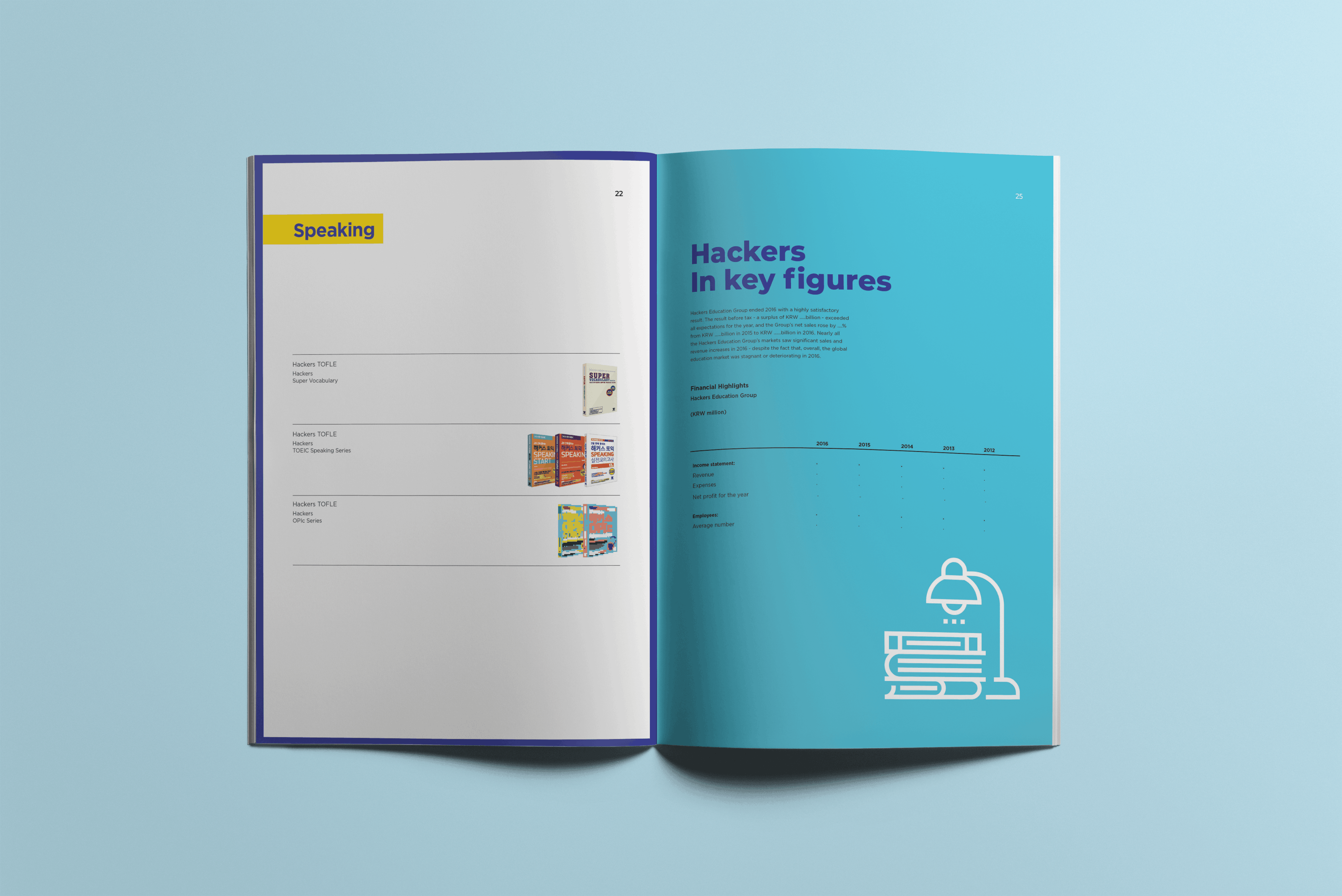
Visual Diversity within Unity: Implemented a unique concept for every spread—varying colour ratios, layouts, and typography while remaining strictly within a unified design system to maintain brand integrity.
Cross-Functional Collaboration
Partnering with Marketing & Copywriting: Collaborated closely with the marketing manager and copywriter to translate dense corporate and publishing data into punchy, highly scannable U.S. market-facing copy.
Key Results
Delivered a premium, 20-page company profile booklet to establish Hackers Education Group's credibility in the competitive U.S. publishing market, directly appealing to major retail buyers and American high school students.