Hackers Education Group
Hackers 3-Step Middle School English Vocabulary
- Interior Book Designer
- Graphic Designer
- Art Director
Overview
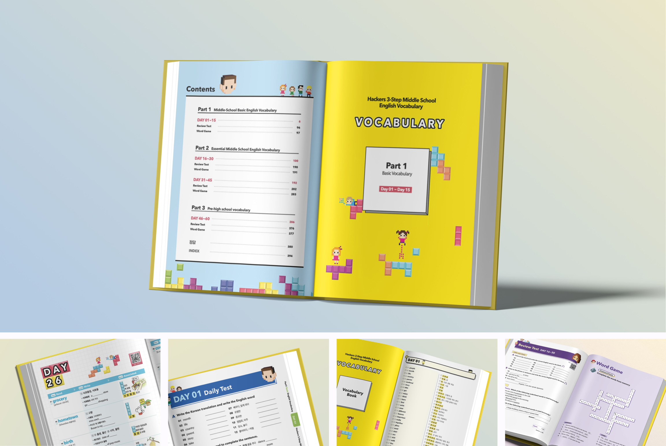
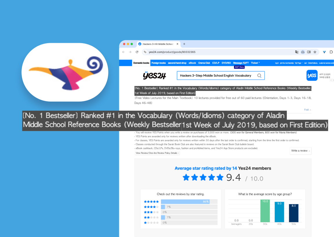
I led the art direction and editorial design of HACKERS 3-Step Middle School English Vocabulary, a vocabulary textbook for Korean middle schoolers. I created the interior visual identity and a template system that the content and proofreading teams used to build the final book. The first edition ranked #1 in Aladin’s middle school reference books category for vocabulary (words and idioms) on the weekly bestseller list for the first week of July 2019. A revised second edition was published on 28 May 2020.
Key Results
- #1Aladin weekly bestseller — middle school vocabulary (words & idioms), first week of July 2019
- 2nd ed.Revised edition published 28 May 2020
Role
Delivery
The challenge
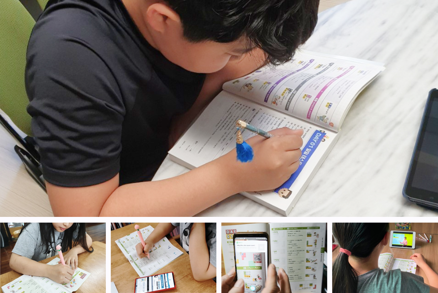
Middle schoolers find vocabulary study repetitive. The book’s learning method has three steps: Step 1 is read, Step 2 is write, and Step 3 is associate. My goal was to make studying feel less like a chore and more like play, while keeping every page easy to read.
My role
- Interior design from concept to completion: I owned the Tetris and pixel concept, page templates, and typographic and colour systems. The cover was designed separately.
- Art direction with illustrators: I art-directed an illustrator who created the block elements and pixel characters. The scene illustrations in the mnemonic cells were made by freelance illustrators hired by the content team. I worked with the design manager and the content team, and handed templates to the proofreading team, who filled them with the final text.
VISUAL CONCEPT
From “fun” to Tetris
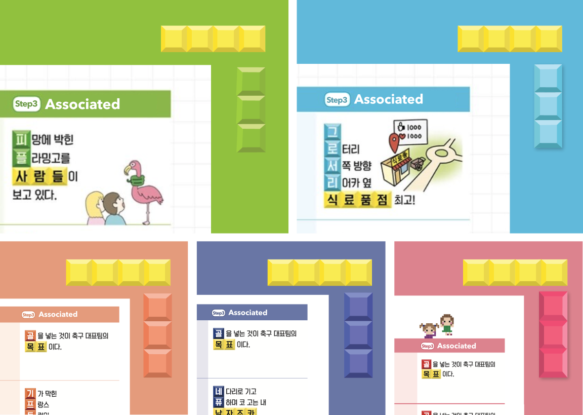
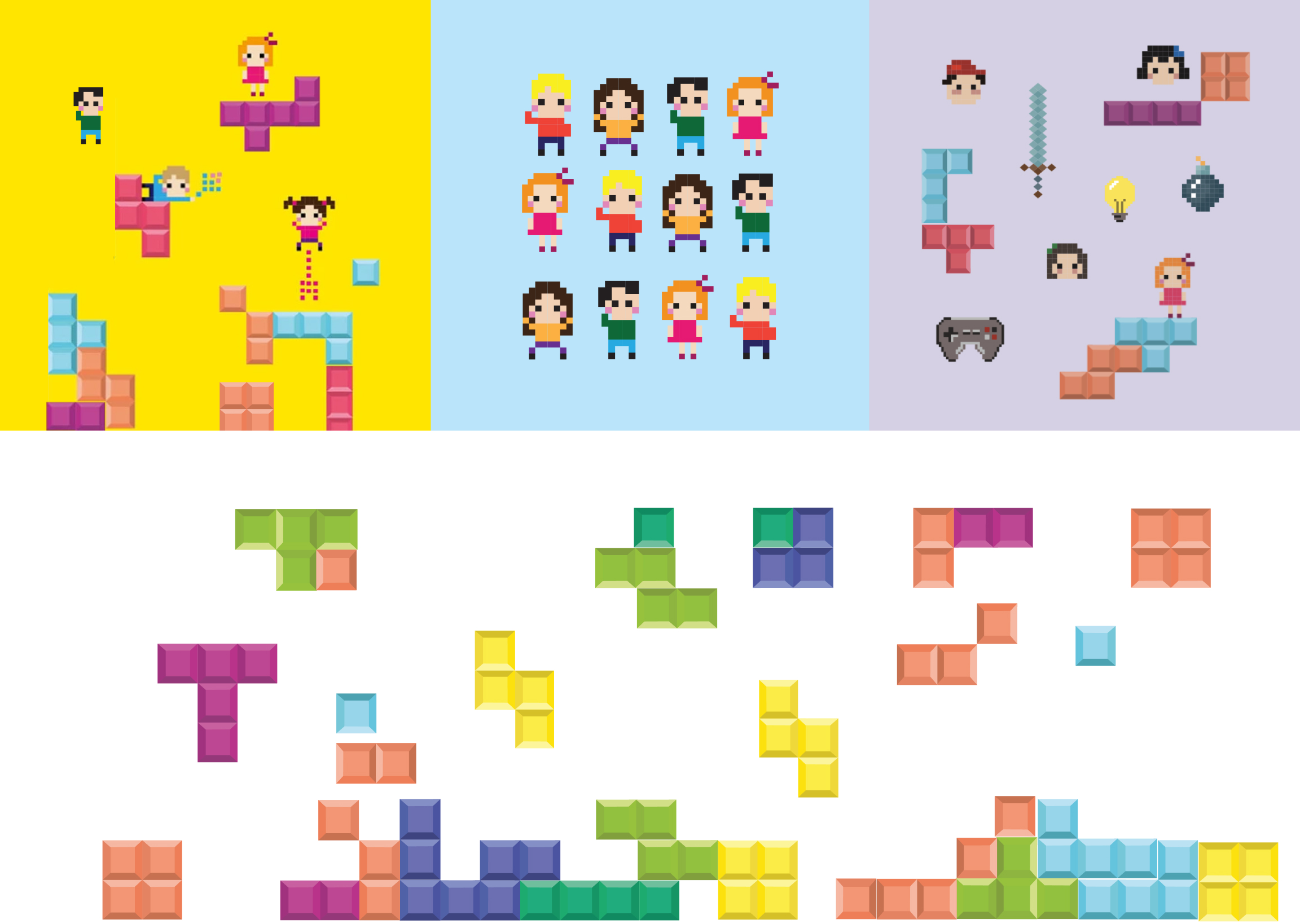
The project goal was to help students study without getting bored. That led me to fun, then to online games, then to pixel art and Tetris. Coloured blocks became a metaphor for assembling vocabulary piece by piece. I proposed this as the book’s overall visual language, and our design manager shared it with the content team. The team embraced the concept and extended it into the learning content itself, matching the sound of each English word to its meaning through stacked blocks in Step 3. I then turned that idea into a consistent visual system.
Template system
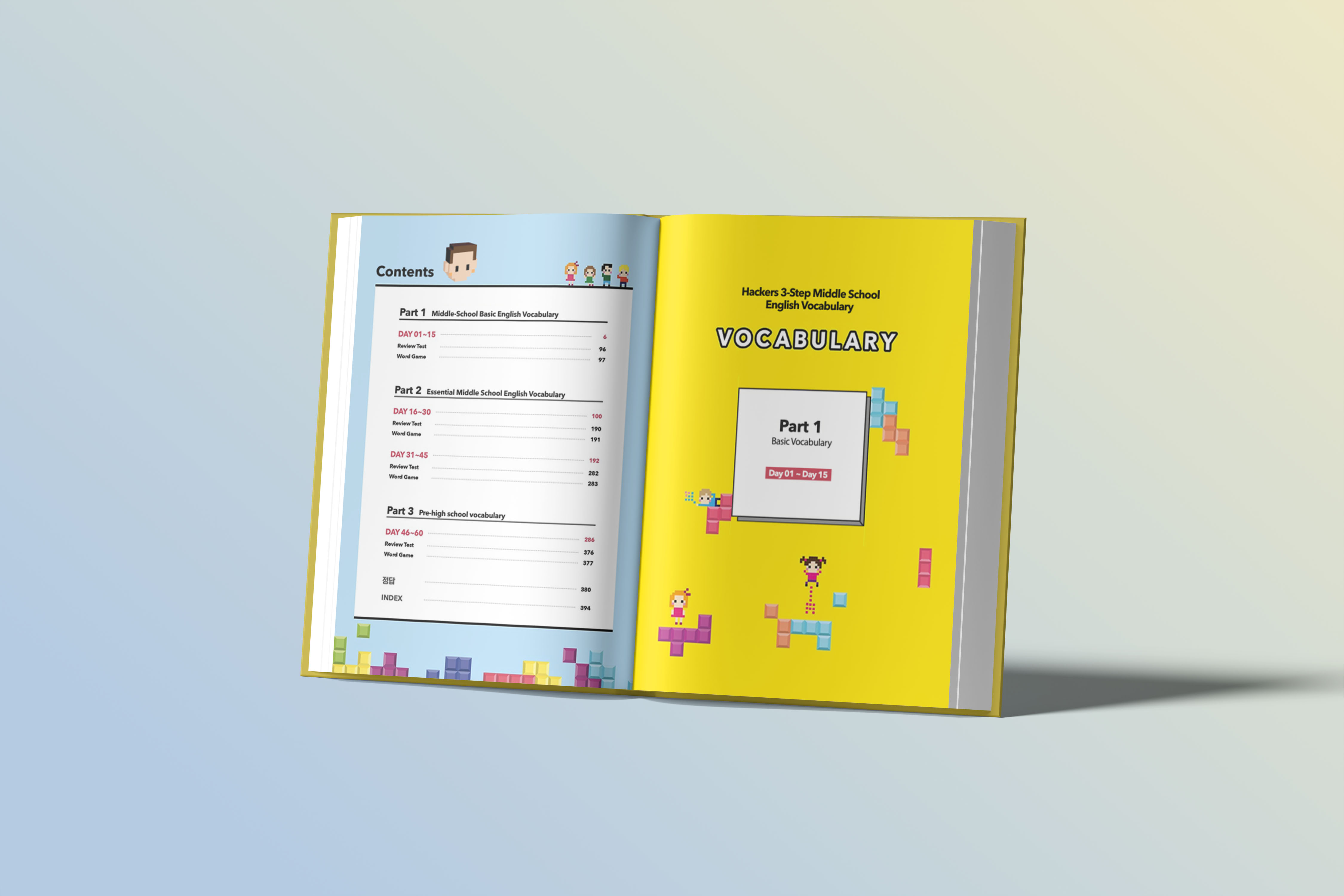
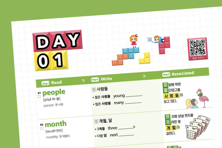
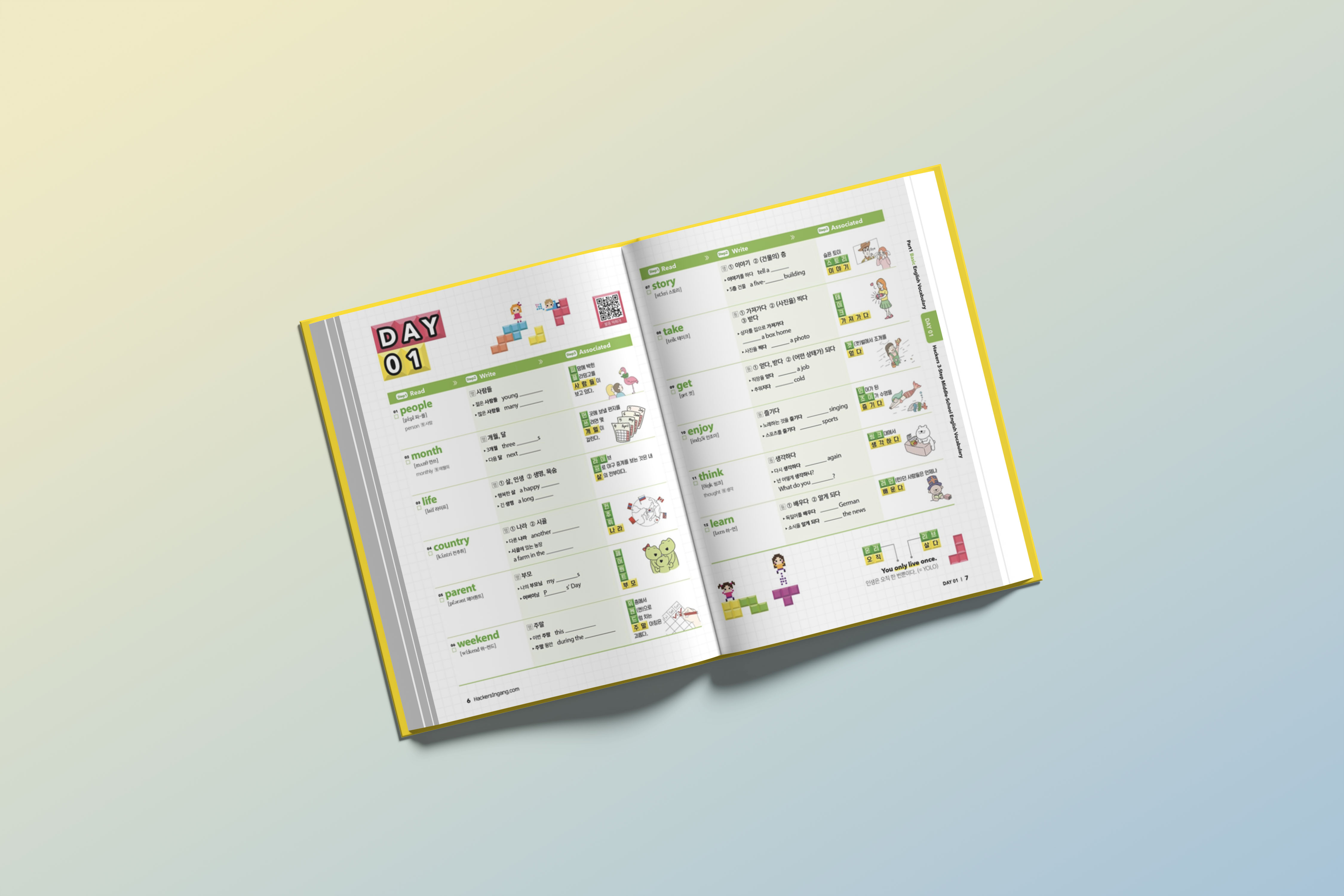
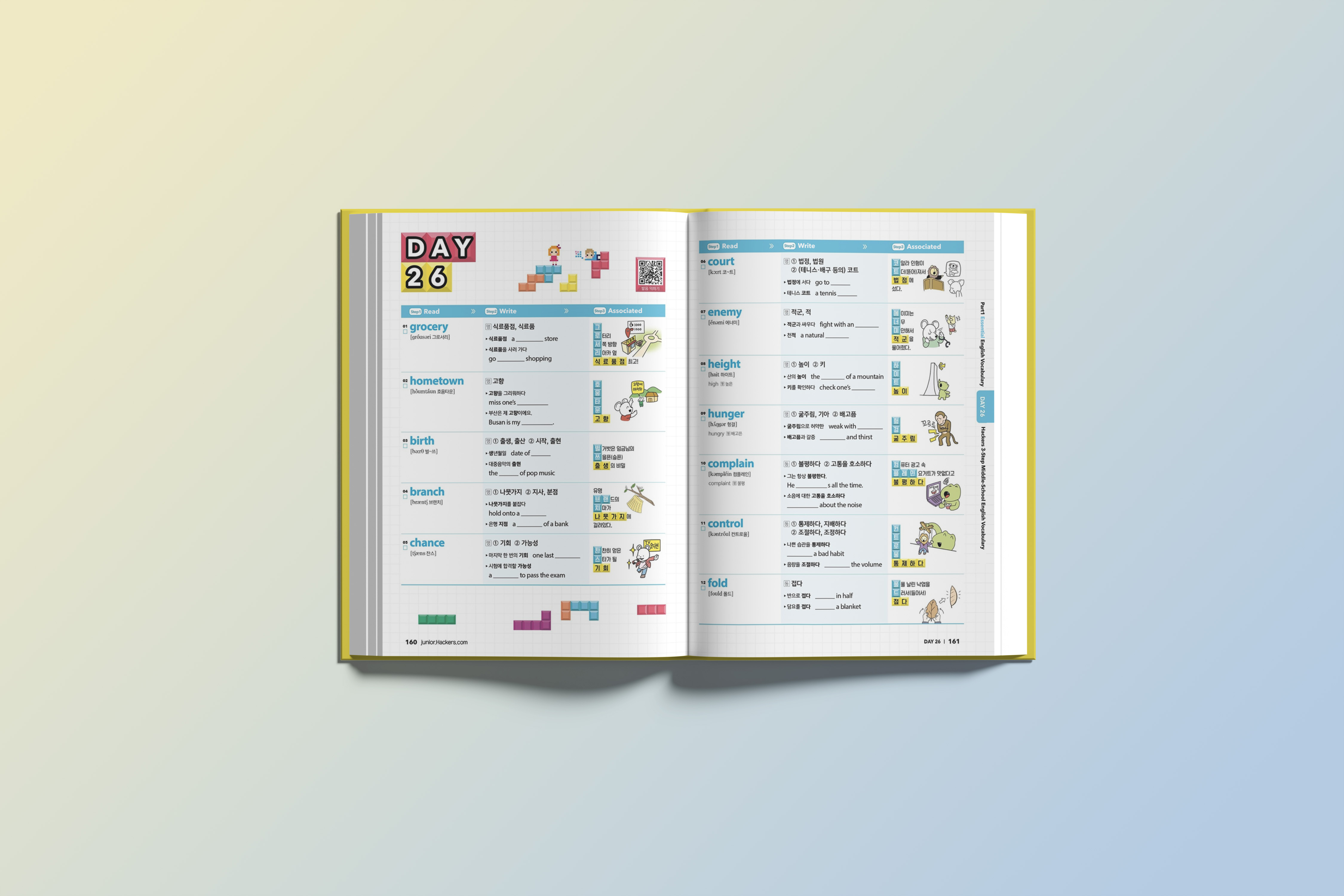
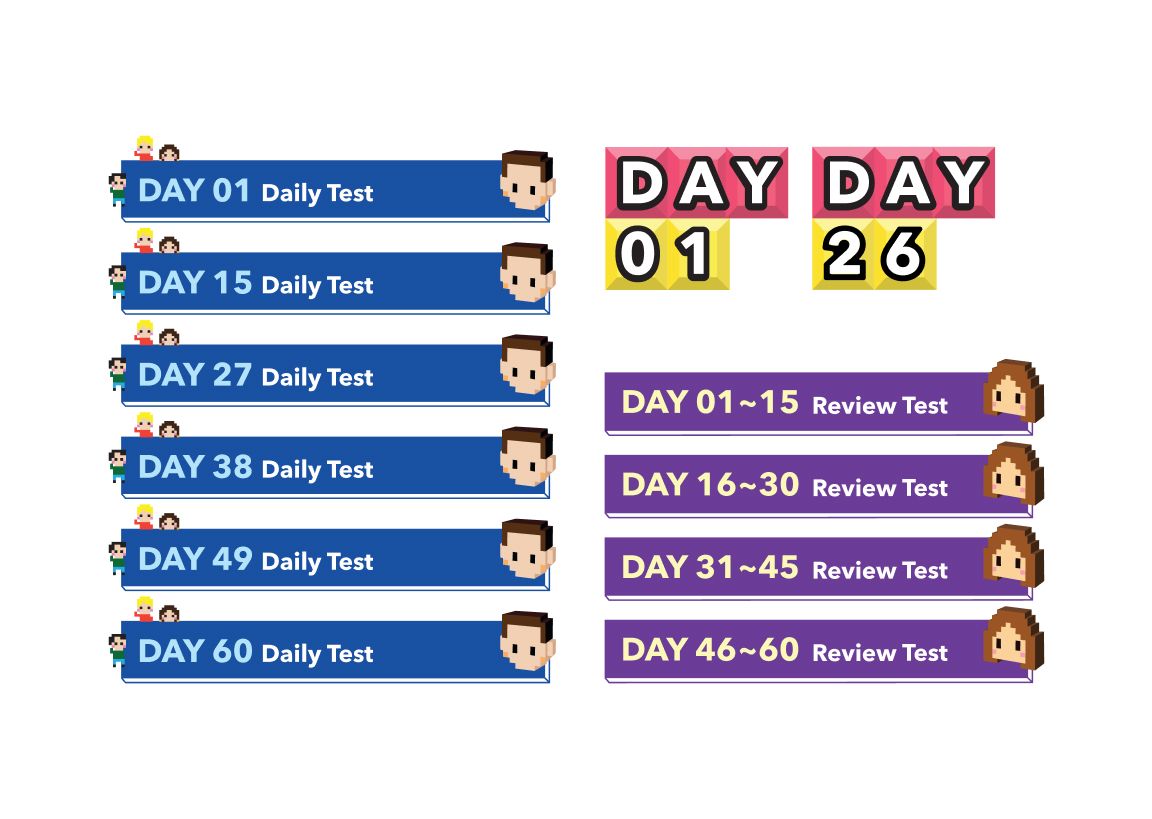
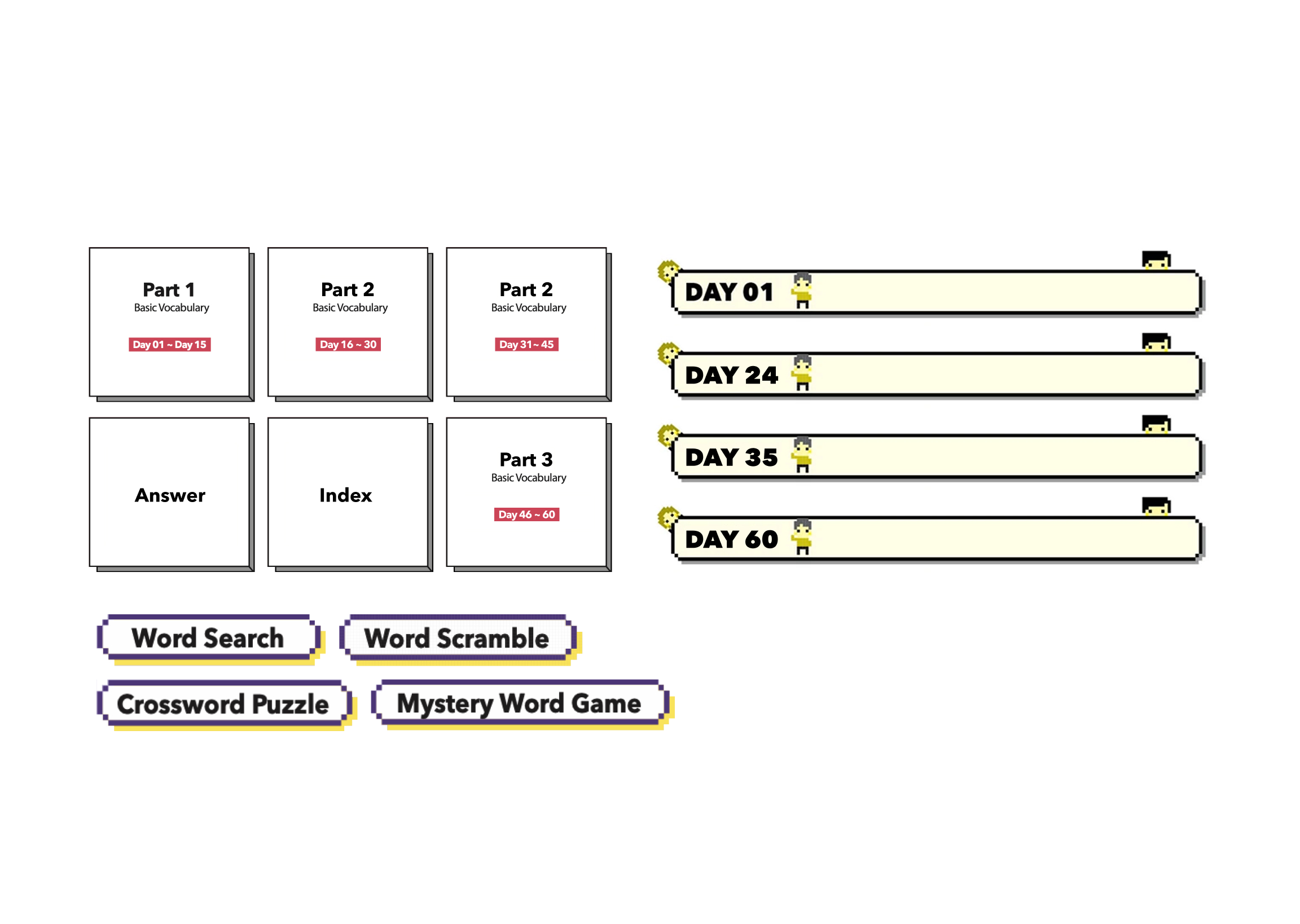
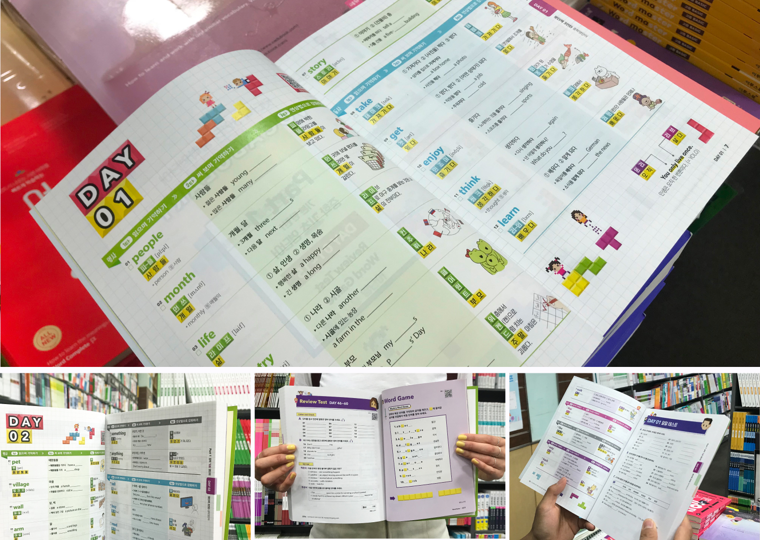
The book is organised as a 60-day study plan in three parts: Part 1 (DAY 01–15), Part 2 (DAY 16–45) and Part 3 (DAY 46–60). Each page type supports a stage of learning: daily word pages, daily tests, review tests, word games, answer key, index and a pocket vocabulary booklet. Each has its own look but shares one visual language. Side tabs and a large DAY marker help students find their place. Type pairs Avenir Next for English with formal Korean typefaces for clear reading.
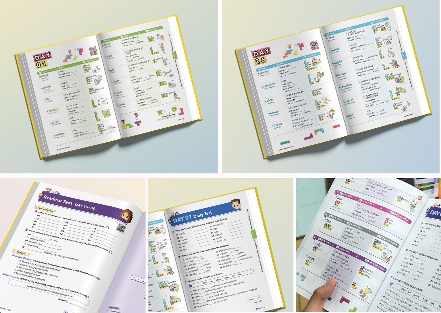
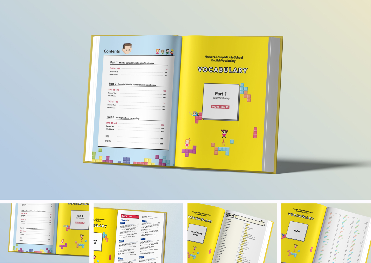
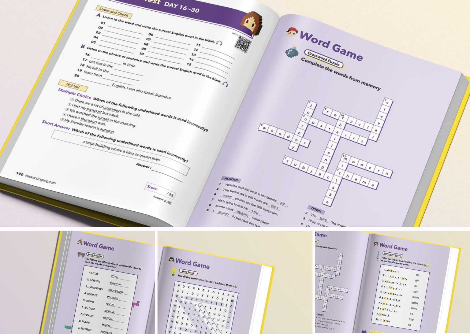
Key design decision 1: Making a learning idea read at a glance
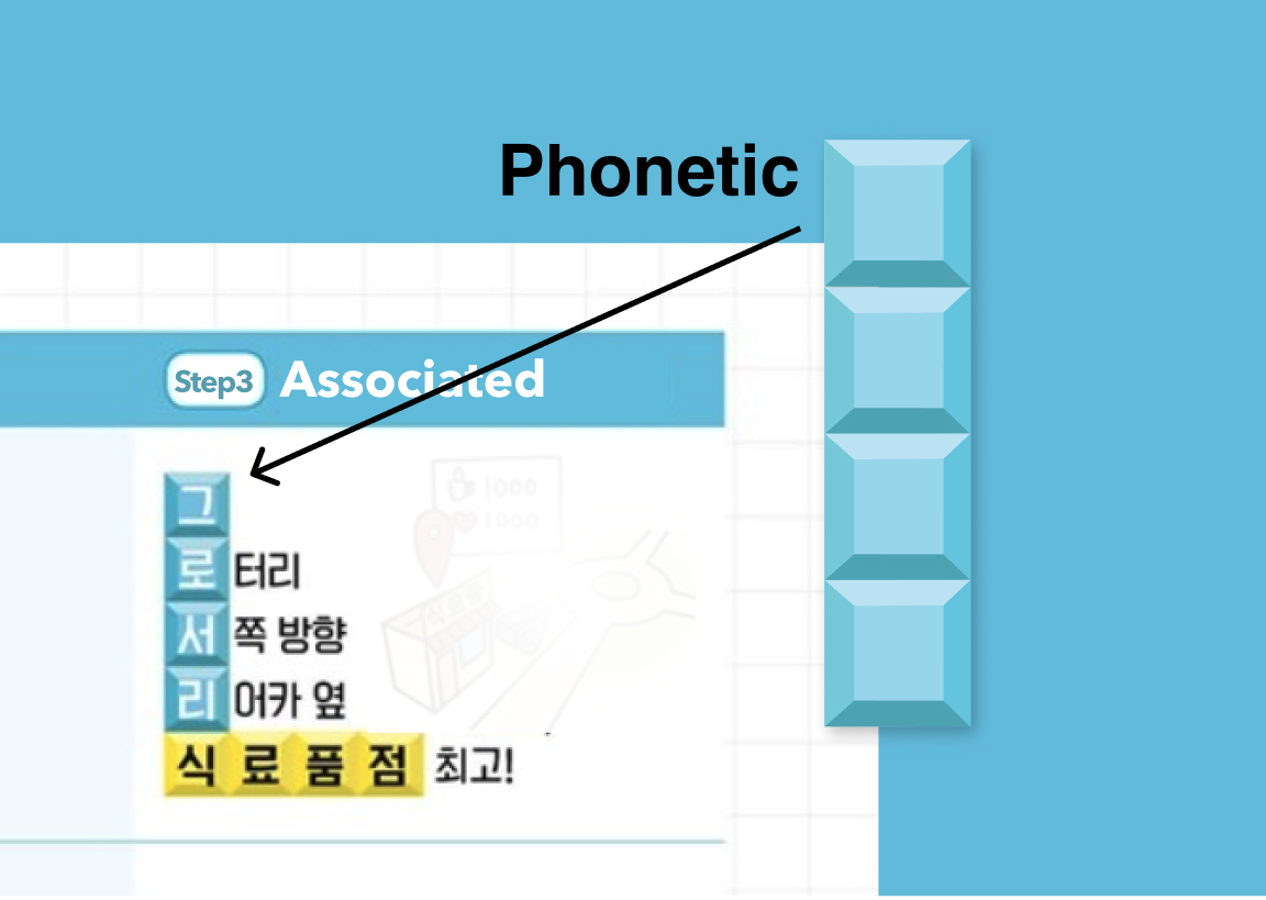
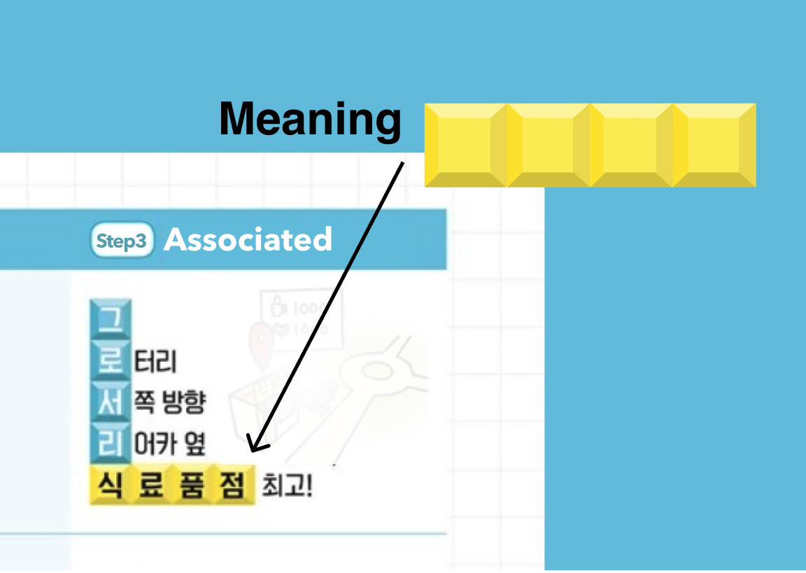
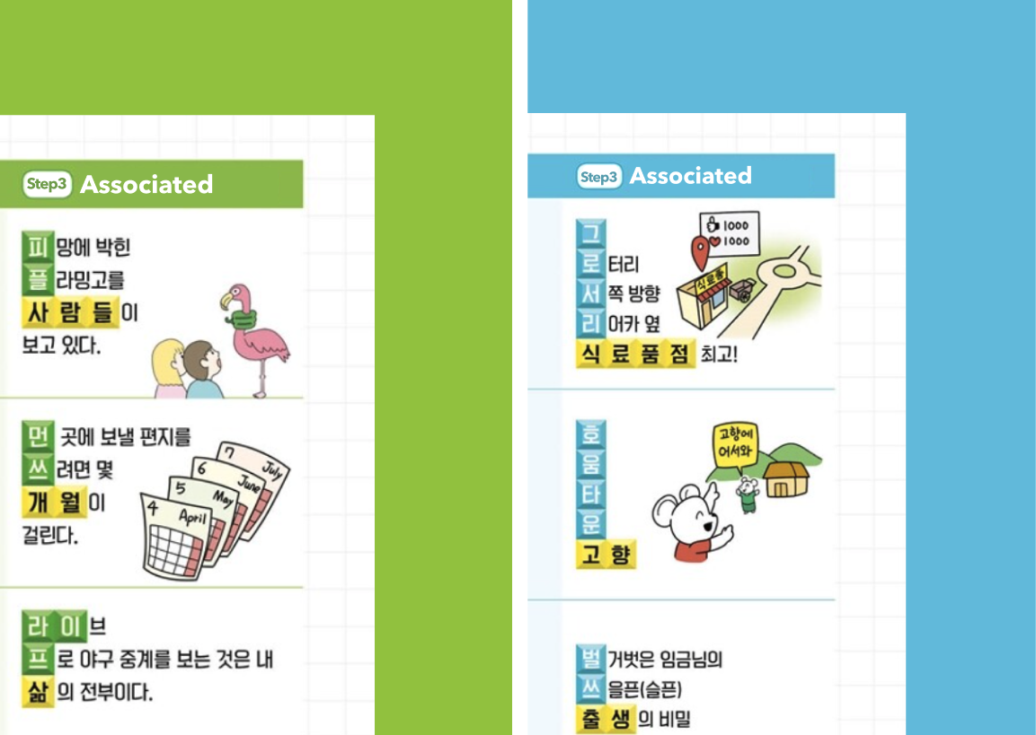
In each Step 3 association cell, the pronunciation of the English word is written in Korean and stacked as coloured sound blocks. Each block leads into a short sentence, which ends in a yellow horizontal block with the meaning. Students follow one line of sight from sound to meaning. I designed this into the system: block sizes, colours and layout rules that kept it consistent across all 60 days of the plan.
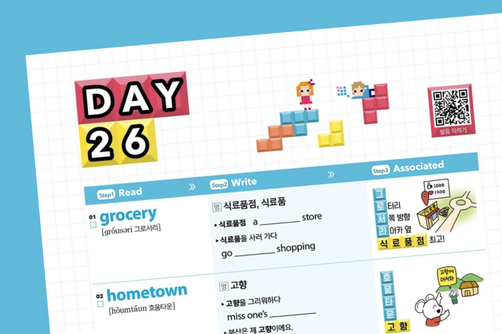
Key design decision 2: Designing rules, not just pages
The Korean sound spelling varies in length from word to word, so I set limits before designing: up to four block rows and three to four characters per row, with the smallest block size that stays legible at a 10pt body minimum. I checked these with the content team in advance so the way sounds were split matched what the template could hold. The association cell grows in height with the amount of text, while illustrations are resized to fit inside it. In the handoff, I asked the proofreading and content teams to keep text from overlapping, and spacing held at 2–4pt.
Key design decision 3: Colour with a purpose
Horizontal meaning blocks are always yellow across all 60 days. Each DAY takes one main colour from the rainbow or light grey, with yellow excluded so the two roles are never confused. The rotation keeps pages fresh across the 60-day plan.
Art direction
I shared a mood board and art direction with the illustrator, including where each illustration would sit in the layout. Together we built a vector library: one block per rainbow colour, 6–8 pixel characters and 5–7 game items. Headline and index characters use high-contrast colour and angles for a more three-dimensional look, while background characters are flatter so they never compete with the content. Vector files let everything scale across page types.
Print production
The book is 412 pages, 170 × 227 mm, printed in full colour using four-colour (CMYK) offset printing on matte, uncoated wood-free paper. Before handing files to the printer, I checked the final proofs several times and gave detailed notes to the proofreading and content teams, so the printed book stayed close to my original designs.
Impact
#1 on Aladin’s weekly bestseller list for middle school vocabulary (words and idioms) reference books, first week of July 2019 (first edition). The book was also distributed through Kyobo and Korea’s online bookstore network. A revised second edition was published on 28 May 2020.
What I learned
The most rewarding moment was turning the learning method into a Tetris game visually: the idea grew from “make vocabulary fun” to online games, then to pixels and Tetris. I also learnt that quality depends on communication. To get the final book close to my first designs, I wrote detailed notes, explained them in person to the proofreading and content teams, and checked the final proofs several times before they went to the printer.